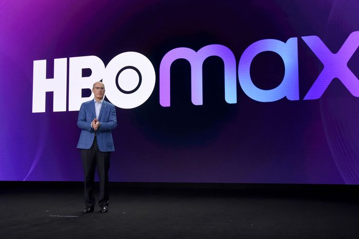
People have been lamenting many things about the shift from HBO Max to simply Max. The name sounds goofy — literally, like Goofy’s son, Max Goof. The UI is now more complicated and condescending. Making people download a whole new app and remember their password right before two giant series finales is a dick move. And so on. But one piece of branding has gone unmourned thus far: HBO Max purple.
The day before the Max rebrand was announced, I remember watching a trailer for HBO Max’s (now canceled) South Side and thinking, Wow, HBO owns this shade of purple. The purple frame surrounding the YouTube thumbnail immediately identified the video as belonging to an HBO Max joint. Netflix has red; Hulu has green; Apple TV+ has brushed aluminum, just like all Apple products. And HBO Max had that distinct and glorious purple. Its logo animations had a gradient that included light and dark versions of the color, some cooler and some warmer (and specifically, between hex codes #991EEB and #5822B4). It gave bisexual-lighting vibes. But the core HBO Max purple was tinged slightly fuchsia, somehow trashy and elevated at the same time, just like And Just Like That … The warmth in the hue drew you in, but at its core, it was still the color of kings.
Max can call its new color “royal blue” all it wants, but purple has long been associated with actual royalty. The especially extra Roman emperors forbade common folk from wearing the color — under penalty of death. Until the invention of synthetic dye, it was a notoriously difficult (and expensive) color to make. One of the main organic purple dyes came from a sea mollusk: Clothiers of old would have to harvest 250,000 snails for one ounce of dye. The category is opulence. Wearing purple, you own everything.
The royal monopoly on purple went out with the Byzantine Empire, but it’s still known as a color for Richie Riches and people of singular vision. Purple was the color of Prince. And Joan on Mad Men. Purple is Elizabeth Taylor’s freaky violet eyes. It’s the subconscious. It’s the color of Sailor Saturn, the most prestige TV–coded of the Sailor Senshi in Sailor Moon. Purple was the perfect color for a streamer that aligned itself with acclaim, with expense, and with being better than the rest. It’s not TV; it’s HBO. It’s not a color; it’s a quarter of a million snails per ounce.
Looking at it this way, it makes sense that David Zaslav & Co. would axe HBO Max purple as soon as they could. The Max rebrand is about broad appeal, about taking everything that made HBO special and hiding it behind a bunch of Food Network bullshit. HBO was the place that said “yes” when other networks said “no.” Stripping HBO Max of its royal purple strips it of its prestige identity. It becomes another basic blue bitch — just like Disney+, Paramount+, Prime Video, DirecTV, the Microsoft Store, Vudu, and the chroma-key backgrounds of a Marvel movie. Actually, that’s unfair to Disney+ and Prime, which at least have picked appealing shades of blue to be. Max blue blares out of a computer screen. It’s obnoxious. It’s eye-watering. It could be cool in a 100 gecs video, but as the main branding of a broadly appealing streamer, it falls flat.
HBO Max was originally intended to bring diverse voices to the table, something that seems like less of a priority for “both sides” Warner Bros. Discovery. Blue is useless from a branding standpoint unless the goal is to make Max less distinct overall. If the goal is to take what was once a unique (-ly affluent, -ly queer, -ly diverse) streamer and turn it into just another content faucet, then mission accomplished. HBO Max purple is Aperol spritzes on a Mediterranean yacht; Max blue is a ranch-dressing fountain at a gender-reveal party. Congratulations, Max. You played yourself.


