For more on Severance, sign up for Severance Club, our subscriber-exclusive newsletter obsessing, dissecting, and debating everything about season two.
This article originally ran on April 1, 2022. We’re republishing it with the start of Severance season two for anyone freshly wondering about the haunting aesthetic choices of Lumon’s severed floor.
When you agree to sever your consciousness to work at the mysterious conglomerate Lumon, you end up in an empty, hauntingly generic office space every weekday morning. In Severance, “Innies” have no memory of their lives outside of work (the opposite is true for their “Outies”) and are treated like “little children,” says production designer Jeremy Hindle, who likens their mysterious, windowless office to a playground. (The Innies are, after all, only a couple of years old.) As Hindle puts it, “The managers are raising them in this work environment,” and Severance’s visual design carries forward that sense of “office as haunted playground” complete with influences from mid-century American office design by the likes of Eero Saarinen and Kevin Roche and accessories that seem to exist out of time. The result is an eerie yet playful steel-toned work space that befuddles the characters while winking at the audience.
In designing the sets, Hindle worked closely with set decorator Andrew Baseman and relied on input from writer Dan Erickson and director Ben Stiller to capture the particular menace of Lumon’s aesthetic. Hindle and Baseman walked Vulture through the thinking behind the various cursed objects and furniture that haunt the world of Severance. (This piece will be updated as more odd corners of the Lumon office reveal themselves.)
A Mid-Century Idea of Work
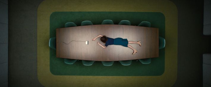
In the show’s first episode, Britt Lower’s character Helly wakes up to her new life as an Innie on top of a large table that bends around the shape of her body. “I said, ‘What is this table?’” said Hindle. “And Dan said, ‘It’s the birthplace. It’s the womb of the office.’” The table, like much of the other furniture in the office building, is meant to evoke a subconscious, almost nostalgic sense of the idea of “work,” grounded in mid-20th-century design. For his first meeting with Stiller, Hindle put together a look book referencing imposing statements to corporate power like the John Deere headquarters designed by Eero Saarinen and Kevin Roche and the Saarinen-designed Bell Labs Holmdel complex (its brainlike parking lot stands in for the exterior of Lumon’s), as well as the 1967 Jacques Tati film Playtime, set within a massive concrete, steel, and glass set. “If Lumon is designing a space just for people to work, you’d go back to the ’60s and ’70s,” Hindle said. “If you look at those references, it just says ‘work.’ That’s it. They’re so dominant and powerful.” It’s as if the office itself is teaching the Innies what an office is.
The Desk Cluster
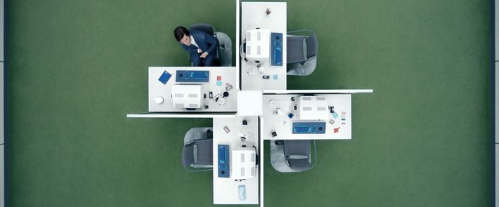
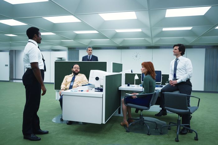
Once Helly emerges from the womb of the table space to join her department, she’s met with a similarly familiar-yet-not collection of accoutrements. “I was careful not to show anything that was easily recognizable,” Baseman said of the props found within the Innies’ “macrodata-refinement” office. “We wanted to confuse the viewer about whether this is a period piece, contemporary, or the future. The lamps and chairs, all of those things were either manufactured or found in faraway lands because we didn’t want people to say, ‘Oh, that’s an Eames chair.’”
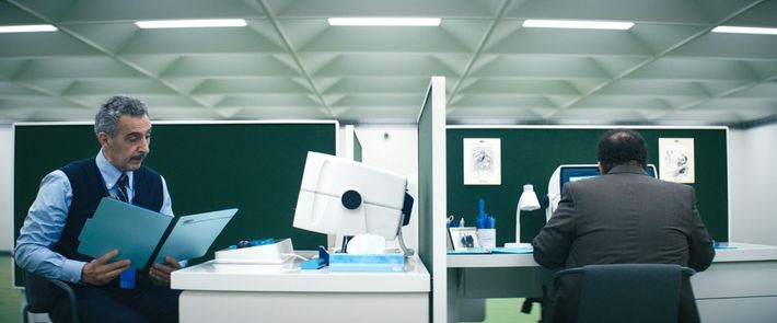
The show’s script described the main characters sitting in a quartet of connected desks, which Hindle designed specifically for the series. “Those dividers are a nightmare, because they were designed so the employees could not see each other,” Hindle said. “But then I had the idea that the characters can control them. They can push them up and down, like a playground.”
A Computer Like No Other
Hindle and Baseman learned the hard way that any single brand of computer would be too identifiable for viewers. “We brought in every imaginable desktop we could think of,” Hindle said. “We made a computer that, if it ever came out in the real world and the engineers described what they were doing, no one would believe them. It’s a cathode-ray tube, but it’s a touchscreen. It has a trackball. We recognize some aspects of it, and some not at all.” The contradictory qualities are supposed to be baffling but also a bit amusing. “It doesn’t look like an adult high-tech computer,” Baseman added. “It looks like a toy.”
The Prized Incentives
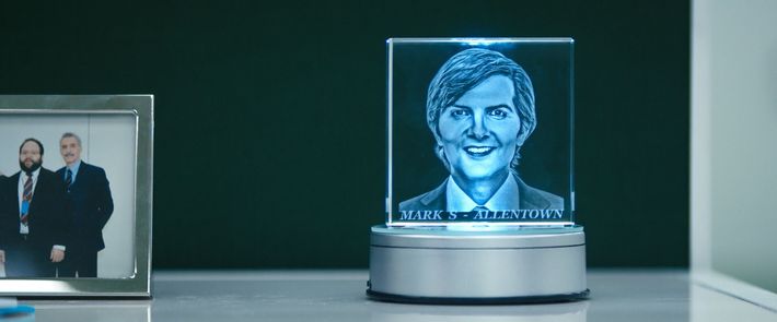
If the Innies are productive with their mysterious number-sorting jobs, they’re offered a selection of incentives ranging from carnival prizes to a celebratory “waffle party” at the end of the quarter. “A lot of those were specifically described in the script, like the Chinese finger trap,” Baseman said. “Even the erasers were vintage. Our prop master Cat Miller procured a lot of those.” The design team operated under the rule of thumb that Lumon manufactured everything itself, so anything that appeared inside the office would seem specific to the company’s aesthetic. This applies to food-based incentives, too; later in the season, we witness such delights as deviled eggs and carved watermelons served up to employees. “We showed Ben every kind of conceivable melon shape,” Baseman said, “and after you eliminate all the obvious forms of melon, the strange ones just seemed right.”
The Tools of Brain Surgery
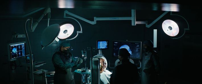
The process through which employees are severed, as depicted in episode two, involves an ominous nail-gun-like device entering the back of the patient’s head to implant the severance chip. “We worked with an amazing brain surgeon who took us through how it would actually work,” Hindle said. Because of COVID-19, the Severance crew built their own operating room instead of filming inside an actual hospital and re-created all the devices that would be on hand — including vials of ketamine, which their consultant said would be useful as a tranquilizer and way to induce memory loss.
Capturing the Heroic Kier on Canvas
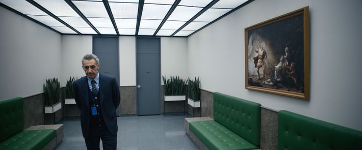
The hallways of the Lumon offices are filled with paintings celebrating its founder, Kier Eagan, in a variety of situations underlining his heroism. One cribs from the pose of the Romantic hero of Caspar David Friedrich’s Wanderer Above the Sea of Fog; another, seen above, poses Eagan as a neoclassical Christ-like figure casting out sinners; a third, which horrifies character Irving, depicts an attack from Optics and Design in a blackened, gory style that draws from Goya. Erickson’s scripts described each painting in detail, and the production team worked with digital artist Hugh Sicotte to design how each painting would look based on those references. The show hired the actor Marc Geller to pose as Kier in “every possible situation and pose,” Baseman said, and then worked through a variety of possible artworks based around the hallowed founder. “The paintings needed to look classical but believable,” Hindle said. “For some, we worked through 50 options. Then we printed them out and painted on them.”
Mark’s Couch Back Home
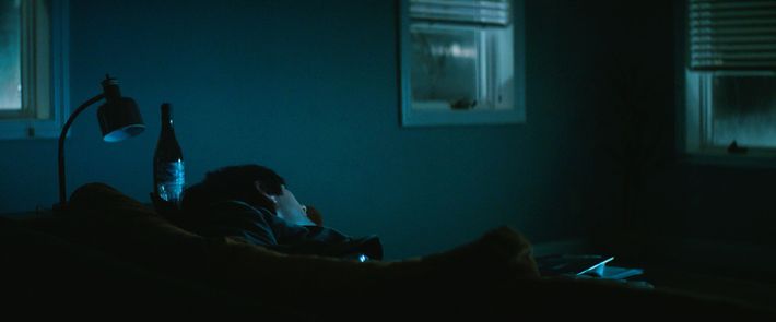
When Adam Scott’s Mark isn’t in the office, he retreats into a despairing life in the real world, where he mourns the death of his wife and lives in grim, suburban corporate housing. “The architecture of his place is so perfectly wrong,” Hindle said. Mark lives next door to Mrs. Selvig (Patricia Arquette), a sweet aunt type who the audience knows is actually a cold Lumon boss by the name of Cobel. Production built the interiors of Mark and Mrs. Selvig’s houses side by side, with Selvig’s half slightly elevated so she can peer down into his life.
Since Mark’s wife has died, nearly everything in his house is stored in the basement. “It’s much harder to do a minimal set,” said Baseman, who spent a long time trying to locate the right orange sofa. “It was a vintage piece I found at a local shop in New York. I wanted a sad generic sofa that wasn’t brown and wasn’t too bright.” Adds Hindle, “It’s a warm glint in the middle of a blue cold space. He’s alone and depressed, and there’s a little red fish.”
The Wellness Room
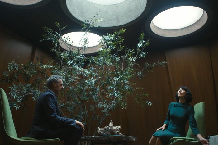
One of the eeriest rooms in the Lumon offices is also one of the sparest: the Wellness Room. There, Ms. Casey (Dichen Lachman) checks in with the Innies and offers them facts about their Outies as comfort (though they are not allowed to react to them). Somewhere between an office and a yoga studio, the design consists of a simple table, mid-century chairs, a tree, and a piece of driftwood that seems to contain a camera. “As a decorator, I always want more fun stuff,” Baseman said, “but in this one, I had to really pull back and tell the story with less. Ben would come onto the set and I’d say, ‘Have I done it again?’ and he’d say, ‘Yeah,’ so we would put things away. That room started out on a different, more detailed scale, and we brought it down to the bare minimum.”
Ricken’s Book
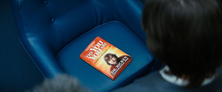
While there are glints of red and yellow outside of Lumon, the interiors of the office space tend overwhelmingly toward blues and greens, which is one of the reasons it’s so shocking to see Ricken’s book slip into Mark’s Innie’s world. The show’s graphic designer Tansy Michaud designed the cover, which, with its garish red-and-yellow cover and text about self-actualization, was meant to be a little graphically obnoxious. “Everything we were doing in design in the ’60s to just before the ’80s was perfect, and now it’s how much can I scream at you to pick me up?” Hindle said. “Also, his character is just so [laughs], so it was easy to put his face on it.”
The Mysteries of Optics and Design
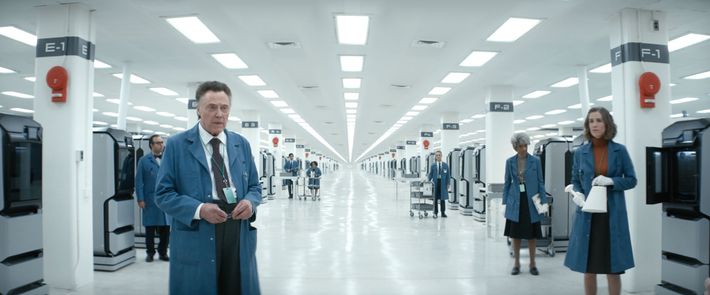
Once the MDR Innies start to explore the Lumon world beyond their department, we get a sense of just how immense and labyrinthine the underground Lumon offices are, including the Optics and Design sector run by Christopher Walken’s Burt. Those offices need to feel “really contemporary” in their manufacturing capabilities, so Hindle filled them with 3-D printers — the easiest way for a company to mass-produce whatever tools it needed. The O&D department has several sections, including a conservation room with easels and tools for touching up the aforementioned works of art. “A lot of the personality of each room is based on the writing and how it’s described in the script,” Hindle said. “And the scale is always getting bigger as they go further. The hallways get wider, because when I asked Dan how far underground does this go, he said, ‘Miles.’”
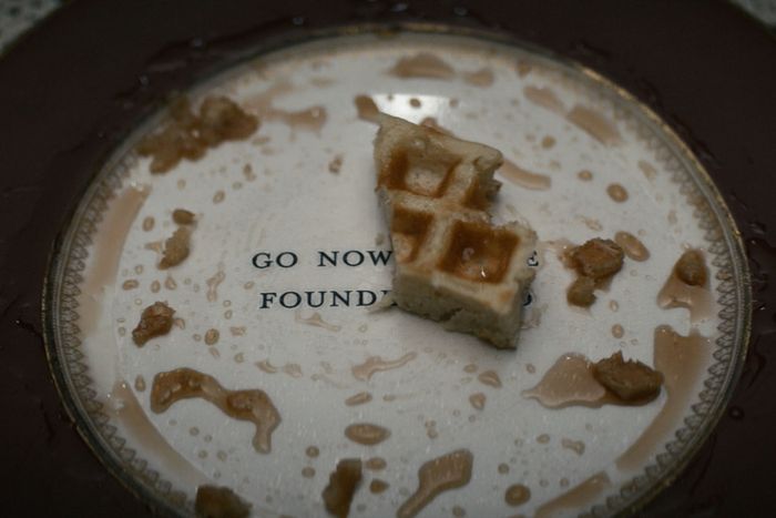
The Waffle Party
Near the end of the season, Zach Cherry’s Dylan finally gets to witness the glory that is the waffle party. It’s less of a casual-brunch thing and more of an Eyes Wide Shut–style masked-performance-art piece that takes place inside the replica Kier house. “We wanted it to be a Victorian house,” said Baseman. “We shot it on location, and we wanted little signs that pushed the element of it feeling like a museum.” Once Dylan finishes his waffles, a message on the bottom of his plate tells him to go to Kier’s bed, where he witnesses a strange, sensual dance performance. “The writing on the plate was all in the script, but to find the right plate and then have it printed with a nontoxic ink was a whole thing.”


