

Pretty Things: A weeklong break from reality, dedicated to beautiful objects.
When selecting paint colors, why not take inspiration from high art? New York design editor Wendy Goodman chose hues similar to those found in Agnes Martin’s current show at the Guggenheim, all available at Farrow & Ball. The late abstract painter’s aesthetic — as described by art critic Jerry Saltz as “minimal, meditative, and pale” — could be all your own. Read on for Wendy’s picks.
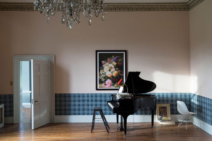
No. 230: Calamine
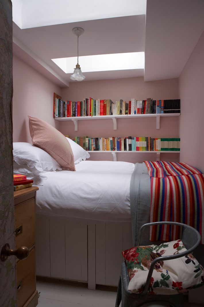
“Calamine is a few notches down from real pink. It is pink in hiding, so for a shier person who wants to be less robust with color, this is a good shade.”
No. 269: Cabbage White
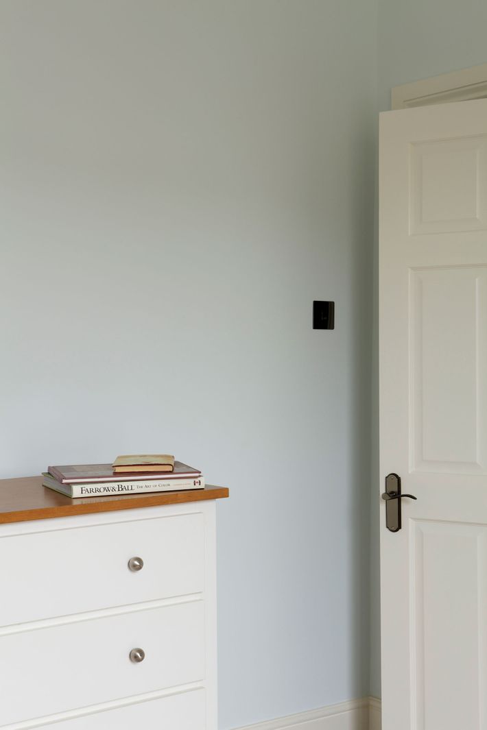
“This is soft and expressive and complements other colors.”
No. 30: Hague Blue
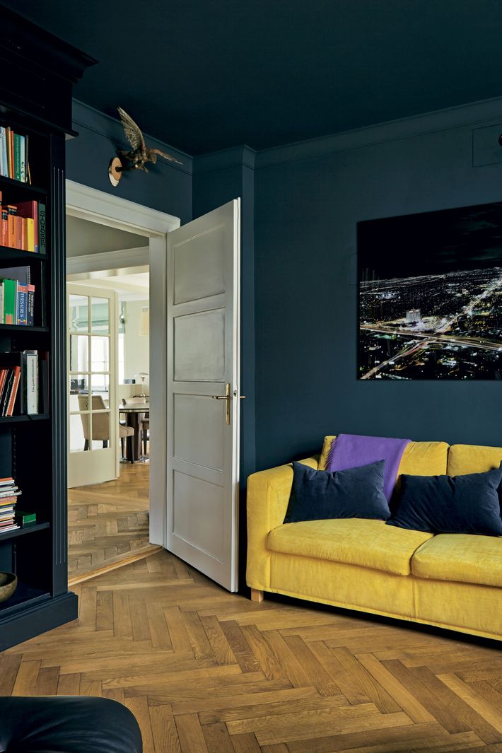
“Hague Blue begs for oranges and soft yellows and can also go with severe colors and black.”
No. 67: Farrow’s Cream
“Genteel, subdued, and soothing. So good for the bedroom.”
No. 202: Pink Ground
“This is soft and sweet. It’s a good background for soft gray, soft browns, or yellow.”