

There’s something deeply magnetic about the worlds Alice Gao creates. In design journals and brand campaigns, her photography has a soulfulness and intimacy that draws you in: A simple room springs forth with unexpected details, a bowl of fruit is as lush and downy as a Renaissance painting. In her Flatiron studio, where she just completed a two-year gut renovation, her décor achieves that rare feat of totally unstuffy sophistication. And in rare glimpses of her style on social media — Gao isn’t the preening-selfie type — there’s a playfulness and ease that sets her apart from your typical influencer.
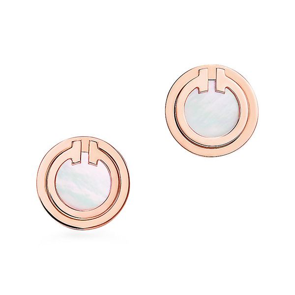
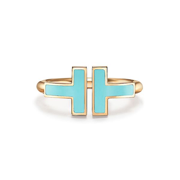
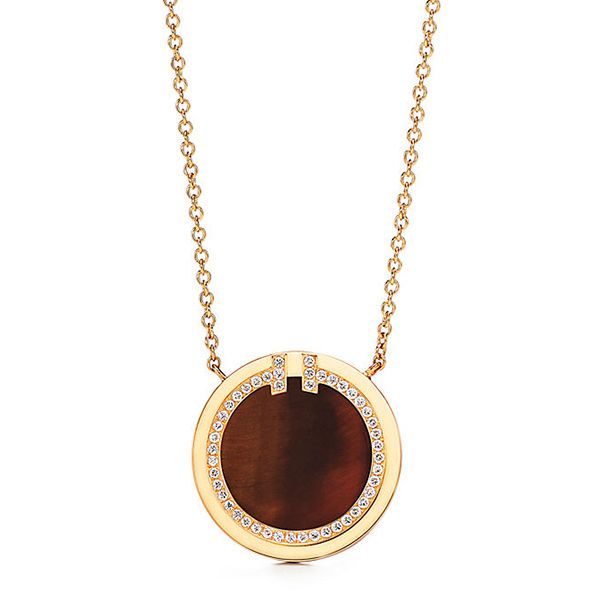
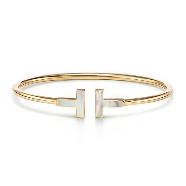
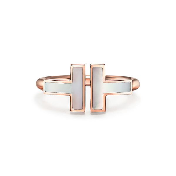
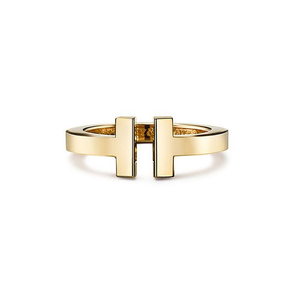
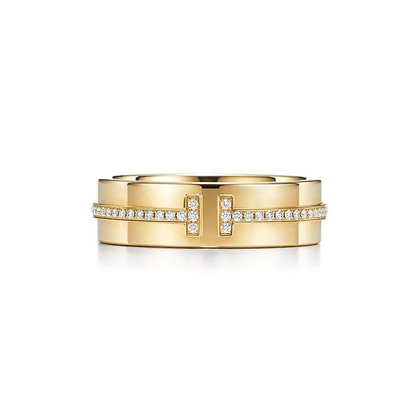
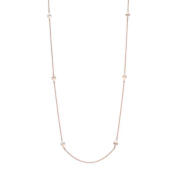
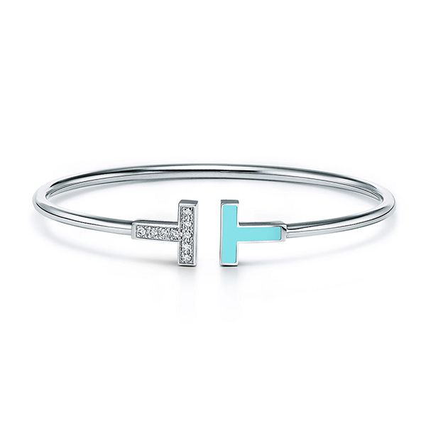
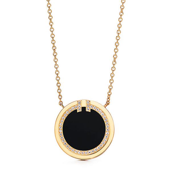
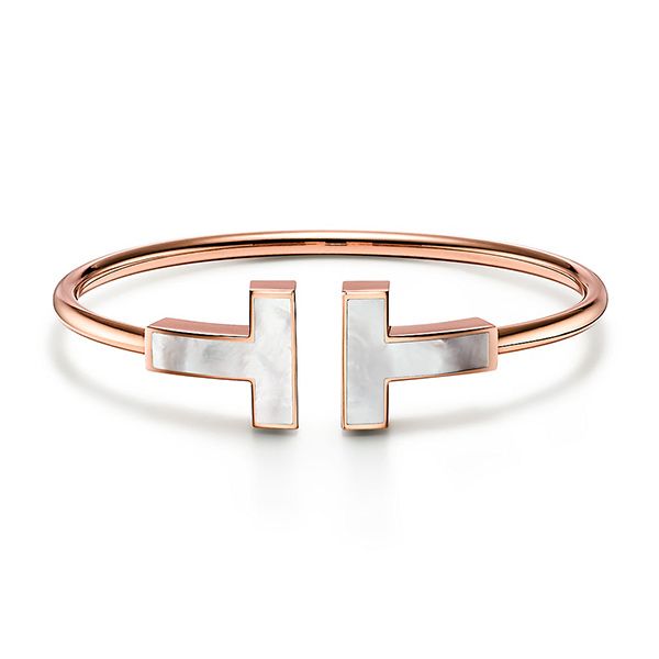
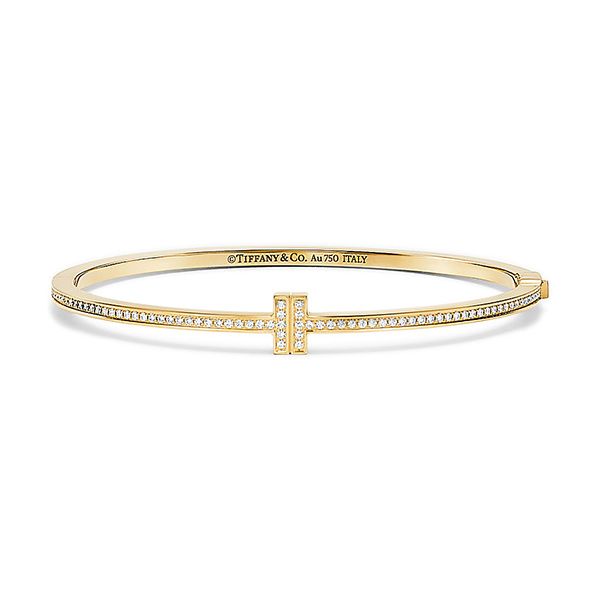
Ask Gao the secret to her unfussy kind of simplicity, and she’ll tell you about her love of color, her willingness to take inspiration from unexpected places, and her sly predilection for adding an off-kilter element to her outfits and images. In partnership with Tiffany & Co., which just expanded its Tiffany T collection with new jewelry featuring vibrantly colored inlaid stones, we spoke with Gao about how she uses color to shape her world and create oases of unexpected beauty — from finding the perfect contrasting tone to complete her photo compositions, to the jewelry that adds subtle sophistication to her look.


Tell us how you approach color in your photography.
I love color. It plays a big role in my photography, especially lately. It’s one reason I keep my wardrobe and studio palette fairly neutral, so when I do bring color in, it’s the star. I like concepting scenes based on their overall palette and the way colors play off each other. Right now I’m very into monochromatic looks, mixing shades that are very similar, then adding one element that’s like, “Ooh, this is going to have just the right amount of clash.”

What role did color play in your studio décor?
I knew I didn’t want that basic minimalist thing, where it’s all white and gray. I wanted something warmer, but that still felt subtle and restrained. We ended up using a very defined palette, which included a mix of greens and cyans in the kitchen, my rug, and artwork, and an ashy salmon in the dining chairs. The renovation process was absurd — it was originally supposed to take six months, and everything that could possibly go wrong did. But the moment I hung up the artwork over the daybed, it coalesced. It felt like mine. It’s my favorite place now. I think keeping the palette tight was the secret to making it feel very Zen.


Shop the Story
The “subtle clash” you described seems to play into your style, too.
Definitely. I’m always drawn to unfussy, elevated basics and simple shapes. But increasingly, the things I feel instantly drawn to are about color. This dark rose, almost berry-colored dress [dress pictured below] is so stunning to me. I knew it would pair beautifully with a red shoe, the gold jewelry, the little touch of Tiffany Blue®. There’s something so gorgeous about the gold with silk — those two sort of lustrous textures together. I love those pairings where things don’t quite match, but there’s a harmony. I compose outfits and photographs in a similar way. I look to create a certain tension between objects. That’s so much more interesting to me than having everything perfect.


How has your style evolved over the years?
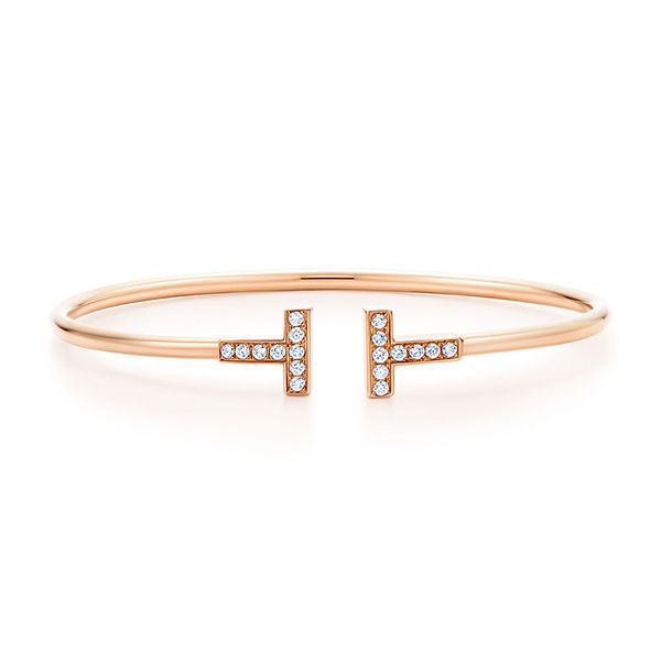
The big change as I get older is that I want pieces that are a little more of an investment. Shoes, bags, and jewelry are the big things. I love having a collection of really carefully chosen jewelry, pieces with some history and a story behind them. I used to only wear really dainty pieces — these days I’m drawn to things with a little more heft. It’s one thing that drew me to the Tiffany T collection — those pieces are architectural, and they have a presence to them that makes them feel special. You can keep it very simple with just one, or stack bracelets or rings for more impact.

What ideas inform your photographic eye?
So many things! Movies of course, art books, but often, it’s not even visual stimuli. It can be the written word — I fall in love with a certain line of a book, and that sets the mood for a photo I capture that day. Urbanism is a big influence, too. Living in New York, I feel that energy, the pulse. There’s no cruising here; you always feel pushed to make your craft better. It’s probably why I like to instill some calmness and create quieter moments in my work, since the outside world is so chaotic and energized. And I always want things to be organic and breathing, not sterile. Making sure the images have soul is the most important thing.


Shop the Story
Travel is a huge part of your life. How has that influenced you?
It’s incredible to visit someplace that looks different, feels different, uses color in a distinctive way. The first time I went to Cartagena, I was so struck by all the pastel buildings. Or in India, the rich, saturated colors that just overwhelm your senses. I recently went to Santa Fe and became obsessed with this architect who designs all these crazy-colorful facades. Bright, bold pink, dusty taupe, deep orange. It’s the most inspiring thing to dive into a new landscape and figure out how to incorporate them in your images.
This is paid content produced for an advertiser by New York Stories. The editorial staff of The Cut did not play a role in its creation.