The origin story of comic books isn’t flashy. No radioactive spider bite, atomic explosion, or shadowy experiment granted the medium the sort of ability that would have allowed it to arrive on early-20th-century drugstore racks as glossy, fully formed vehicles for sophisticated entertainment. Rather, it took a steady progression over the course of more than 75 years for the form to fully understand, and then harness, its powers. When the first comics arrived on newsstands in the early 1930s, they were a cynical attempt to put old wine in new bottles by reprinting popular newspaper comic strips. Cheaply printed and barely edited, those pamphlets were not what a critic at the time would have called high art.
Yet today, the medium is flourishing in ways its ancestors could never have imagined. From floppy single issues of superhero sagas to hefty graphic novels, harrowing comic-book memoirs to YA fare about queer adventurers, readers can tap into a dizzying array of what the great cartoonist Will Eisner famously termed “sequential art.” And, as evidenced by the sheer number of adaptations in film, television, and even on the Broadway stage, the rest of the entertainment industry has grown wise to what fans have long known: There’s a special alchemy that comes when you tell a story with pictures.
Printed images — and the comic book medium’s unique presentation of them — are at the heart of this feature. We have set out to trace the evolution of American comics by looking at 100 pages that altered the course of the field’s history. We chose to focus on individual pages rather than complete works, single panels, or specific narrative moments because the page is the fundamental unit of a comic book. It is where multiple images can allow your eye to play around in time and space simultaneously, or where a single, full-page image can instantly sear itself into your brain. If there are words, they become elements of the image itself, thanks to the carefully chosen economy of the writer and the thoughtful graphic design of the letterer. In the best pages, one is torn between staring endlessly at what’s in front of you or excitedly turning to the next one to see where the story is going. When comics have moved in new directions, the pivot points come in a page.
To assemble our list of 100, we assembled a brain trust of comics professionals, critics, historians, and journalists. Our criteria were as follows: A page had to have either changed the way creators approach making comics, or it had to expertly distill a change that had just begun. In some cases, there were multiple pages that could be used to represent a particular innovation; we’ve noted those instances. We didn’t necessarily pick the 100 best pages — there are many amazing specimens we didn’t include because they didn’t have a significant influence on the craft of comics. These are also not the only 100 pages that have shaped comic books, but each, in its own way, has had a profound impact on the form as we know it. And, this being comics, we had to get a little nitpicky: We’re only dealing with comics first published by North American publishing houses, and we’re not including newspaper comic strips, webcomics, or reprints thereof.
Some pages are notable for their written content — game-changing first appearances, brilliant narrative innovations, and so on. Some are significant because the artwork told a story in ways no one had thought to do before, and ended up being emulated — or, in some cases, outright aped. All are interesting on their own and integral parts of the tomes from which they were plucked. We conclude on what we think is a high note, with a few recent comics that have already made an impact and portend a richer and more diverse future. Strung together, these pages are a megacomic of their own, documenting the evolution of an art form in constant flux.
You can click on the title of each page to open a window with a full-sized version.
Gods’ Man (1929)
Writer, penciler, and inker: Lynd Ward
We could “Um, actually” our way through candidates for “First Comic Book Ever” until we’re blue in the face. But it’s inarguable that one of the leading pioneers of modern longform graphic storytelling was Flemish illustrator Frans Masereel. Right after World War I, he created a series of “pictorial narratives” without words — you may have spotted his most famous, Passionate Journey (1919), in the gift shop at your local art museum.
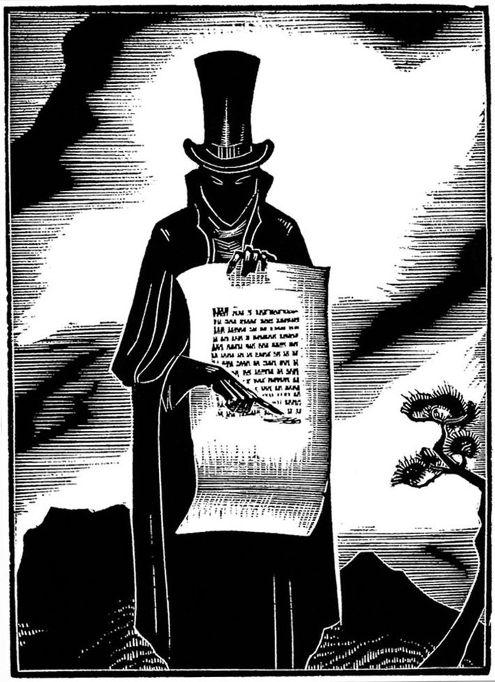
Chicago-born art student Lynd Ward discovered Masereel’s work while studying printmaking in Leipzig, Germany, and was inspired to use the oldest print medium — woodblocks pressed into ink — to create something very modern: the first stand-alone graphic narrative by an American, or as he called it, a “novel in woodcuts.” Gods’ Man (1929) tells the story of a struggling artist who makes a supernatural bargain with a mysterious stranger (pictured here) for a magic brush that comes at a terrible cost. The book, composed of one woodcut illustration on each of the volume’s 139 pages, was a surprise success, and Ward produced five more graphic novels (though use of that term was decades away) before settling into a career as an illustrator and fine artist. His work was a huge inspiration to future cartoonists, including Art Spiegelman, whose Maus was heavily influenced by Ward’s woodcut style. Spiegelman later edited Library of America’s excellent boxed set of Ward’s silent novels.
New Fun: The Big Comic Magazine No. 1 (1934)
Writer: Malcolm Wheeler-Nicholson; Penciler and inker: Lyman Anderson
If Lynd Ward pioneered the American graphic novel, it was left to more commercially minded creators to concoct the floppy, staple-bound items that would become known as “comic books.” They began as an offshoot of the comic-strip boom in the late 1920s/early 1930s, when the comics section in newspapers (dubbed the “funny pages”) increased in size as adventure-themed strips grew to match the popularity of their sillier comedic counterparts. Eventually, Eastern Color, a successful comic-strip printer, realized that the popularity of comic strips could be used to attract customers. They struck up a deal with the Gulf Oil Company to produce a small “book” of four full-page strips that would be given away as a promotional item at Gulf gas stations. Gulf Oil Weekly proved to be popular, inspiring Eastern Color and Dell Publishing to try selling “books” of reprinted comic strips. After a few attempts, Dell backed out of the project. Eastern Color went on alone and launched the ongoing series, Famous Funnies, in May 1934.
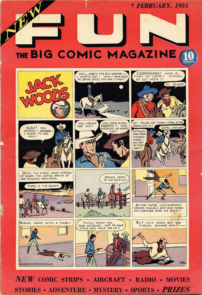
Following the success of Famous Funnies, pulp magazine writer Malcolm Wheeler-Nicholson founded National Allied Publications and released New Fun Comics No. 1 in January 1935. The major distinction of New Fun Comics was that, right from the first story of cowboy Jack Woods (which appeared on the cover — an approach largely eschewed by future comics), these comics were entirely original material rather than reprinted comic strips. (Famous Funnies had the occasional original material, but it was rare and typically used as filler.) With its declaration that these flimsy products could provide exciting, new content, New Fun No. 1 was the birth of the comic book as we now know it.
Action Comics No. 1 (1938)
Penciler, inker, and letterer: Joe Shuster; Writer: Jerry Siegel
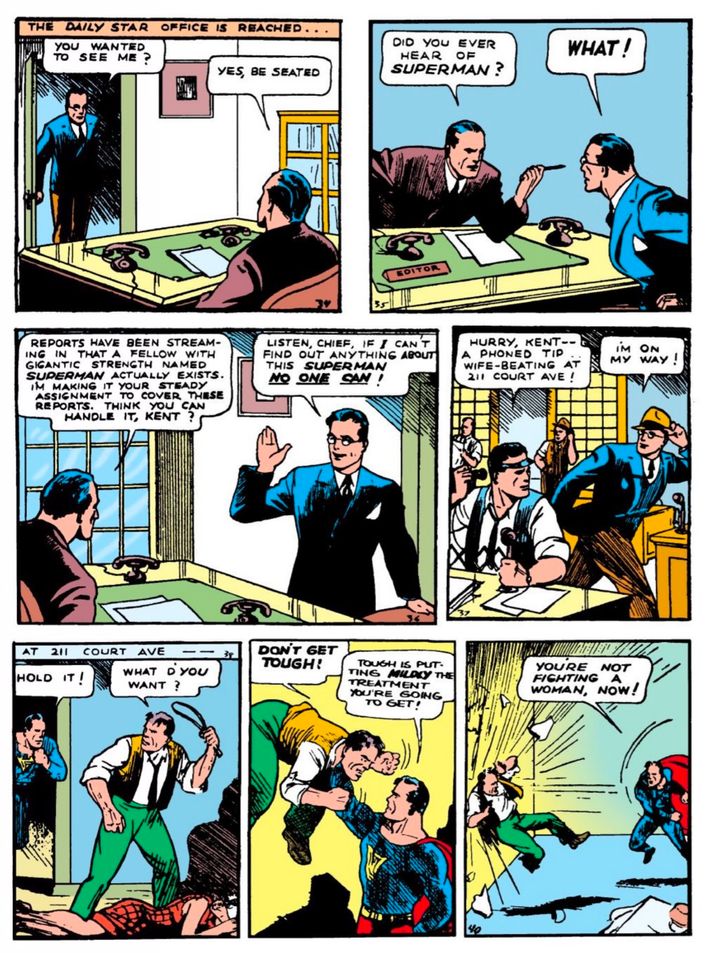
In which we learn that superheroes were social-justice warriors from the start. Steeped in the politics of the left-leaning, working-class Depression milieu from which Superman emerged, the man of steel’s first appearance shows him foiling a lynching, roughing up war profiteers, breaking a wrongly convicted murderer out of death row, and beating his ideals into this domestic abuser. The first true superhero was forged in the crucible of progressive social politics.
Creators Jerry Siegel and Joe Shuster originally conceived “Superman” as a newspaper strip, which is obvious from the arrangement of this page, with a “button,” or mini-cliff-hanger, in the last panel of each tier. It was only after being rejected from every newspaper syndicate they could find that Siegel and Shuster reluctantly agreed to let fledgling publisher National (later renamed “DC,” after another of their series, Detective Comics) run it as the cover feature of their new title, Action Comics. Shuster cut up his comic strips and pasted the panels onto a board in the new comic book format.
National changed ownership between Action Comics accepting Siegel and Shuster’s story and actually publishing it. Ironically, the new brass thought the debut issue’s now-iconic cover — Superman smashing a mobster’s car into a mountain — was so stupid they forbade Supes from appearing on any future fronts. Those National execs changed their minds, though, once sales kept rising, and they learned that kids weren’t going to the newsstand asking for Action Comics — they were looking for Superman. It was the start of not just a genre, but an entire industry.
Whiz Comics No. 2 (1939)
Writer and colorist: Bill Parker; Penciler and inker: C.C. Beck
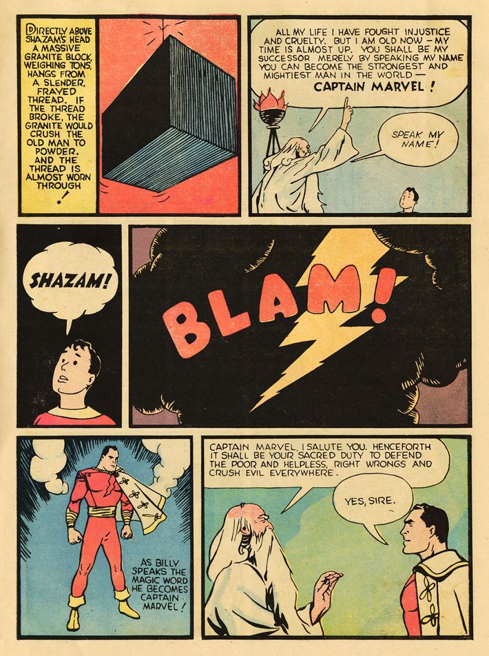
By the end of 1938, it was clear that National’s “Superman” feature was a tremendous success. It had been out for barely a year since the release of Action Comics No. 1 when publisher Fawcett Publications got into the superhero game by introducing Captain Marvel in Whiz Comics No. 2. The intention of Captain Marvel was to create Fawcett’s own Superman — except with his secret identity being a 12-year-old boy, Billy Batson, who transforms into hero form when he exclaims “Shazam!” (The name stands for the initials of the magical beings who supplied his powers: the wisdom of Solomon, the strength of Hercules, etc.)
The blend of Superman-style adventures with the wish fulfillment of a kid led to Captain Marvel becoming the most popular superhero of the 1940s, selling better than even his Kryptonian inspiration and leading to an array of Marvel-themed spinoffs such as Mary Marvel and Captain Marvel Jr. Naturally, National sued Fawcett, and the case went on for years until National seemingly won in 1952. Rather than appeal further, Fawcett just stopped publishing superhero comics (sales had already been declining), and eventually sold Captain Marvel to National. (He remains a DC property to this day, with a feature film on the way next year.) The notion of giving kids a character they could identify with proved to be massively influential.
Detective Comics No. 33 (1939)
Writer: Bill Finger and Gardner Fox; Pencilers: Bob Kane and Sheldon Moldoff; Inker: Kane; Letterer: Moldoff
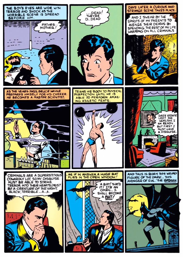
National quickly looked to expand their burgeoning superhero empire. Every freelancer knew that National was looking for new superheroes. It was with this in mind that writer/artist Bob Kane, who had done a few different features for National before finally landing a regular feature with the adventure serial, “Rusty and His Pals,” sat down to create his own superhero, whom he called the Batman. The problem for Kane was that his ideas for the character were not particularly strong and he knew it. So he enlisted writer Bill Finger, whom Kane had recently hired to write “Rusty” for him, to develop the character. Finger changed nearly everything about the character but his name and their revamped Batman (who was heavily influenced by pulp hero the Shadow) made his debut in 1939’s Detective Comics No. 27, drawn by Kane and written by Finger (Finger lifted the plot of the Shadow novel Partners of Peril for that first Batman story).
Finger teamed up with Kane for one of the most important Batman stories ever, the origin of the character in Detective Comics No. 33. At this point in comic-book history, most superheroes had no underlying motivation for being heroes other than a desire to do good. With Batman’s origin, Kane and Finger introduced the novel idea of a young boy witnessing his parents’ murders and being driven to avenge their deaths by becoming a superhero. It was the building block of Batman’s characterization for years to come and inspired countless angsty superheroes with similar sob stories.
Marvel Mystery Comics No. 8 (1940)
Writer, penciler, inker, and letterer: Bill Everett
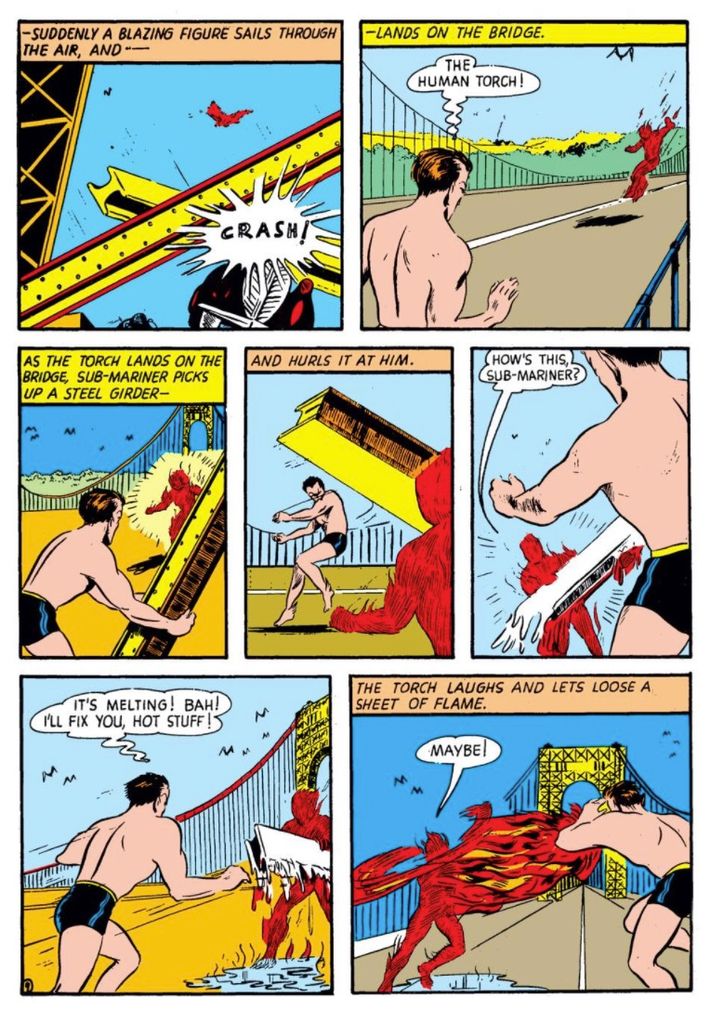
One early company that tried to cash in on the superhero craze was Centaur Publications, a pulp publisher that had recently purchased two failed comic-book companies, Comic Magazine Company and Ultem Publications. Centaur’s superhero features, like “Amazing Man” and “The Arrow,” did not exactly set the world afire. Centaur’s art director was Lloyd Jacquet, who had helped put together the first issues of New Fun Comics for National in 1934. Jacquet saw that demand for new superhero content was so great that he left Centaur to form the comic-book packager Funnies Inc., in the process bringing along a number of Centaur artists.
Funnies Inc. was hired by publisher Martin Goodman to put together a trial comic. The issue, Marvel Comics No. 1, included a Bill Everett short story introducing the roguish Namor the Sub-Mariner, and a Carl Burgos story introducing a heroic android called the Human Torch. (He was unrelated to the later Fantastic Four character of the same name.) The issue sold so well that Goodman hired away some Funnies Inc. creators to work directly for him at his new company, Timely Comics. The comic book was retitled Marvel Mystery Comics and history was made in the eighth issue when Everett and Burgos (good friends from their time together at Centaur) had each other’s characters appear in their two features, with Human Torch hunting down Namor. It was the first superhero crossover and introduced the idea of a shared comic-book universe, concepts that became key parts of superhero-comics history.
The Spirit, December 8, 1940 (1940)
Writer, penciler, and inker: Will Eisner; Colorist: Joe Kubert; Letterer: Sam Rosen
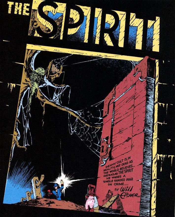
The most successful of the fevered content-generating stables known as comic-book packagers in the late 1930s was Will Eisner and Jerry Iger’s studio. They had formed their company in 1936, so they were well positioned when the superhero boom following Action Comics No. 1 came about. By the end of 1939, they had 15 writers and artists working for them, but Eisner himself remained their greatest asset. He was a brilliant writer and artist, able to produce comic-book features in a variety of formats. Eisner and Iger were making a great deal of money in the late 1930s. However, Eisner wanted more from his career.
He came up with the idea of doing a comic-book series that would be appear as a supplement to the weekly Sunday color comic-strip pages in local newspapers. He wanted to own this idea outright, so he sold his interest in their packaging studio to Iger in exchange for Iger not contesting Eisner’s ownership of this new enterprise. The supplement would open with a story starring the Spirit, a new costumed detective character Eisner created, with backup stories featuring other Eisner creations. When it launched on June 2, 1940, the series looked like most other Sunday comic strips. Eventually, once the series was clearly a success, Eisner began to experiment. First, he did splash pages like most other comic books of the period (three-quarters of the page given to one image and then one-quarter showing the first panel of the story) but December 8, 1940, was the first time Eisner worked the name of the feature into the landscape of the drawing. Soon, The Spirit would be most known for the way that the title was brilliantly worked into the opening splash page. Eisner’s Spirit was a direct influence on the many acclaimed artists who worked as assistants for him while he did The Spirit (and continued the series while he was drafted during World War II), like Jules Feiffer, Jack Cole, Wallace Wood, and Jerry Grandenetti. What’s more, Eisner’s experimental artwork was a clear influence on artists like Jack Kirby and Jim Steranko, the latter of which directly homaged Eisner in a number of his works.
All-Star Comics No. 3 (1940)
Writer: Gardner Fox; Penciler and inker: Everett E. Hibbard
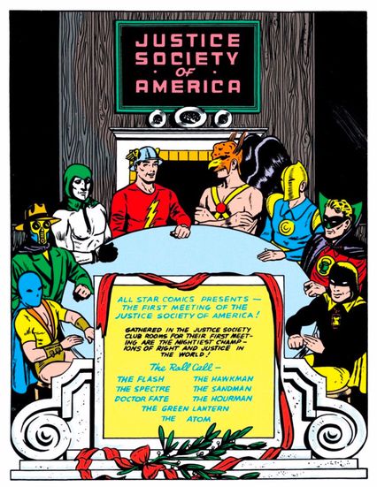
One of the earliest comic-book pioneers was Max Gaines, the salesperson for Eastern Color Printing who first devised the idea of creating “books” collecting color comic strips to be used as promotional items for companies. He was the mind behind Eastern Color’s Famous Funnies series and soon was interested in setting up his own comic-book company. Harry Donenfeld, the co-head of National Allied Publications, agreed to help fund Gaines’s new venture, which was called All-American Publications, provided that Gaines took on Donenfeld’s National Allied partner, Jack Liebowitz, as a partner (partially to keep an eye on Gaines and partially to keep Liebowitz from leaving and forming his own company). Along with Detective Comics (a small company formed solely for the publication of the aforementioned Detective Comics), All-American and National Allied all used “Superman-DC” as their shared name on the covers of their titles.
In 1940, All-American launched a comic-book series called All Star Comics, which would feature short stories starring heroes from both All-American and National Allied. With the third issue, however, they tried something novel. Writer Gardner Fox wrote a framing sequence that connected the disparate stories in the issue. Said framing sequence revealed that all of the various heroes in the book were actually part of a single superhero team known as the Justice Society of America. For years, the Justice Society parts of the book only worked as a framing sequence to set up the solo stories, but eventually the book began telling full-length Justice Society stories. Since All-American was technically its own company (Gaines would sell his interest in the company to National Allied in 1944 and then form EC Comics), this was not only the first superhero team but also the first intercompany crossover, two ideas that have subsequently been used to death and beyond.
Captain America Comics No. 6 (1941)
Writers: Joe Simon, Jack Kirby, and Stan Lee; Pencilers: Charles Nicholas Wojtkoski, Al Avison, Jack Kirby, Joe Simon
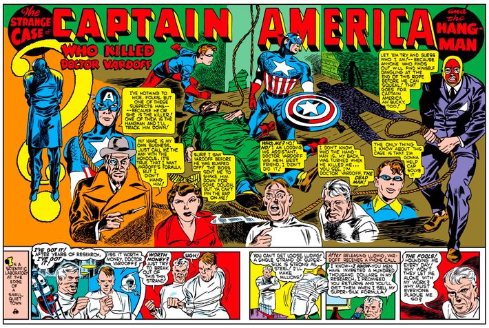
Joe Simon and Jack Kirby were into punching Nazis before it was cool, as can be seen from the famous cover to their Captain America Comics No. 1, in which the titular super-soldier blitzkriegs der Führer in the face almost a full year before the attack on Pearl Harbor and America’s entry into World War II. The duo was equally as innovative between the covers, becoming the Golden Age’s unquestioned masters of superhero art (just as Kirby as a solo act would become the Silver Age’s unquestioned master). Simon and Kirby would have characters’ fists and legs break the panel borders, as if heroes and villains were so excited to beat each other up they were almost literally leaping off the page.
But they became best known for their spectacular double-page spreads, which, if they did not invent, they certainly perfected, beginning with this tale in Captain America Comics No. 6. This “widescreen” technique of spreading a single image across two whole pages starts the story with a bang and immediately draws the reader in with bombastic action and/or an opening “teaser,” like you see here. Two-page spreads are now not only commonplace, but de rigueur.
Animal Comics No. 1 (1942)
Writer, penciler, and inker: Walt Kelly
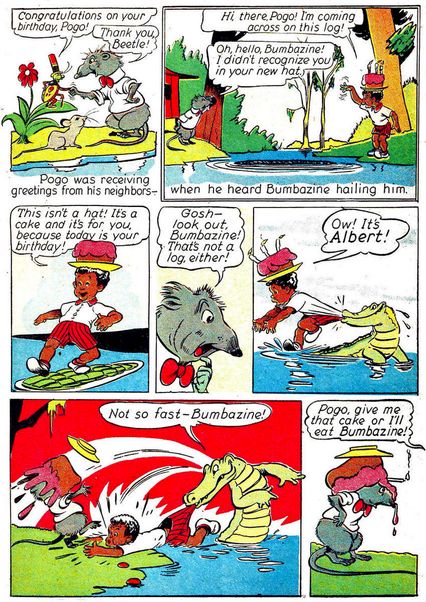
Dell Publishing began Walt Disney’s Comics and Stories in 1940 and, owing to the popularity of its subject matter, it became one of the best-selling comics series of all time in the United States, with a monthly circulation of well over 3 million copies. After all, Disney comics spawned whole countries’ industries around the world: In France, the first true comic book was 1934’s Le Journal de Mickey, beginning, as WDCS did, as a reprint of the “Mickey Mouse” comic strips. In Japan, Osamu Tezuka single-handedly launched manga with his Disney-influenced style in 1947’s New Treasure Island.
Speaking of international influence, the first “original” (non-reprint) story in WDCS wouldn’t come until 1942’s adaptation of “The Flying Gauchito,” a segment in the film The Three Caballeros. The artist on “The Flying Gauchito” comic was a former Disney animator named Walt Kelly. Kelly would create Pogo the Possum for Animal Comics later that year, another Dell-published Disney-style comic. This page is from that first story, “Albert Takes the Cake,” with a much more zoologically accurate Pogo and Albert the Alligator. Kelly and Pogo would enjoy even greater success in newspaper funnies pages, the rare instance of a comic-book character that became more popular in comic-strip form.
Wonder Woman No. 2 (1942)
Writer: William Moulton Marston [as Charles Moulton]; Penciler and inker: Harry Peter (as H.G. Peter)
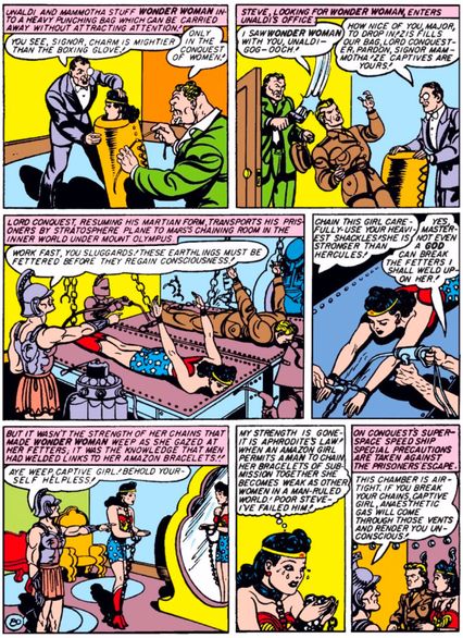
“Tell me anybody’s preference in story strips, and I’ll tell you his subconscious desires,” said Dr. William Moulton Marston, co-creator of Wonder Woman. Huh. You don’t say, Doc? A psychologist and contributor to the invention of the lie detector, Marston was, to put it mildly, an interesting individual. After denouncing superhero comics for their “blood-curdling masculinity,” he was invited by All-American Comics to put his money where his mouth was by creating a strip more to his liking. This was the result: Wonder Woman, written by Marston under a pseudonym and drawn by veteran illustrator Harry Peter.
A cornerstone of Marston’s belief system was women’s inherent superiority to men, which may explain why he liked to see them get tied up so much. Here we have no less than three forms of bondage on one page: wrist and ankle shackles, chained to the wall by the neck, and, most imaginatively, getting sewn up inside a punching bag. Lest you think we picked this page for pure sensationalism, rest assured that this was a pretty typical early Wonder Woman adventure. One later Marston tale had no less than 75 bondage panels in it.
After Marston died of cancer in 1947, the creators who inherited Wonder Woman would scrub out all the kink. But the proto-feminism of those early days — here embodied in the next-to-last panel where Diana chastises herself for submitting to a man’s will — would live on in the now-legendary character and the many superheroes that imitated her.
“Miss Fury” No. 1 (1942)
Writer, penciler, and inker: Tarpé Mills
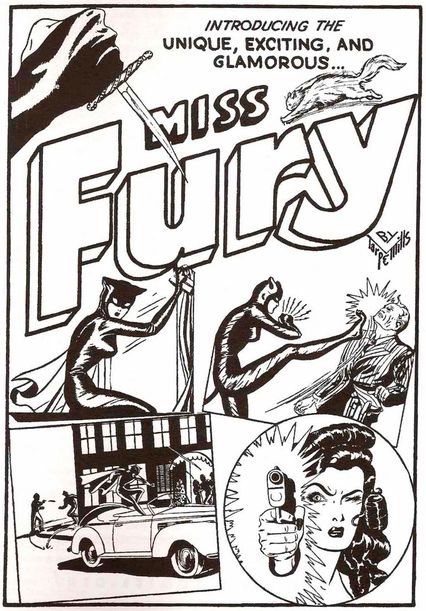
It all started because fashion illustrator and cartoonist June Mills broke her foot. While laid up, Mills doodled out ideas for an adventure comic strip with a heroine modeled on herself, who had a cat sidekick very much like her own pet Peri Purr. “Black Fury” debuted in the newspaper funnies pages on April 6, 1941, becoming the first female comics hero created by a woman and predating Wonder Woman’s (man-created) first appearance by several months. Our hero, Marla Drake, is a socialite turned nocturnal ass-kicker when she apprehends a gangster while en route to a costume party. Conveniently, she’s dressed in a catsuit that has since been ripped off by innumerable heroines and villainesses.
Worried that male readers would reject such a rock-em, sock-em action strip if they knew it was created by a woman, Mills hid her gender by using her middle name, Tarpé, as a pseudonym. She was outed soon enough, though, and it didn’t hurt the strip’s popularity one bit: It was even renamed “Miss Fury,” feminizing it even further. The page you see here is the introduction to Miss Fury’s comics series, which was a big hit for Timely — later known as Marvel — featuring new material and reprints. Mills brought her fashion skills to bear in dressing Drake and her femme fatale foes in the latest styles, a practice adopted by later teen comics, and Miss Fury herself received one of the highest accolades a ‘40s comics character could receive: she adorned the nose of many a WWII bomber.
All-Negro Comics No. 1 (1947)
Writer, penciler, and inker: John Terrell
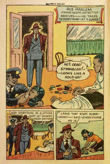
While the 1940s might have been the “Golden Age” in a number of readers’ views, it certainly was not a golden age in how comic books depicted African-Americans. Characters like the Spirit’s sidekick Ebony White and the Young Allies member Whitewash Jones were straight out of minstrel shows, with grotesquely large lips and other exaggerated features. This was the sort of thing that was on Orrin C. Evans’s mind when he lost his job in 1947. Evans had been working at the Philadelphia Record since the early 1930s, where he had made history by becoming the first African-American reporter to be on staff as a general reporter at a mainstream white-run newspaper. The outlet went out of business in 1947, following a strike, so Evans teamed up with a few of his Record co-workers to address what he felt was missing in the comic-book world: strong, positive depictions of African-Americans.
In June 1947, they launched All-Negro Comics No. 1, the first comic-book series written and drawn entirely by African-American creators. While each of the artists likely wrote their own strips, Evans oversaw the whole endeavor and made sure that all of the heroes be depicted non-stereotypically. Evans’ brother, George, drew the heroic Lion-Man, while John Terrell wrote the lead feature in the series, the stalwart African-American police detective, Ace Harlem. Sadly, when Evans went to produce a second issue, the company that sold him the paper for the first issue was no longer willing to sell to him — nor would any other paper company. He spent the rest of his life working in journalism. Nevertheless, All-Negro Comics tales like this one about Ace Harlem must be acknowledged as forerunners of black heroes like Black Panther and Luke Cage.
Young Romance No. 1 (1947)
Penciler: Jack Kirby; Inker: Joe Simon
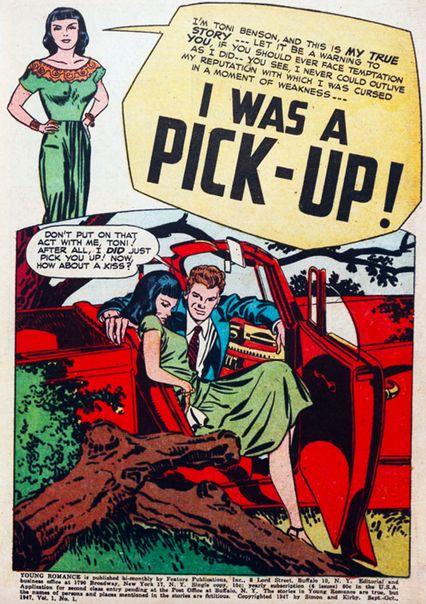
Today, Jack Kirby is known best as a superhero artist. Yet the most lucrative genre of Kirby’s career, from the late ‘40s through the mid-’50s, was romance. It gave Kirby and his business partner Joe Simon a life raft at a moment when superheroes were languishing and everything was up for grabs — a moment when comic-book sales were soaring but books about costumed derring-do were old hat. Romance comics, introduced by Simon and Kirby with this story in 1947, became more than a genre — they were a sensation. By the end of the ‘40s, romance grew to a reported one-quarter of the comic-book market. Romance enabled Simon and Kirby to buy houses in the suburbs, and for a decade kept Kirby busier than all the other genres he worked in combined. These comics, modeled on women’s true-confession pulps, offered something vital, and were part of a generation of comic books trying to age up and diversify their audience.
“Pick-Up” distills the genre’s conventions: confessional first-person narration, regrets for sinful recklessness that expose the narrator to risk and shame, and an opening splash that mixes moralism and prurience. The story is punchy and exhilarating. (Simon and Kirby so liked the protagonist that they brought her back for a sequel in issue No. 11.) Though endlessly mocked (see the arch Pop Art paintings by Roy Lichtenstein and other spoofs), the best of the romance comics, like Young Romance No. 1, dealt with not only ripe sensuality and thwarted desire but also issues of prejudice, class shame, and social identity, heightened and compressed into brief morality plays.
True Crime Comics No. 2 (1948)
Writer, penciler, and inker: Jack Cole
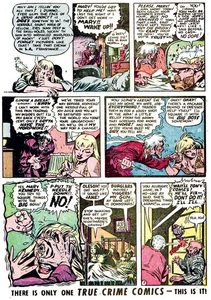
There is no darker chapter in comic-book history than the anti-comics craze kicked off by Seduction of the Innocent. It was a 1954 best seller written by psychiatrist Fredric Wertham, who argued that the (admittedly lurid) crime comics clogging the newsstands of America were the direct cause of a spike in juvenile crime. The book reprinted countless panels of mayhem and extremely male-gaze-y women. But nothing was more disturbing than a panel from this page of the story “Murder, Morphine and Me!” in which a woman is about to have a needle stuck in her eye by a crazed junkie. The injury-to-the-eye motif was one of the most harmful aspects of comics, Wertham wrote: “This detail … shows perhaps the true color of crime comics better than anything else. It has no counterpart in any other literature of the world, for children or adults.”
That last claim is a good example of Wertham’s shaky research (what about Un Chien Andalou? Or Oedipus Rex?) but fake news was as popular in 1954 as it is now. “Murder, Morphine and Me!” was by Jack Cole, best known for creating the goofy, lovable Plastic Man, but this time he created a daring, fever-dream melodrama. A teenage Art Spiegelman would discover the panel in a New York City library and fall in love with Cole’s work, but the wider damage was already done: Wertham was so persuasive that Senate hearings were held to determine if comics were merely evil or outright enemies of the state. Dozens of publishers went out of business and the onerous Comics Code was established. Cole, after becoming one of the original Playboy cartoonists, committed suicide in 1958, and he left a legacy of dynamic pencils and layouts that could delight as well as terrify.
It Rhymes With Lust (1950)
Writers: Arnold Drake and Leslie Waller (as Drake Waller); Penciler: Matt Baker; Inker: Ray Osrin
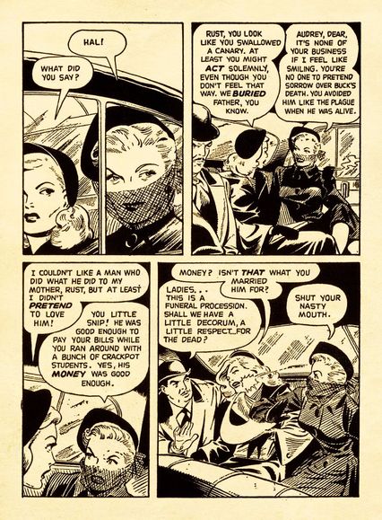
Arnold Drake is best known for co-creating the original Guardians of the Galaxy for Marvel and Doom Patrol and Deadman for DC, but in 1949 he was going to college thanks to the GI Bill and picking up extra cash writing comics scripts. It hadn’t been lost on him that comic books were his fellow soldiers’ favorite reading material overseas, and he hit on the idea of appealing to college-bound veterans like himself with more sophisticated fare — longer, more serious stories, aimed at adults. Basically, he had come up with the graphic novel as we know it today.
It Rhymes With Lust, co-written with Drake’s friend Leslie Waller, is a long romance comic, revolving around redheaded man-eater Rust Masson (whose first name rhymes with … see, now you get it). Rust masterminds Dallas-style shenanigans in fictitious Copper City, playing her myriad rivals and pawns off of each other and slapping around her goody-two-shoes stepdaughter. Three decades ahead of its time, this “picture novel” didn’t sell well enough to spawn many imitators, but nonetheless remains a significant milestone in American comics history.
Also noteworthy is the fact that this first graphic novel was drawn by Matt Baker, among the greatest of the Golden Age’s African-American artists. A sharp dresser — here he is with Lust publisher Archer St. John — and believed to be gay or bisexual, Baker was best known for depicting elegant, beautiful women, a skill on display here and in the title he was most associated with, Phantom Lady (antecedent of Watchmen’s Silk Spectre). A heart attack killed Baker when he was just 37, so who knows how far his star could have risen; but it’s important to recognize that creators of color and LGBTQ creators have been with comics since the earliest days.
“Marge’s Little Lulu” No. 38 (1951)
Writer: John Stanley; Pencilers: John Stanley and Irving Tripp; Inker: Tripp
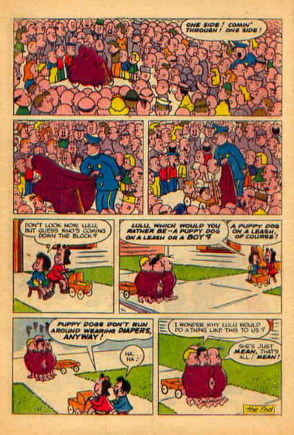
It’s hard to pick just one page to represent John Stanley’s oft-reprinted story “Five Little Babies,” starring a character ported over into comics from The Saturday Evening Post, Little Lulu. From the first panel, where the boys greet the arrival of rich brat Wilbur van Snobbe, to the very last, where the boys, chastened, can only marvel at Lulu’s revenge, a tale of vengeance, toxic masculinity, and female self-worth plays out with an inexorable pacing worthy of Sophocles or Cormac McCarthy. It helped that the story was also utterly hilarious. Lulu was the creation of Marjorie Henderson Buell, who drew single panels of the tomboy character for The Saturday Evening Post. However, when Stanley started crafting Lulu’s own comic book with inker Irving Tripp, the stories blossomed into biting, laugh-out-loud sitcoms, with Lulu a feminist hero for the ages.
The boys, led by Lulu’s frenemy Tubby, explicitly ban her from their world with a “No Girls Allowed” sign on their clubhouse, but again and again Lulu foils their plots using her superior smarts and insight, before returning to her defiantly girlish activities without a hint of inferiority. The subtext showed that by rejecting girls and women, the boys were cutting off an essential part of their own humanity. Although the Stanley/Tripp stories were favorites for kids — Trina Robbins and many other women of the 1970s underground comix scene, which we’ll get into later, were fans — his flawless pacing and storytelling was an avowed influence on a range of famous creators on this list, from R. Crumb to Daniel Clowes and beyond. One of our contributors, Heidi MacDonald, a former editor of kids’ comics for Disney and DC, is fond of saying that if a writer had a hard time telling a story in eight pages, she’d hand them a collection of Stanley stories. If they didn’t get it after that, they never would.
Two-Fisted Tales No. 25 (1951)
Writer, penciler, and inker: Harvey Kurtzman; Colorist: Marie Severin; Letterer: Ben Oda
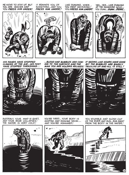
At the climax of “Corpse on the Imjin,” a tale of the Korean War, writer-artist Harvey Kurtzman delivers a page that combines formal rigor with brutal violence, as one man drowns another in Korea’s Imjin River. This often-studied page, frantic yet controlled, epitomizes Kurtzman’s gift for artful repetition. He used that gift dramatically in his war comics for EC, and humorously, with sudden, absurd gags to break up the rhythms, in his greatest gift to EC, the satirical Mad. Despite the stark difference between those two sides of his output, Kurtzman masterfully used page rhythms in both, making him one of comics’ chief formalists, as important to the comic book as Eisenstein was to cinema.
“Corpse” still packs a narrative punch. It reduces the genre of the war story to an elemental hand-to-hand fight between two unnamed soldiers, one American, one North Korean. The tale starts with the American musing about how remote and clinical warfare has become, but he is proven wrong when the North Korean, hungry and desperate, attacks. By the story’s pitiless logic, one man must kill the other. There is no glory in it, nor any patriotic affirmation of duty done; instead, the tale is poetically bleak and fatalistic, true to the Stephen Crane–like naturalism of Kurtzman’s best war stories. Remarkably, this harsh fable was published during the Korean War itself; this issue would have been released in about September or October of 1951, during a protracted and bloody stalemate in the War.
Many comics creators that came after emulated Kurtzman’s rhythmic control of page layout (see for instance our examples from Amazing Spider-Man No. 33 and Watchmen No. 1). Yet his thematic content also made waves: the underground comix generation, notably R. Crumb and Art Spiegelman, admired Kurtzman’s rough truthfulness and tragic humanism, even as they ate up the rude satire of Mad. But “Corpse” is arguably his masterpiece.
Four-Color Comics No. 386 (1952)
Writer and penciler: Carl Barks
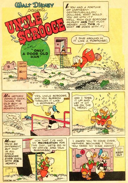
“Only a Poor Old Man” wasn’t Scrooge McDuck’s first appearance — he’d been a supporting character in comics starring his nephew, Donald Duck, for years — but it was the issue that nailed down McDuck’s most notable manifestation of rampaging capitalism: diving in to his huge pile of money. McDuck was the creation of Carl Barks, an immensely imaginative cartoonist whose young adulthood spent working in various 19th-century professions — including cowboy and mule driver — left him with an appreciation for adventure and a firsthand knowledge of greed and stupidity. After becoming an animator at Disney, Barks discovered his greatest talent was as a cartoonist, and for 24 years he chronicled the Duck family and the world of Duckburg with shrewd characterizations that played up the foibles of human nature. Scrooge evolved from a penny-pinching miser befitting his Dickensian name to a more comedic and occasionally even good-hearted uncle to that shiftless slacker, Donald.
Barks’s animation-inspired storytelling and expressively comedic characters had a seminal influence on all the massively successful “funny animal” comics to follow — and beyond: R. Crumb names him as a major influence. Barks’s take on Donald and Scrooge would inform both the original DuckTales cartoon and its revival. Scrooge’s OCD fetishizing of wealth — many a tale begins with an assault on his “money bin” by the nefarious Beagle Boys — remains a potent symbol of the power and danger of a duck-amuck economy. And “diving into the money bin” has become a part of the language: a real-life Disney promotion based on the phrase even toured to promote the new DuckTales animated series.
Mad No. 4 (1953)
Writer: Harvey Kurtzman; Penciler and inker: Wally Wood; Colorist: Marie Severin; Letterer: Ben Oda
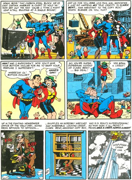
By 1953, Harvey Kurtzman and Wally Wood had been working for EC Comics for a few years, turning out serious war epics, thought-provoking science-fiction stories, and satirical (and gory) horror morality plays. When Mad debuted as a comic (it didn’t become a magazine until issue 24), it wasn’t setting the world on fire, sales wise. Then came issue No. 4 and “Superduperman.” The story, written with sharp wit and laid out by Kurtzman and featuring stunning art by Wood, became a instant hit, changing the fortunes of the comic. In the story, creepy assistant copy boy, Clark Bent, who is secretly Superduperman, lusts after Lois Pain, uses his X-ray vision to look into the ladies’ room, and is a generally pathetic figure. After a wild battle with Captain Marbles (who has become a villain), the triumphant Superduperman figures he can use his newfound glory to woo Lois. It doesn’t really work out.
The story turns the do-gooder superhero paradigm on its head by making both of the heroes into horrible people, which really hadn’t been done before. It also parodies the copyright-infringement lawsuit that the publishers of Superman, National, filed and won against the publishers of Captain Marvel a few years earlier. National threatened to file a lawsuit against EC Comics for the parody, but they never went through with it. Perhaps most notably, “Superduperman” was an avowed and massive influence on a decidedly unfunny comic: Alan Moore, Dave Gibbons, and John Higgins’s Watchmen, which extrapolated on Kurtzman and Wood’s comedic deconstruction of superheroic self-delusion and entitlement. Mad continues to this day, outlasting its many imitators and still making fun of everything.
Haunt of Fear No. 19 (1953)
Writer: Al Feldstein; Penciler and inker: Jack Davis; Colorist: Marie Severin; Letterer: Jim Wroten
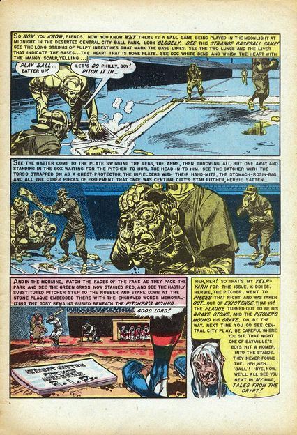
When Maxwell C. Gaines, founder of Educational Comics, died in a boating accident in 1947, his college-student son William M. Gaines inherited the company. Until that point, EC had put out wholesome, low-selling family fare like Picture Stories From the Bible. Max was reportedly abusive toward Bill, and in a bit of posthumous revenge, Bill took EC in a new direction with violent, irreverent titles like Tales from the Crypt, in which abusers get their comeuppance in spectacularly gory fashion. Many of the next few pages on our list prove that the newly rechristened Entertaining Comics wasn’t just one of the most successful publishers of the 1950s, it was also the most influential.
In “Foul Play!”, drawn by EC MVP Jack Davis, an evil baseball pitcher kills a rival player by sliding into him with poisoned cleats; the victim’s teammates get their revenge by dismembering him and playing a baseball game with his guts. Stephen King featured the story in his terrific survey of the horror genre, Danse Macabre, and infamous anti-comics crusader of the 1950s Dr. Fredric Wertham gave the page you see here a no less prominent, albeit less flattering, position in his best-selling Seduction of the Innocent. The success of Tales from the Crypt and its sister titles, Haunt of Fear and The Witch’s Cauldron, would inspire a wave of crappier, but equally as gory horror comics that would lead to anti-comics panic. (Not to mention much better things like Warren Publishing’s Eerie magazine and the King/George Romero collaboration Creepshow.)
We’d be remiss if we didn’t point out the coloring on this page by living legend Marie Severin, who started out at EC when she was just 20 years old. Note how Severin chooses to paint the goriest scenes in only two colors, to lessen the visceral shock while simultaneously allowing for all the gruesome details fans craved. For this reason Tales from the Crypt editor Al Feldstein called her “the conscience of EC.”
Impact No. 1 (1955)
Writers: Bill Gaines and Al Feldstein; Penciler and inker: Bernie Krigstein [as B. Krigstein]; Colorist: Marie Severin; Letterer: Jim Wroten
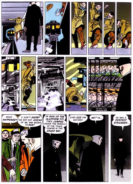
The page, powerful but perhaps unremarkable to the modern comics reader, may be the single most analyzed page in comics history. It had a strong influence on Art Spiegelman — who wrote about it for the New Yorker — and Frank Miller, who frequently mentions it in interviews. It’s the drawn work of Bernard Krigstein, a name nearly unknown to the average comics fan but revered among cartoonists from the ’50s on. Krigstein was an ambitious artist who, in 1955, found himself at EC Comics, when it was trying to reinvent itself as a more sophisticated publisher following the fateful establishment of the censorious Comics Code Authority in the wake of Fredric Wertham’s anti-comics campaign of the early 1950s. The story involves Reissman, a former concentration-camp guard, who sees one of his victims on a New York subway and falls to his death trying to escape him.
It wasn’t the bold story that made “Master Race” so revolutionary — although the Holocaust was only ten years in the past and rarely spoken of. It was how Krigstein told the tale, using repeated panels, fractured images and expressionist anatomy to capture Reissman’s panic and dark deeds, and to break down time into fragmented, strobe-light-esque instants. Although today these devices are established comics vocabulary, they were utterly revolutionary in their time and inspired countless artists who came after to experiment with their own storytelling. Or as Spiegelman put it in the New Yorker, “Krigstein began to vibrate with the inner language of comics, to understand that its essence lay in the ‘breakdowns,’ the box-to-box exposition that breaks moments of time down into spatial units.” Krigstein never drew another story with the impact of this one, but he didn’t need to.
Incredible Science Fiction No. 33 (1955)
Writer: Al Feldstein; Penciler and inker: Joe Orlando; Colorist: Marie Severin; Letterer: Jim Wroten
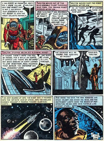
When the comic-book industry banded together to form the Comics Code Authority in September 1954, EC Comics publisher William Gaines believed that the new rules were effectually designed to hurt his company. They banned the words “crime”, “horror,” and “terror” in comic-book titles, which directly targeted histop-selling series — Crime SuspenStories, The Vault of Horror, and Tales From the Crypt. Gaines tried his best to keep EC Comics afloat post-Code, and EC Comics launched a “New Direction” in 1955, with a collection of new series that they hoped would not offend.
However, at the end of 1955, they ran afoul of the Comics Code in the production of Incredible Science Fiction No. 33. The Code opposed a new story in the issue, “An Eye for an Eye”, by Angelo Torres, as being too violent. So it was replaced with a reprint of a classic Weird Fantasy story. Titled “Judgment Day,” it depicted an astronaut representing the Galactic Republic visiting the robot planet Cybrinia to see if Cybrinia could be included in the Republic. He has to turn them down because blue robots were treated worse than orange robots for no reason. As he flies away in his ship, he takes his helmet off and we see that he is black. The Comics Code would not allow the story unless the astronaut was recolored to be white. Writer Al Feldstein was outraged and so was Gaines. They threatened a lawsuit. Eventually, the Code relented and the story was published as originally drawn. However, this was the clear sign that EC Comics could not work within the parameters set by the Code, so Gaines ceased his comic-book production, concentrating instead on his popular humor magazine, Mad, which skirted regulations because it was technically a magazine. EC are sometimes accused of being shock merchants, but this page reminds us that they were also idealists.
Martin Luther King and the Montgomery Story (1958)
Writers: Alfred Hassler and Benton Resnik; Penciler: Sy Barry; Letterer: John Duffy
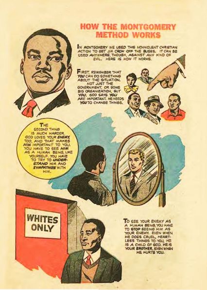
The Fellowship of Reconciliation was formed in England in early 1914 in a failed attempt to prevent the outbreak of World War I. The following year, they opened up their American branch of the organization and have been serving the public good ever since. In the 1950s, they were directly involved with Martin Luther King Jr. in the Montgomery Bus Boycott of 1955-56. It was while working with Dr. King that the Fellowship’s director of publications, Alfred Hassler, came up with a brainstorm. He pitched the idea of producing a comic book that could serve to spread the message of the boycott. Essentially, he wanted to create a guidebook for nonviolent protesting.
Hassler worked with Toby Press to produce the comic book. Legendary cartoonist Al Capp lent a few artists, including one named Sy Barry, from his studio to draw it. Dr. King gave his own feedback on the comic book as well. The published work was a 16-page publication called Martin Luther King and the Montgomery Story. It opened with a short biography of King’s life, then an “everyman” account of the Montgomery Bus Boycott, followed by a detailed guide to how to do a nonviolent protest like the bus boycotts. 375,000 copies were printed — 250,000 in English and 125,000 in Spanish — and they were distributed through African-American schools, churches, and civil-rights groups. The protesters who became known as the Greensboro Four, who helped to desegregate Woolworth’s in North Carolina by having protest sit-ins, specifically cited The Montgomery Story as the direct inspiration for their actions. The success of the comic led to countless other political groups using comic books to express their message to the masses. Recently, in honor of The Montgomery Story, Representative John Lewis used comics to tell his autobiography in the award-winning and best-selling graphic memoir series, March.
Archie’s Girls: Betty and Veronica No. 68 (1961)
Penciler: Dan DeCarlo; Inker: Rudy Lapick
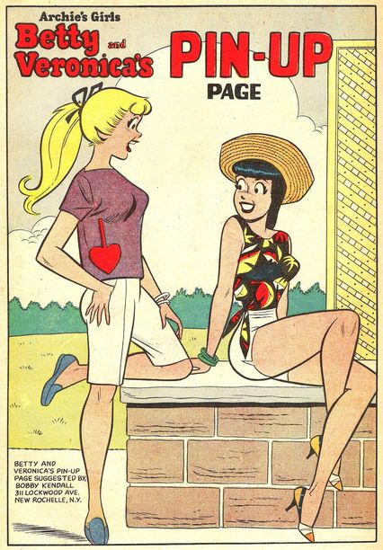
In 1941, MLJ Magazines launched a teen humor feature based on a popular series of films starring Mickey Rooney as an everyteen. Titled “Archie Andrews,” it was a smash success, MLJ was renamed Archie Comics Publications in 1946, and every other comic-book company soon launched their own rip-offs. After Stan Lee hired Dan DeCarlo to work on Timely’s teen humor comics in 1946, DeCarlo became the most renowned teen-humor artist in the industry, working on Millie the Model for over a decade. When comic sales took a drop in the late 1950s, DeCarlo began taking more freelance assignments for Archie. The only problem: He had to draw in the style of the original Archie artist, Bob Montana, which slowed DeCarlo’s output down. Around 1960, they successfully got him to commit to them full time by letting him draw in his own style.
This 1961 pinup from Betty and Veronica No. 68 sees DeCarlo using his unique style on Archie’s famous girlfriends, including his distinct ponytail hair style for Betty, which was, oddly enough, a big deal at the time. Soon, every other artist at Archie had to draw like DeCarlo. As time went on, his style became one of the most influential in comics history, given that it became the official “look” for Archie Comics for the next 50 years. Along the way, DeCarlo also created some of Archie’s most popular new characters, like Sabrina the Teenage Witch and Josie and the Pussycats.
Fantastic Four No. 1 (1961)
Writers: Stan Lee and Jack Kirby (it’s complicated); Penciler: Kirby; Inker: George Klein; Colorist: Stan Goldberg; Letterer: Artie Simek
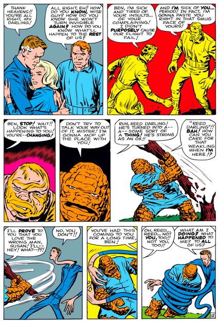
There is some confusion over why Martin Goodman was inspired to have Stan Lee bring back superheroes for the first time in nearly a decade to the comic-book company that was known as Atlas Comics at this point in time (was it really due to a National higher-up bragging about Justice League of America’s sales during a golf game with Goodman?) and there is even some dispute over who came up with the characters in the Fantastic Four. It was almost certainly through a collaboration between Stan Lee and Jack Kirby, but both men claimed it was their sole creation that they then brought to the other. (It did bear considerable resemblances to Kirby’s earlier work on DC’s Challengers of the Unknown). Either way, there is no doubt about why this story changed comics for good.
Even leaving aside the fact that the Fantastic Four gain their powers from stealing a rocket ship and then crashing it (it was the early 1960s, though, so at least they had a noble cause: beating the “Commies” to the stars), which was already an innovative superhero origin, the genius of Lee and Kirby’s Fantastic Four was clear as soon as they crashed, gained superpowers … and promptly began fighting with each other. These were superheroes who acted like actual people. They had genuine reactions to each other and their situation. This was the key to Marvel’s success in a nutshell: Real people, real problems, plus superpowers. Within a year or so, Lee and Kirby (as well as others, perhaps most notably Steve Ditko) were applying this formula to all their new heroes and the Marvel Age of Comics was born.
The Flash No. 123 (1961)
Writer: Gardner Fox; Penciler: Carmine Infantino; Inker: Murphy Anderson; Letterer: Gaspar Saladino
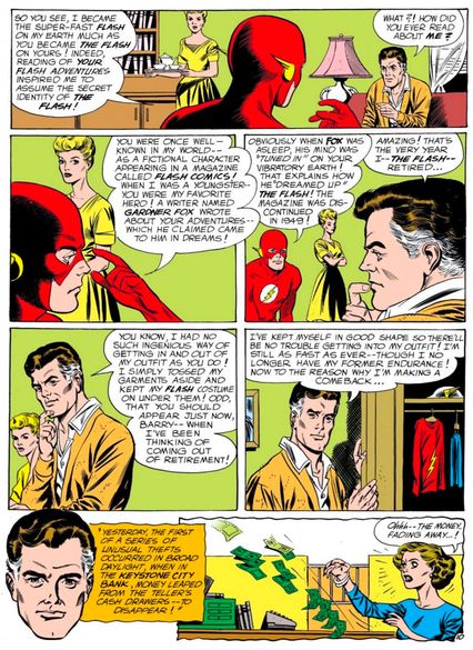
See the woman who’s wearing a dress the same color as her hair in the background of this Carmine Infantino–drawn page? One can only read her blank-faced silence as benumbed shock at the arcane exposition of superhero continuity being performed by two men in her living room. That guy on her right with the white temples, that’s Jay Garrick. He was the Flash in the ‘40s, see, during the Golden Age of comics, until his book got canceled. The guy on her left in the red hood, that’s Barry Allen. He became the Flash starting in 1956, and his creation begins what’s called the Silver Age of comics. As Barry says, he got the idea to call himself “the Flash” after gaining superspeed powers because he recalled reading comics about Jay’s adventures when he was a kid. So, in a way, Barry Allen is the first fan-turned-pro.
More notably, in this story, “The Flash of Two Worlds,” Barry learns Jay isn’t fictional. He’s very real, and his adventures happened in another dimension called “Earth-2.” It is this concept — that every superhero story you ever read actually happened, even the “fictional” ones — that makes this page so important. For better and for worse, this notion of “continuity” is what keeps fans coming back to superhero comics decade after decade. This was the very first of many, many long-winded continuity explanations in comics history.
All-American Men of War No. 89 (1962)
Writer: Robert Kanigher; Penciler and inker: Irv Novick
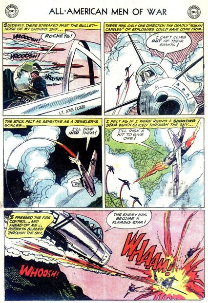
We selected this page for its final panel, which Roy Lichtenstein appropriated for one of his most famous Pop Art paintings, Whaam!, currently hanging in the Tate in Liverpool, England. As part of his process, Lichtenstein cut out this Irv Novick panel from All-American Men of War, projected it on a wall, traced the line art, then painted it through a screen to mimic the so-called “Benday dot” effect employed in this era of comics printing. Lichtenstein made millions from these and similar paintings, but the artists who did the original comics? Not so much.
The Pop Art movement occupies a strange place in comics history. On the one hand, it informed things like Adam West’s Batman TV show, which drove thousands of readers to the comics racks. On the other hand, it reinforced the (almost entirely American) stereotype that comics were dumb crap made by hacks for morons. Warhol made Campbell’s Soup into “fine art” like Lichtenstein made romance and war comics into “fine art,” implying that without their divine intervention, both would remain mass-produced, disposable junk. (If you want to see side-by-side comparisons of Lichtenstein’s paintings and the comics he stole them from, check out David Barsalou’s excellent Flickr page, “Deconstructing Roy Lichtenstein.”)
Amazing Fantasy No. 15 (1962)
Writers: Stan Lee and Steve Ditko (it’s also complicated); Penciler and inker: Ditko; Colorist: Andy Yanchus; Letterer: Artie Simek
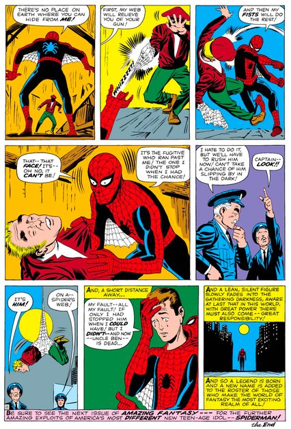
The lead feature in 1962’s Amazing Fantasy No. 15, crafted by writer/artist Steve Ditko and writer Stan Lee, is one of the most efficiently constructed origin stories in comic-book history — and yet, the final page is so powerful that it practically obscures the impact of what came before it. Since the launch of Fantastic Four No. 1 a year earlier, Lee and Jack Kirby had applied their “real people with superpowers” approach to two other heroes: a scientist whose anger transforms him into a monstrous Hulk, and a handicapped doctor whose cane transforms him into a literal god of thunder. Working with Ditko on Spider-Man, however, Lee advanced the idea to a gut-wrenching new level.
After nerdy Peter Parker gets bit by a radioactive spider, he not only doesn’t become a superhero like a standard Silver Age hero, but he specifically goes out of his way to not be a hero. He instead decides to use his powers to make money and become famous. This is all setup for the shocking ending, when a criminal whom Peter didn’t stop while at a TV appearance later murders his beloved Uncle Ben. Ditko’s depiction of Spider-Man discovering the identity of his uncle’s killer is one of the most striking panels of the era. Then comes the famous kicker: “With great power there must also come — great responsibility!” Later versions of that phrase would be shortened and often attributed to Uncle Ben, but whichever form it took, Spidey would live by this principle for his entire career.
Avengers No. 4 (1964)
Writers: Stan Lee and Jack Kirby; Penciler: Kirby; Inker: George Roussos; Colorist: Stan Goldberg; Letterer: Artie Simek
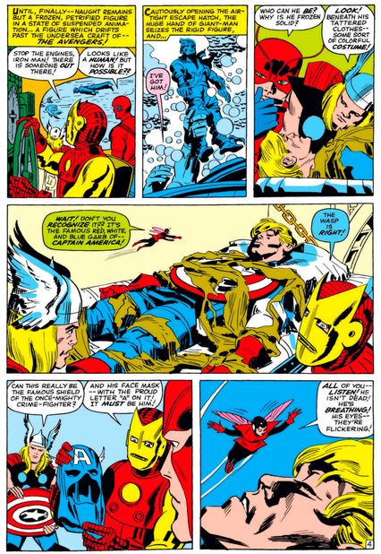
A mostly forgotten aspect of Marvel’s return to superhero comic books in the 1960s is that this was the second “return to superhero comics” that the company attempted after dropping their superhero line of books in the late 1940s. In the early 1950s, a superhero revival brought back their three major Golden Age superheroes: Captain America, the Human Torch, and Namor. The effort flopped, but that revival was on the mind of publisher Martin Goodman when he directed Stan Lee to start writing superheros again. Goodman’s instinct was to revive their earlier heroes, which led to the compromise of a new version of the Human Torch in the Fantastic Four. Then, once Fantastic Four proved to be a success, Fantastic Four No. 4 brought Namor back into fold. However, perhaps due to Captain America being so associated with the Golden Age, they held back on reviving him too.
But two years after Fantastic Four’s debut, Captain America returned in Avengers No. 4, firmly connecting Marvel’s past with its present. The Avengers discovered Captain America had been in suspended animation for two decades. In a stunning artistic sequence from penciler Jack Kirby and inker George Roussos, Captain America wakes up, realizes his partner Bucky is dead, sees he is surrounded by strangers, but then quickly gathers himself. That’s how awesome Captain America is — it took him mere seconds to adjust to one of the most shocking experiences imaginable. Bucky had actually been a regular feature in Captain America’s post–World War II comics (plus the abandoned 1950s revival), so the reveal that he had actually died back in World War II was the first major piece of retroactive continuity — known more commonly as a “retcon” — that Marvel unveiled, inspiring decades of similar continuity tweaks.
Strange Tales No. 138 (1965)
Writers: Stan Lee and Steve Ditko; Penciler and inker: Ditko; Letterer: Sam Rosen
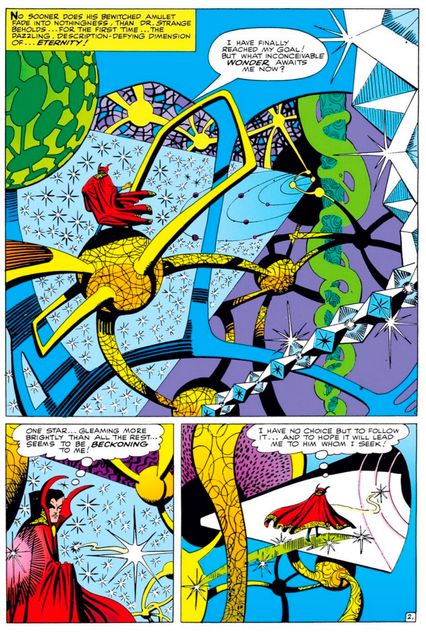
By Marvel Comics’ glory period in the mid-’60s, Stan Lee’s lifelong penchant for spotlight-hogging had thoroughly alienated his two main artistic collaborators, Jack Kirby and Steve Ditko. By late 1965, Ditko had kicked Lee off co-plotting duties for the series they co-created, The Amazing Spider-Man, meaning Lee only added his distinctive dialogue flourishes after the comics pages themselves had already been completed. Ditko had also stopped consulting Lee on the other series he created for Marvel, “Doctor Strange” in Strange Tales, with no “co-” credit required here: Lee himself has admitted that Stephen Strange was Ditko’s sole creation.
While Ditko seemed to lose interest in Spidey at the end of his run, his love of Doctor Strange just got stronger, climaxing in an epic serialized battle between the Master of the Mystic Arts and his two main adversaries, Baron Mordo and the Dread Dormammu. The fight took place in a string of cliff-hanger tales for over a year, from No. 130 to No. 146, the first true continuous modern “story arc” as we know it. On this page, a highlight of the tale, Strange makes his way to the embodiment of the cosmos, Eternity, across one of the gonzo trans-dimensional vistas Ditko was known for concocting. These mind-blowing not-landscapes were a huge influence not just on cosmic comics, but on the whole ‘60s counterculture: Later this same year the first major psychedelic concert would be held in San Francisco, and it’d be called “A Tribute to Doctor Strange.”
The Amazing Spider-Man No. 33 (1965)
Writers: Stan Lee and Steve Ditko; Penciler and inker: Ditko; Letterer: Artie Simek
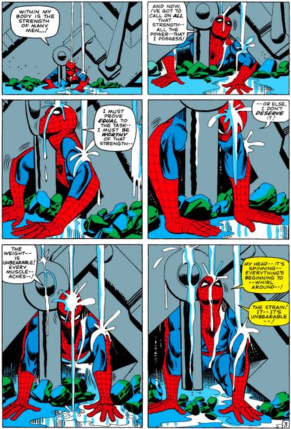
Superheroes perform amazing feats of strength, speed, and skill seven times before breakfast. What makes this one of the most influential sequences in comics is that it depicts a superhero unable to do something, and struggling against his own failure — and how plotter/artist Steve Ditko makes several panels of a guy trapped under a pile of wreckage into incredible, moving reading.
In the previous issue, Spidey’s archnemesis Doctor Octopus dumped a whole bunch of machinery on top of him as water began flooding the villain’s underwater lair. To add to the tension, said lair also contains a McGuffin — er, a rare isotope that will save the life of Peter Parker’s Aunt May. Even though our rational minds may tell us, There’s no way they’re gonna kill off Spider-Man in the first five pages of a comic, Ditko’s storytelling skill is such that, emotionally, the tension and stakes have been raised so high that, for a second, you think that maybe the hero won’t come out on top this time. That’s why this is one of the most referenced and consulted sequences in superhero history, even making its way into the climax of the film Spider-Man: Homecoming.
Fantastic Four No. 51 (1966)
Writer: Stan Lee and Jack Kirby; Penciler: Kirby; Inker: Joe Sinnott; Colorist: Stan Goldberg; Letterer: Artie Simek
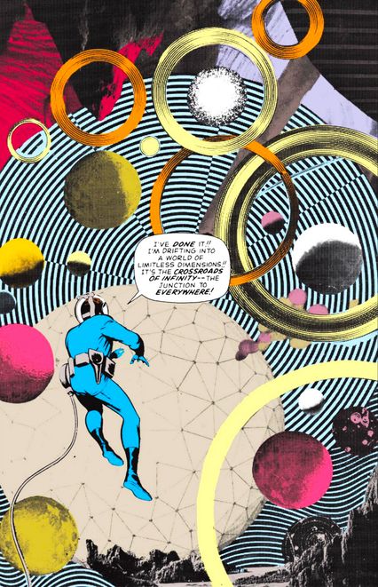
Super-scientist Reed Richards discovers what will come to be known as the Negative Zone, an other-dimensional realm rendered in photo-collage and delirious abstraction. This pure exercise of Jack Kirby’s visual imagination is not the first photo-collage to appear in Fantastic Four, but marks the first time that Kirby used a full page to depict a hero’s passage between worlds. Fantastic Four No. 51 thus establishes an ecstatic new phase in Kirby’s art. Reportedly, he conceived of the Negative Zone as a setting to be rendered entirely in collage, and although that idea proved too impractical, this issue and this page would unlock many future examples of Kirby’s sublime otherworldliness.
In the mid-’60s, Kirby introduced complex plots — emphatically scripted by editor Stan Lee — and a bevy of long-lasting figures, many of them in Fantastic Four. If his early-’60s art had suffered for his massive workload, by 1965 he was concentrating on fewer books and tighter, more lavish and detailed pencils: the quintessence of his mature style. At the same time, he was pushing his art into areas where even his drawing could not go. This seminal page not only proved a watershed for Marvel continuity by introducing the oft-used Negative Zone, but also by suggesting a kinship between Kirby and fine-art collage in Surrealism and Pop Art. Further, it anticipates the mixed-media work of such later comics artists on this list, such as Jim Steranko, Bill Sienkiewicz, and Dave McKean.
Fantastic Four No. 52 (1966)
Writers: Stan Lee and Jack Kirby; Penciler: Kirby; Inker: Joe Sinnott; Colorist: Stan Goldberg; Letterer: Sam Rosen
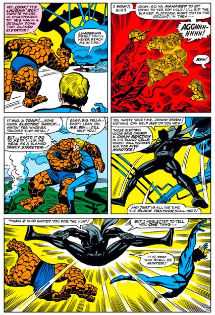
As Marvel grew in popularity in the mid-’60s, Stan Lee and Jack Kirby began to use the newfound fame of their comic-book series to address the societal issues of the era. When he reflected on the creation of the Black Panther, Kirby noted, “It suddenly dawned on me — believe me, it was for human reasons — I suddenly discovered nobody was doing blacks. And here I am a leading cartoonist and I wasn’t doing a black.” Kirby began developing a new black superhero (the first black superhero since All-Negro Comics No. 1’s Lion-Man) for Marvel, with the initial intent that the character would have his own new series. Marvel’s then-restrictive distribution system, which limited how many ongoing series they could release, forced Black Panther out of his own series and into the pages of Fantastic Four No. 52.
Originally, Kirby designed Black Panther’s costume with a cowled mask, a la Batman, but publisher Martin Goodman reportedly feared that Marvel might have a hard time seeing their comics distributed in the Southern United States with an openly black character on the cover, so they gave Panther a full face mask. The moniker was unrelated to the political party of the same name, which had yet to officially form (the name had already been in use in African-American political circles, so Kirby and Lee did not coin it). What was especially notable about the introduction of Marvel’s first black superhero is that we meet him as he single-handedly defeats the entire Fantastic Four as part of an elaborate test of his skills. They did not simply want to introduce a new black superhero; it was important to make him stand out from the crowd. The success of the Black Panther paved the way for all other black superheroes who followed, as well as for the astounding success of his feature-film adaptation.
The Amazing Spider-Man No. 50 (1967)
Writer: Stan Lee and John Romita; Penciler: John Romita; Inker: Mike Esposito; Colorist: Stan Goldberg; Letterer: Sam Rosen
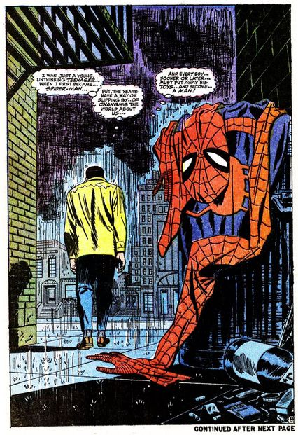
After working on his co-creation for almost four years, Steve Ditko ultimately had enough with Marvel Comics and decided to leave the company. Marvel had a pretty good idea that Ditko was ready to leave, so writer/editor Stan Lee had Spider-Man guest star in an issue of Daredevil to see how that series’s artist, John Romita, could handle the character. Romita must have passed muster, as he moved over to take over Amazing Spider-Man from the departing Ditko with issue No. 39.
Initially, Romita drew the book in Ditko’s style. You could barely tell that Ditko was gone. As it became clear that Dikto wasn’t coming back, Romita slowly began to take over the approach of the book. He rounded off some of Ditko’s edgier qualities and made Spider-Man (and especially Peter Parker) a good deal more accessible to a mainstream audience. One of the ways that Romita put his stamp on the title early on was visible in Amazing Spider-Man No. 50, when Romita and Lee shocked readers by having Peter Parker quit his superhero-ing. (He got over it, don’t worry.) As Spider-Man’s popularity increased, public came to identify with Romita’s version of the character rather than Ditko’s. Romita’s Spider-Man remained the version used on all licensed material for the next two-plus decades, although his direct involvement with the series itself scaled back once he became Marvel’s art director in 1973. In subsequent years, the notion of Spidey hanging up the tights has become just about as commonplace as lectures about great power and great responsibility, but Lee and Romita did it best.
Zap Comix No. 1 (1968)
Writer, penciler, inker, and letterer: Robert Crumb
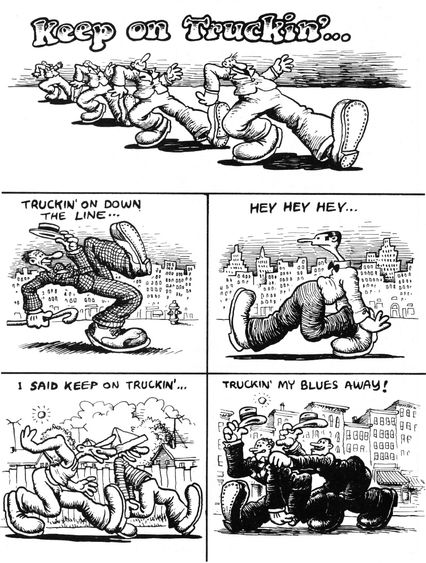
Robert Crumb grew up in the 1950s as a fan both of Dell’s Disney output and Harvey Kurtzman’s satire comics. His older brother made him draw their own Dell-style comics, forcing him to develop cartooning skills that served him well after high school, when he got a job as a staff artist at the American Greetings card company in Cleveland. Nevertheless, when the opportunity arose for him to go to New York and work for Kurtzman at one of his post-Mad comedy magazines, Crumb leapt at the chance, only to arrive and find that that magazine, Help!, had folded. Broke and stuck in New York, Crumb began dropping LSD, still legal then and prescribed to his then-wife by her psychiatrist. Psychedelic drugs twisted the cartoon images instilled in his brain since childhood into new and exotic forms. Crumb would say that it was during this “fuzzy period” that he created all the characters that would later make him famous: Mr. Natural, Flaky Foont, Angelfood McSpade, and this strip, “Keep on Truckin’.”
After relocating to San Francisco, Crumb and his wife would sell his Zap Comix on the sidewalk out of their baby carriage, and the uncensored rawness of Crumb’s acid-fueled strips single-handedly started the underground movement. The nonsensically optimistic “Keep on Truckin’” became something of a heraldry crest for the easy-going hippies, appearing on all manner of merchandise for which Crumb never saw a dime. Crumb would later claim to hate being a counterculture icon: “I got too much love,” he has said. He pushed back by plumbing the depths of his id for a series of misogynistic and racist strips to alienate his allegedly progressive audience, rendering “Keep on Truckin’” uncharacteristically quaint by comparison.
Strange Tales No. 167 (1968)
Writer, penciler, and colorist: Jim Steranko; Inker: Joe Sinnott; Letterer: Sam Rosen
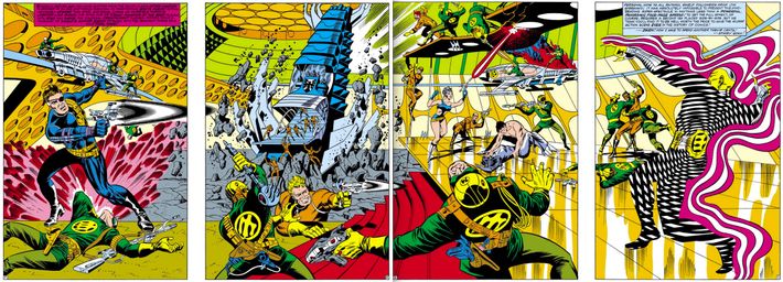
While Marvel Comics did not necessarily have a “house style” in the ‘60s like, say, Dan DeCarlo’s Archie Comics, they clearly were driven by the superhero stylings of Jack Kirby. Kirby was the man who launched most of Marvel’s titles; when Kirby left a series, they would have him provide layouts for the incoming artist, so that the new artist could more easily follow his style. This worked out well for Marvel because Kirby was just that good, but at the same time, if you don’t give artists room to grow, there is a danger of stagnation. That was never something Marvel had to worry about, though, with Jim Steranko.
A former professional escape artist (no, seriously), Steranko was the rare penciler who showed up at the Marvel offices with a portfolio and wasn’t just hired, but was given a regular feature immediately. Steranko took over the Nick Fury feature in Strange Tales from Jack Kirby. As was general company policy, Kirby provided layouts for Steranko’s first issue. However, Steranko soon took off in his own direction: He merged comic-book art with Pop Art, the psychedelic with the surreal. Perhaps the best example of Steranko’s flair for the different was on his revolutionary four-page image in Strange Tales No. 167 — a spread that would require you to buy multiple copies of the book for you to see the full thing. Marvel editor Roy Thomas said it best: “I think Jim’s legacy to Marvel was demonstrating that there were ways in which the Kirby style could be mutated, and many artists went off increasingly in their own directions after that.”
Green Lantern No. 76 (1970)
Writer: Denny O’Neil; Penciler and inker: Neal Adams; Colorist: Cornelia Adams; Letterer: John Costanza
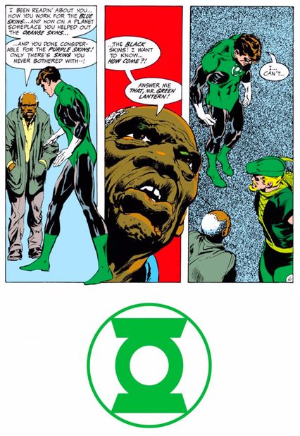
As often happens, a major innovation arrived in something that was on its last legs and thus had nothing to lose. When writer Denny O’Neil and artist Neal Adams took over Green Lantern, it was on the verge of cancellation, so editor Julius Schwartz gave them the go-ahead for a story line wherein space hero Hal Jordan decides his powers could be put to better use helping the downtrodden people of Earth. He teams up with newly woke archer Green Arrow, who introduces his fellow Justice Leaguer to an old man on a ghetto rooftop who delivers this famous speech. The emerald duo then embarked on a series of social-issue-of-the-month adventures, tackling various ills like overpopulation, drug addiction, and pollution the only way superheroes have known how since Action Comics No. 1: by punching them in the face.
Their efforts seem a little cringeworthy today, like your dad trying to be cool while wielding an extraterrestrial ring of power; indeed, the ultraestablishment New York Times featured this rooftop scene in a typically condescending survey of superhero wokeness. The Arrow-co-starring run on Green Lantern wound up not selling very well, but was hugely influential among creators young enough to be hippies themselves and ushered in a new generation of socially aware heroics. (By the way, if you’re wondering why it’s just two-thirds of a page: This was back in the days when DC would run ads on some story pages where that Green Lantern symbol is now.)
It Ain’t Me Babe Comix No. 1 (1970)
Writer, penciler, inker, and letterer: Meredith Kurtzman
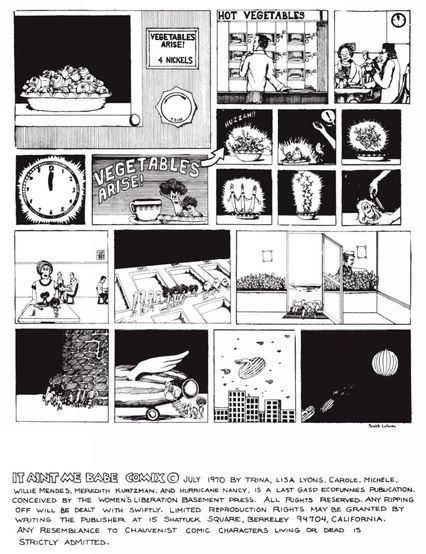
A perfect confluence of events made the underground comix movement financially viable. Post-adolescents had been turned back onto comics in the ’60s thanks in no small part to the Marvel revolution, and as they grew older, they hungered for even more edgy fare. Simultaneously, the counterculture movement inspired a big boom in “head shops,” stores that sold cannabis paraphernalia to the counterculture crowd (mostly in New York City, Los Angeles, and San Francisco). These stores were always looking for new things to sell that appealed to their regular clients and since comics were “cool” again, head shops began to sell work like R. Crumb’s aforementioned Zap Comix. It was a great time to be in the underground … if you were a man, that is.
The underground comix business model was built on group efforts. A fellow decides to put out a new comic and he asks Friends A, B, and C to work on it. The issue was that it was only guys asking other guys. The handful of female underground creators, like Trina Robbins and Barbara “Willy” Mendes, would never be invited to participate in these comix and were stuck having to pitch to underground newspapers. Robbins and Mendes decided that their only way of breaking into underground comix was by forming their own female-only group effort. Robbins had been doing comics for the feminist newspaper It Ain’t Me Babe, so she used that name for their one-shot comic, featuring a cover with famous female comic characters raising their fists in solidarity with women’s liberation. The book was a major success, selling 40,000 copies over three printings, proving that there was a market for female-created and female-driven underground comix. This particular page features a clever women’s-liberation allegory comic (made by Harvey Kurtzman’s daughter, Meredith), but the real action is in the all-female credits at the bottom.
The New Gods No. 7 (1972)
Writer, penciler, and colorist: Jack Kirby; Inker and letterer: Mike Royer
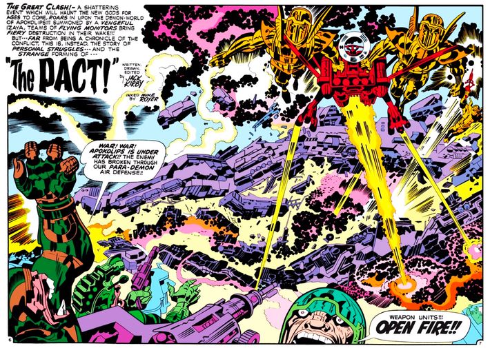
In the early ‘70s, Kirby decamped to rival publisher DC, where he turned costumed heroics into a personal mythos that exceeded even his wild flights at Marvel. His so-called Fourth World saga, a cluster of four interwoven titles, and in particular New Gods, brought a Biblical sense of scale to the genre. New Gods envisioned two warring worlds: New Genesis, led by the saintly Highfather Izaya, and Apokolips, ruled by the stony nightmare known as Darkseid, a despot whose goal was control of everyone and everything — “Anti-Life,” as Kirby put it, the quintessence of fascism.
“The Pact,” a chapter withheld until a year into the New Gods series, tells an origin for its patriarchal succession myth: In a failed bid for peace, the ferocious Orion, son of Darkseid, is traded to New Genesis in return for Scott Free, son of Izaya, who is sent to Apokolips. Orion, warlike, tormented, is the linchpin of New Gods; raised in New Genesis, he will fight the evil of Apokolips. Scott, also damaged, will weather the hell of growing up on Apokolips and become the hero of New Gods’ sibling title, Mister Miracle. But more than anything, “The Pact” is a war story and a parable about how violent conflict poisons all sides. When his partner Avia is murdered, Izaya vengefully wreaks warfare and destruction on Apokolips, until he realizes that he has succumbed to “Darkseid’s way.” This is a spread near the start, in which Kirby pushes his violent graphic mannerisms as far as they will go: crowded, multiplane depths and drastic foreshortening; bold cropping of figures; and the dot-based, fizzing rendition of energy (so-called Kirby Krackle). It’s a riot of Kirbyism, implying his own memories of shelling, strafing, and battlefield terror in World War II. Superheroes ever since, on page and screen, have sought to inhabit this same outsize sense of grandeur and threat.
Binky Brown Meets the Holy Virgin Mary (1972)
Writer, penciler, inker, and letterer: Justin Green
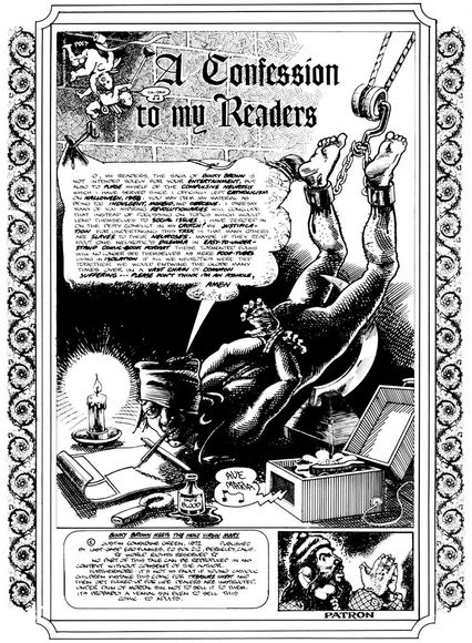
At once sacrilegious, comic, and scary, this introductory page by cartoonist Justin Green imagines the work of making his autobiographical comic, Binky Brown Meets the Holy Virgin Mary, as an act of penance and a form of torture. As if aware that there has never been a comic book quite like this, Green asks the reader’s indulgence from the outset, even as he mocks his own suffering. The threat of castration — so apt for a book about sexual guilt — hovers over Green as he seeks to explain, or excuse, this story about adolescence, religious mania, and what Green has since recognized as his OCD. Young Binky (Green’s stand-in), raised up in a hygienic postwar America that seethes with repressed weirdness and anxiety, comes to believe that his sexual fantasies are radiating outward from his body as invisible rays that threaten to strike representations of the Blessed Virgin Mary. From there, Binky Brown depicts a full-on plunge into hyperscrupulous overcompensation and self-torment, as filtered through an unsettled visual imagination.
Based on its topic, you might think that this pioneering confessional comic would be a drag. It’s anything but. Binky is at once shameful and shameless, appalling and thrilling, embarrassing, excruciating, and hilarious. It’s genuinely funny, but the laughter comes shrink-wrapped with guilt, because this is a true and terrifying story. “NSFW” does not begin to cover it; sensitive readers may cringe. Reading Binky means getting inside Green’s head, where religious iconography, phallic symbolism, and satiric riffs on both high and low culture are incised with a stunning technique worthy of Albrecht Dürer. It’s outrageous, sure, but it’s also a gutsy, harrowing work of art. The confessional vein of underground and alternative autobiographical comics begins here. Without Binky, Art Spiegelman has said, there would be no Maus — and other autobio trailblazers, including Aline Kominsky and R. Crumb, have declared their debt as well. Binky, wellspring of one of the key genres in 21st-century comics, is a scabrous and irreverent masterpiece.
Wimmen’s Comix No. 1 (1972)
Writer, penciler, inker, and letterer: Trina Robbins (as Trina)
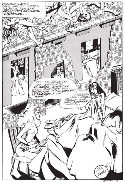
Following the success of It Ain’t Me Babe Comix, artist Patricia Moodian was able to convince Ron Turner (of Last Gasp comics, who published the comic book), to do a follow-up ongoing series that followed in that same women’s-liberation theme. Moodian was the original editor (she insisted that different women would edit every issue going forward), a job she achieved, she later recalled, “simply because I took the initiative to do the work it took to get a publisher and gather together the women who would be interested in such an opportunity.” Moodian collected an initial group of ten female creators in total — including Trina Robbins, Aline Kominsky, Michele Brand, and Diane Noomin — and they created Wimmen’s Comix No. 1, an anthology that gave female creators a wide berth to try whatever type of subject matter (or genre) that they wanted to tell.
That said, most of the stories tended to tell stories concerning feminist issues of the day. For her contribution to the first issue, Robbins wrote “Sandy Comes Out,” about her former roommate, Sandy Crumb Pahls, who gave Robbins her blessing to write about her experience. That the first non-pornographic comic-book story about an out lesbian character was written by a heterosexual woman caused some controversy at the time, but as Robbins later noted, it inspired one critic, artist Mary Wings, to create her own comic, Come Out Comix. Wimmen’s Comix intentionally sought out new creators, thereby publishing some of the earliest works by a number of new comic-book creators. The series was very influential on the next generation of progressive artists, like Phoebe Gloeckner (who had one of her earliest works in an issue of Wimmen’s Comix), Alison Bechdel, and Howard Cruse, who based his editorial approach for the radical queer series Gay Comix on Wimmen’s Comix.
Air Pirates Funnies No. 1 (1972)
Writer, penciler, inker, and letterer: Bobby London
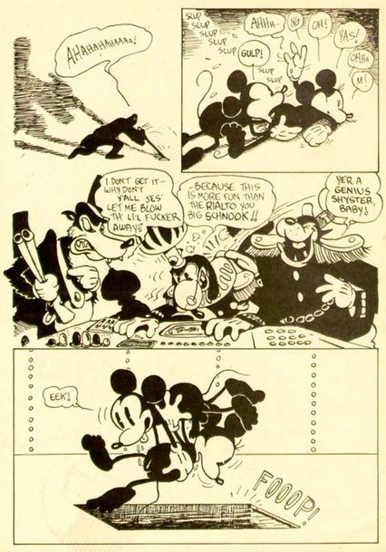
Without permission from the fine folks at the Walt Disney Company, founder Dan O’Neill, Bobby London, and their fellow troublemakers in the Air Pirates underground cartoonists’ collective just decided to put out their own Mickey Mouse comics, albeit ones in which Mickey and pals cursed, jerked off, smuggled drugs, and orally pleasured their partners, as you see here with Mickey performing cunnilingus on Minnie. Whether this was all part of a dubious scheme to seize the copyright of the characters or just to poke the eye of an ultraestablishment entertainment conglomerate is a little unclear — and we’ll venture to say it was a little unclear to the Air Pirates at the time too.
So unclear, in fact, that the Walt Disney Company didn’t even notice these bootleg comics existed until the Air Pirates arranged to have them delivered to a company board meeting. The ensuing lawsuit may have been the whole point, as part of O’Neill’s defense was that the Disney company had drilled its trademarks into his brain as a child, and so it was a little hypocritical of them to complain about his trying to artistically make sense of them now as an adult. O’Neill’s philosophical and ethical case was somewhat undermined by the fact that he showed up to his first court hearing dressed as an Old West gunslinger with bananas in his gun holsters, but it is the cross to bear of all true revolutionaries to be misunderstood. Disney won the battle in court, but they lost the war: The Air Pirates’ defiance in the face of law, logic, and good taste has been an inspiration to anti-corporate crusaders ever since.
Wimmen’s Comix No. 2 (1972)
Writer, penciler, inker, and letterer: Aline Kominsky
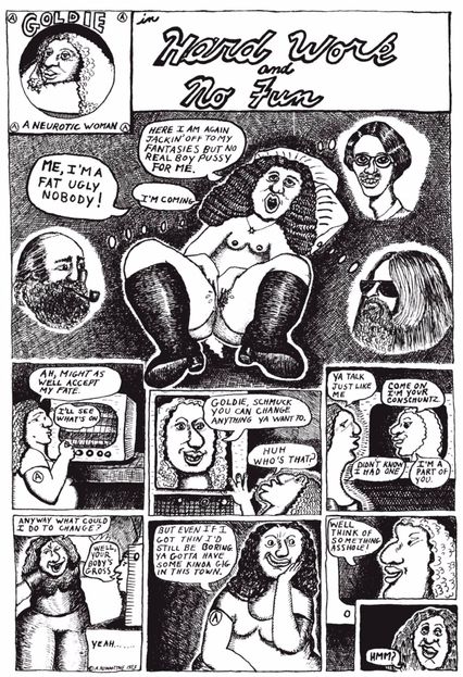
The great Aline Kominsky made her debut with “Goldie, A Neurotic Woman,” a series that ran in the first, second, and fourth issues of the trailblazing feminist anthology Wimmen’s Comix. The Goldie comics introduced Kominsky’s fearless mode of confessional-comic abjection: a self-lacerating and grotesque autobiographical humor partly inspired by Justin Green (see the Binky Brown page above), yet uniquely her own. Kominsky’s style and themes reportedly put off even some members of the Wimmen’s collective, leading Kominsky to depart for work in other venues. Her friend and collaborator Diane Noomin, looking back in 2016, explained to The Comics Journal that they both “felt drawn to comics that were satirical, ironic, self-deprecating, and personal,” and believed that this approach was anathema to the “idealized feminism” that they saw as epitomized by It Aint Me Babe Comix and Wimmen’s co-founder Trina Robbins. (This famous schism at Wimmen’s Comix is one of the defining moments in the history of feminist cartooning.)
Kominsky quickly seized the power of first-person cartooning, and her scratchily drawn horror vacui style demonstrated the potential of comics rendered in defiance of narrow standards of illustrative slickness. Underground comix had their share of slickness, sure, but they also helped broaden the range of acceptable styles into the comix brut. Kominsky, along with Rory Hayes, became one of the underground’s most engaging primitivists — but make no mistake: Unlike Hayes, Kominsky had studied painting and art history, and knew what she was doing. The work may seem to advertise the artist’s self-loathing, and, yes, some of the disclosures in Kominsky’s work are harrowing. Yet the bracing assertiveness of Kominsky’s drawn body, in all its rough plasticity and comic excess, makes her best work a triumph of satiric feminism. Its influence percolates from Dori Seda to Phoebe Gloeckner to Diana DiMassa, alternative comix by women that testify to what Kominsky made possible.
The Amazing Spider-Man No. 121 (1973)
Writers: Gerry Conway and Gil Kane; Penciler: Kane; Inkers: John Romita and Tony Mortellaro; Colorist: David Hunt; Letterer: Artie Simek
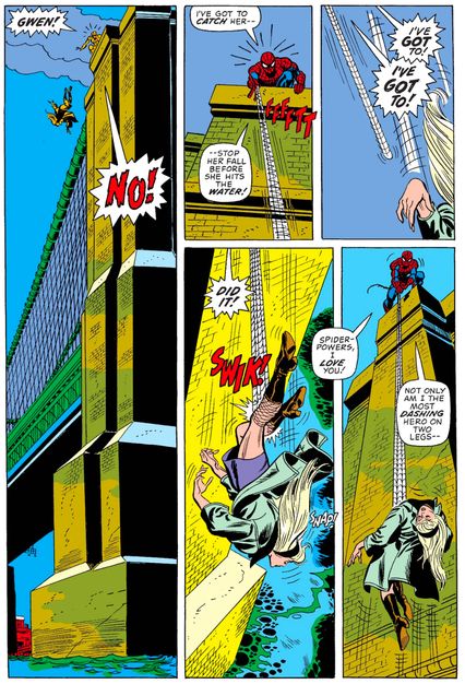
In 1972, after serving as Marvel Comics’ editor-in-chief since 1941 (except for a brief period when he served in World War II), Stan Lee was finally promoted to publisher of the company. With his promotion, Lee, who had already scaled back his comic-book writing, officially dropped his last two series, the two that meant the most to him: Fantastic Four and Amazing Spider-Man. Since Lee had already been cutting back, Marvel had gone through an influx of new, mostly very young writing talent. One of these writers, Gerry Conway, was named the successor to Lee on Amazing Spider-Man when he was just 19 years old.
Lee’s former Spider-Man collaborator, John Romita, still on the series as the inker for penciler Gil Kane, felt that they should do something major to shake things up with Lee’s departure. Conway, Thomas, and Romita are said to have had the idea to kill off a major character: Romita initially wanted Aunt May, but Conway was not a fan of Peter’s girlfriend of the time, Gwen Stacy (he felt that she and Peter were too “perfect” together), and suggested that they kill Gwen off instead. In the fateful issue, the Green Goblin throws Gwen off of a bridge and Spider-Man catches her with his webbing — but in the process, her neck snaps. Conway specifically added the sickening “snap” sound effect himself. Gwen Stacy was by far the most famous character killed off in a superhero comic at this point and fans were outraged: Stan Lee was so irritated at the fan outcry that he insist that Conway bring her back. So Conway introduced a clone of Gwen, leading to the first of many Spider-Man clone sagas. Spider-Man’s guilt over Gwen’ s death haunted him for years and many historians view this gruesome moment as the spiritual finale of comics’ Silver Age.
Howard the Duck No. 1 (1975)
Writer: Steve Gerber and Frank Brunner; Penciler and colorist: Brunner; Inker: Steve Leialoha; Letterer: John Costanza
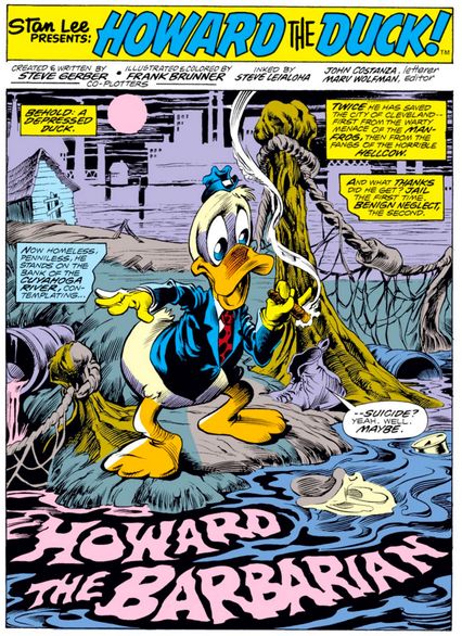
If Lee and Kirby had created the “heroes with problems” genre in the ‘60s, by the ’70s, it was left to comics writers like Steve Gerber to go one step further and create characters with depression and suicidal thoughts. Thus, the first issue of Howard the Duck opens with a talking duck contemplating suicide by jumping into the Cuyahoga River. Gerber was one of a new breed of comics writers who excelled at emotionally charged stories dealing with abuse, identity, and low self-esteem disguised as superhero or horror comics. Howard had originally appeared as an unlikely supporting character in Gerber’s acclaimed run on the horror comic Man-Thing, and when Marvel decided to create a spinoff starring the sarcastic talking duck, it was just right for the zeitgeist. Howard’s bitter and morose take on life provided an adult outlook entirely reflective of the grim post-Watergate era, even as he fought such bizarre and memorable foes as the bell-headed Doctor Bong and the Kidney Lady.
Howard went on to star in a newspaper strip and an ill-fated film adaptation that contained the first hints that George Lucas wasn’t always the world’s greatest filmmaker. Gerber eventually clashed with Marvel and got fired, leading to Howard’s most lasting impact: Gerber sued for copyright of the character he had created, and a benefit comic for his legal battles, called Destroyer Duck, was drawn by Jack Kirby. Although Gerber’s suit was ultimately unsuccessful, it helped rally awareness of creators’ rights and eventually led to more publishers allowing creators to own their work, a development that has led to comics’ present-day creative renaissance.
American Splendor No. 2 (1976)
Writer: Harvey Pekar; Penciler and inker, and letterer: Robert Crumb
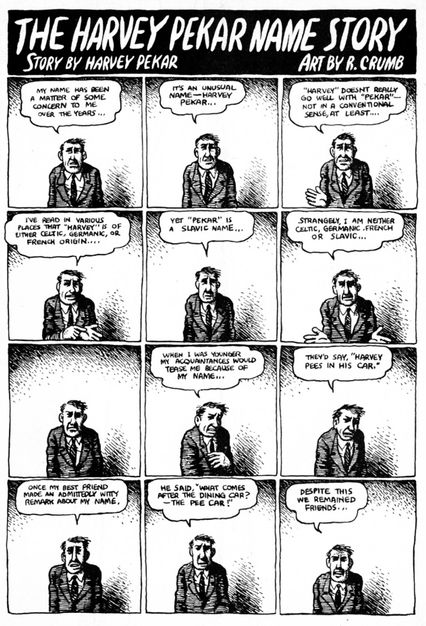
“It’s an unusual name — Harvey Pekar…” A rumpled-looking man, facing the reader, relays a series of anecdotes about his name in a repetitive, almost unvarying grid of identically sized small boxes spread over four pages. This ought to be as dull as dirt, but thanks to the comic timing of writer Harvey Pekar and subtle graphic variations of cartoonist R. Crumb, the story exerts an undeniable pull. Comics have the ability to transform tedium — humdrum repetition, subtle changes, the ticking of a clock — into fascinating, even hypnotic sequences, and there are few better examples than this page. Pekar, who, at his best, had a stand-up comic’s timing (note that silent seventh panel), understood this, and understood too the power of comics to tell quiet, mundane stories about daily life. Far from violent physical action (though he sometimes wrote about that too), Pekar became comics’ poet of inaction, torpor, indecision, frustration, and the thousand social and ethical quandaries posed by daily living.
Pekar’s autobiographical series American Splendor (1976–2008), self-published for its first roughly 15 years, partnered him with Crumb and a succession of other unglamorous stylists. Laying out strips in stick figures, Pekar, a self-taught, working-class literary intellectual, urged his artists toward minute observation, insisting on a standard of unexaggerated realism even as he bared his hard-knock life and curmudgeonly persona. Though Pekar would sometimes welcome the comics stylizations of Crumb and others, in general his comics avoided the grotesque heightening of a Justin Green or Aline Kominsky-Crumb (other great comics memoirists) in favor of a studied naturalism. American Splendor, oh-so-ironically named, informed a whole school of serialized comics autobiography in the ‘80s and ‘90s, including Chester Brown, the late Dennis Eichhorn, Mary Fleener, Joe Matt, and many more. Pekar also wrote several book-length comics, but his longer tales cannot match the knack for structure and payoff that he shows in the American Splendor shorts. Daily life in Cleveland was never so vividly captured, nor Crumb ever so well partnered with a writer.
A Contract With God (1978)
Writer, penciler, inker, and letterer: Will Eisner
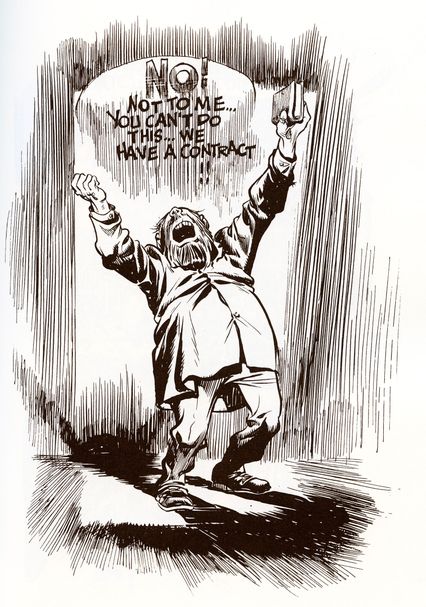
Writer/artist Will Eisner retired his newspaper comic book The Spirit in 1952, when it looked like the superhero was a wartime fad that had overstayed its welcome. He spent the following decades in commercial and advertising work, primarily for the United States military. But Eisner never gave up his dream of legitimizing comics as a serious literary form. As he neared retirement age, he returned to the medium’s untapped possibilities and found inspiration in the worst kind of tragedy: the death of his teenage daughter Alice from leukemia in 1970. The rage and grief practically leaps like flames off the page from the resulting story, “A Contract with God”, about a Depression-era Jewish man who denounces the Almighty when his child dies.
Eisner bundled this tale, along with three others about working-class Jews in the Bronx of the 1930s, into a single volume, A Contract with God and Other Tenement Stories. In an inspired bit of marketing — and a desire to be taken seriously — he called the book a “Graphic Novel” on its cover. It’s not the first graphic narrative; it’s not a novel (it’s a short-story collection); it’s not even the first book to call itself “a graphic novel”; but because it was by the creator of The Spirit, it was the first graphic novel by anyone in comics that the mainstream paid attention to. So, as these things go, the phrase finally stuck, and Eisner was heralded as the father of the form. For this and his many other technical and artistic innovations — and the fact that he was such a tireless inspirational voice urging comics to be everything they could be — the American industry’s Oscar, the Eisner Awards, was named after him in 1988.
Uncanny X-Men No. 132 (1980)
Writers: John Byrne and Chris Claremont; Penciler: Byrne; Inker: Terry Austin; Colorist: Glynis Wein; Letterer: Tom Orzechowski
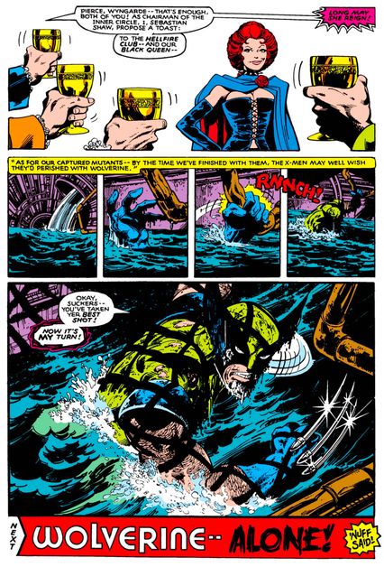
Since the 1930s, countless legions of superheroes have been created. But only a select few have become iconic, household names. Wolverine — a.k.a. Logan — is one of those names. Introduced as “the world’s first and greatest Canadian superhero” in 1974’s Incredible Hulk No. 180, the character became a permanent member of the X-Men when their series was relaunched in 1975. Originally written by Len Wein and pencilled by Dave Cockrum, the new group of X-Men characters took off. The book hit legendary status when the new team — writer Chris Claremont and artists John Byrne and Terry Austin — took over the book. Claremont made Wolverine into a cynical, fearsome warrior, prone to “berserker rages,” but with a softer side that was slowly revealed. And under the magical pencils and inks of Byrne and Austin, the character was a short, solid, scruffy, cigar-smoking powerhouse.
Wolverine truly broke out in the Dark Phoenix Saga, which played out in Uncanny X-Men Nos. 129 through 138. Early in the story, Wolverine is taken down by members of the Hellfire Club, seemingly left for dead in a sewer. As we find out, though, Wolverine can take a beating like no one else: The last panel, with a grimy and gritty, utterly determined Wolverine swearing revenge in the rushing waters of the sewer, established the template for his future visual and narrative depictions. The character would soon get his own regular series and appear in many, many other characters’ books — becoming, in a short time, one of Marvel’s most popular and enduring heroes.
Uncanny X-Men No. 137 (1980)
Writers: John Byrne and Chris Claremont; Penciler: Byrne; Inker: Terry Austin; Colorist: Glynis Wein; Letterer: Tom Orzechowski
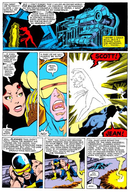
Today, it’s all on the observer to avoid having stories spoiled for them — you have to make a real effort to avoid finding out who dies on the latest episode of Game of Thrones or The Walking Dead. But in 1980, there was no instantaneous mass mode of communication. The readers who picked up Uncanny X-Men No. 137 had no idea about the truly shocking ending — they were expecting to see the saga of original team member Jean Grey’s transformation into the villainous Dark Phoenix end with her being sent to superhero rehab, as usual. No one was prepared for the page where Jean sacrifices herself to prevent the Phoenix Force from taking more lives.
Nor did X-Men readers know that Phoenix’s death was not long-planned, but instead a last-minute change decreed by then Marvel editor-in-chief Jim Shooter, who felt that Phoenix’s crime — killing 5 billion people in an earlier issue — was too severe to go unnoticed: Jean must be punished or die. Writer Chris Claremont and artist John Byrne had been telling the tale of Phoenix for months, a hugely popular and addictive soap opera with a colorful cast and space-opera vistas, but had no choice but to scrap their planned ending (although Claremont would later kvetch when a different writer brought Phoenix back). The death of Dark Phoenix has had an impact through comics history, spinning into many subsequent story lines about Jean, and inspiring myriad attempts to craft a shocking superhero death. In today’s landscape, it seems unlikely anything will ever top the shock of this page.
Cerebus No. 26 (1981)
Writer, penciler, inker, and letterer: Dave Sim
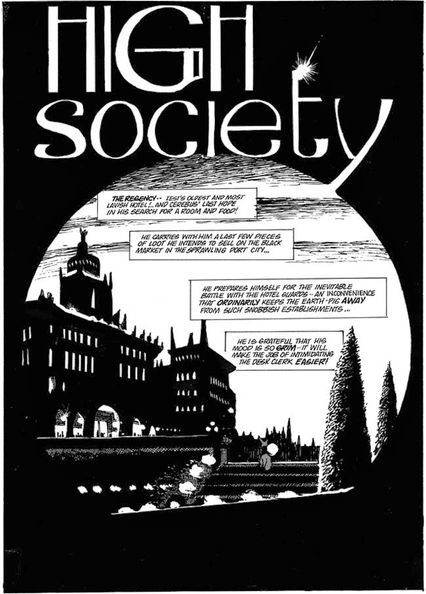
The so-called “direct market” of comics shops that began the 1970s did so largely out of necessity. Newsstands were dying by the score, so fans founded their own specialty shops to ensure that they’d have a place to pick up their beloved funny books. An unexpected but welcome side effect of this retail specialization was that an entire independent comics scene began to spring up within it. Cutting-edge material could thrive in the comics shops that would not have been accepted by either the Comics Code or by mainstream news vendors. One of the first creators to take advantage of this new opportunity was Ontario’s Dave Sim, whose self-published Conan the Barbarian parody Cerebus [sic] the Aardvark premiered in comics shops in 1977. While always clever and witty, when its “High Society” arc began in 1981, Cerebus set a new standard both for itself and the medium.
Cerebus, a cranky anthropomorphic “earth pig,” had fought, drank, and schemed his way through 25 previous issues, but beginning in this one, he stumbles into the office of prime minister of the powerful city-state of Iest, expanding Sim’s satiric targets from popular comics of the ’70s and early ’80s to much deeper social and political issues. “High Society” would span 25 issues of the Cerebus comic, over 500 pages, of which this is the first. Cerebus would end up as a 300 issue-, almost-6,000-page political/philosophical epic, ultimately getting bogged down by Sim’s bizarre gender politics. But at the height of his commercial and critical success, Sim was the leading voice of a movement for self-published, creator-owned comics, which brought us Jeff Smith’s Bone, Terry Moore’s Strangers in Paradise, Paul Pope’s THB, and many more.
Avengers Annual No. 10 (1981)
Writer: Chris Claremont; Penciler: Michael Golden; Inkers: Armando Gil; Colorist: Michael Golden; Letterer: Joe Rosen
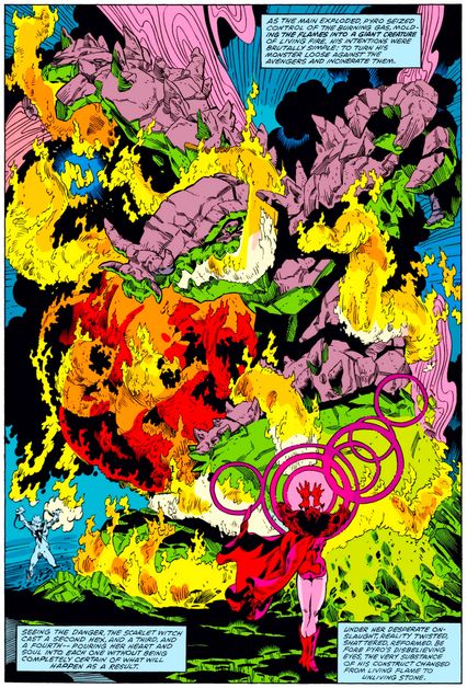
Written by Chris Claremont, Avengers Annual No. 10 has a lot of things going for it: An action-packed battle between our heroes and the newly regrouped Brotherhood of Evil Mutants; the first appearance of the popular character Rogue, who would later join the X-Men; and the cleanup of a messy continuity issue involving superhero Carol Danvers, who later would become Captain Marvel. The real reason this issue is a standout, though, is the spectacular and highly influential artwork of Michael Golden.
Golden, who started his career in commercial art, started doing comics in the late 1970s. By the time he drew and colored the issue, ably inked by Armando Gil, Golden was at the height of his powers. With most artists, you can tell what their influences are. Maybe a little Kirby here, a bit of Buscema there, or some resemblance to Ditko in the face. Golden was different. His quirky, highly detailed style had the feel and energy of Japanese manga, the elegance of the great European comics auteurs, and the in-your-face excitement of American comics, all put together into a blender and coming out looking like nothing that had been seen before. Many an aspiring artist at the time took notice of the issue and looked upon it — and some later Golden works in Doctor Strange, Marvel Fanfare, and The ‘Nam — with reverence. You can see the influence in artists like Arthur Adams, Jim Lee, Rob Liefeld, Todd McFarlane and many others, some of whom would go off and form the blockbuster Image Comics a little over a decade later.
Daredevil No. 181 (1982)
Writer: Frank Miller; Pencilers: Frank Miller and Klaus Janson; Inker and colorist: Klaus Janson; Letterer: Joe Rosen
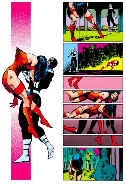
When Daredevil No. 181 was published in 1982, it was already clear that Frank Miller’s involvement in the book — he had been writing the series for a little over a year at that point, and setting comics readers on fire with his art for longer — was hugely influential. Under Miller, Daredevil had gone from swashbuckling superhero to moody crime epic; the preternaturally talented Miller, along with Klaus Janson, began to casually blow up everything the world thought a Marvel comic could be. And it culminates here, in one of the most dramatic pages in Marvel Comics history: Elektra Natchios, killed at the hands of Daredevil foe Bullseye with her own sai. Even now, the page is striking: entirely wordless, but full of artistic choices by Miller and Janson that wring every ounce of drama from the scene. Bullseye’s victorious smile, the sickening image of the sai impaling Elektra’s chest, the fabric of her costume tenting around the prong that pierced her. The two panels of her staggering away, followed by five panels that draw out her falling to the ground and struggling back up. Elektra isn’t dead at the end of this page, but she will be.
Miller would go on to tell many more acclaimed and memorable Daredevil stories. But this page will always stand out as the moment he forged the culmination of his influences — a bit of Raymond Chandler, a healthy dose of Will Eisner, and a lot of Japanese manga — into something distinct, something that made superhero comics feel brand new all over again. Superhero comics, for better or worse, have never fully stopped chasing Elektra, bleeding out into the street, as the man who killed her indifferently puts on his jacket and walks away into the night.
Elfquest No. 17 (1983)
Writers: Wendy Pini and Richard Pini; Penciler, inker, and letterer: Wendy Pini
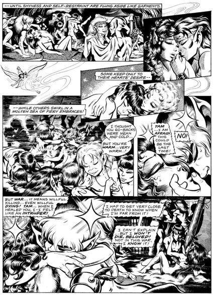
Elfquest, along with Sim’s Cerebus the Aardvark, was the big success story of the early direct market. Artist Wendy Pini, who had already made a name for herself as one of the first cosplay celebrities, conceived of her fantasy epic about competing tribes of elves in the early 1970s, and enlisted her husband Richard to help her write it. The couple shopped the series around to all the major publishers with nothing but rejection to show for it, so they founded their own company, one of the first of the indie comics publishers, WaRP Graphics.
The series made no bones about being a high fantasy tale for adults. This is from one of the more notorious sequences, when the elves basically have an orgy before a big battle. Evolving attitudes about what comics were supposed to be — and who they supposed to be were for — clashed greatly with unevolved attitudes in the 1980s. In 1986, cops in Illinois raided the comics shop Friendly Frank’s and hauled away store manager Michael Correa in handcuffs for carrying Elfquest and many other adult-aimed comics depicting sexual situations, like Heavy Metal and Omaha the Cat Dancer. The arresting officer declared he found “a satanic influence” in the comics, and Correa was charged with displaying obscene materials. The comics industry rallied to Friendly Frank’s cause in an ultimately successful defense, leading to the foundation of one of the country’s leading First Amendment nonprofit organizations, the Comic Book Legal Defense Fund.
American Flagg! No. 1 (1983)
Writer, penciler, and inker: Howard Chaykin; Colorist: Lynn Varley; Letterer: Ken Bruzenak
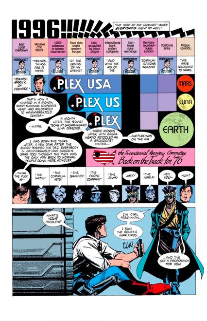
For about two years, starting in 1983, Howard Chaykin’s American Flagg! (published by Chicagoland-based First Comics) was the smartest thing in serial comic books. Crackling with detail, this dystopian epic of media manipulation and corporate intrigue fulfilled the promise of both the “ground-level” independent comics of the mid-’70s and Chaykin’s own ambitious experiments with the graphic novel (Empire, 1978; The Stars My Destination, 1979). The book, a graphic-design orgy, showed writer-artist Chaykin at his densest but also most elegant, with pages enhanced by the lettering of the brilliant Ken Bruzenak. Flagg ran for the better part of five years, but it’s the first two years, with pages written and drawn almost solely by Chaykin, that made its rep as a satiric science-fiction epic and design touchstone: a link between the 1960s experiments of Neal Adams and Jim Steranko and the decadence of the late ‘80s.
Flagg was the first U.S. comic-book serial to attain the complexity and slickness of the generation of European sci-fi comics defined by the magazine Métal Hurlant (imported into the U.S. as Heavy Metal). Flagg was media savvy, exploring postmodernity and artifice (including its own). It also experimented with the remediation of other media through comics: more than two years before Frank Miller exploited the technique in Batman: The Dark Knight Returns, Chaykin was configuring panels as television screens, and commenting acidly on how TV could drive events. (Watchmen also picked up on this idea). In its sheer density of visual information, as embodied by this page, Flagg joins Ridley Scott’s proto-cyberpunk film Blade Runner (1982) as one of the decade’s most immersive futures.
Saga of the Swamp Thing No. 21 (1984)
Writer: Alan Moore; Penciler: Stephen R. Bissette; Inker: John Totleben; Colorist: Tatjana Wood; Letterer: John Costanza
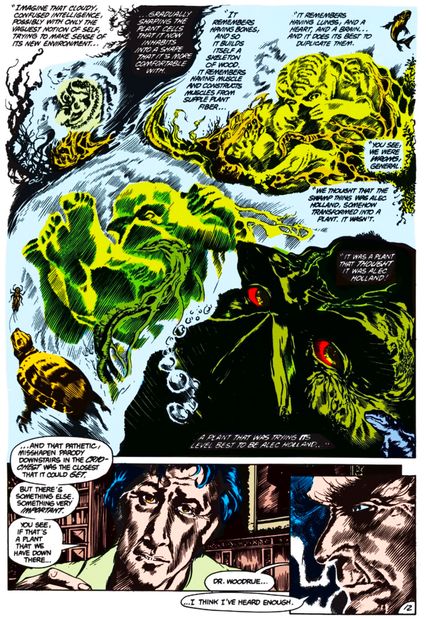
Telling your audience that “everything that you thought you knew was a lie” is one of the boldest gambits in comics, as it requires confidence that readers will like your new story better than the lie. During his run on the “Marvelman” feature in the British comic-book series Warrior, that’s precisely what Alan Moore did with the title character, a Captain Marvel rip-off from the 1950s — and to great acclaim. Moore’s success on Marvelman (later retitled Miracleman to avoid legal troubles with Marvel Comics) led to editor Len Wein hiring him to work that same magic on Saga of the Swamp Thing for DC Comics. It was, at the time, a series DC had released as a tie-in with Swamp Thing’s 1982 movie, which was based on the classic horror character created by Wein and Bernie Wrightson. In Moore’s second issue, he revealed that Swampy did not originate when scientist Alec Holland was mutated in a chemical explosion to become a creature made out of swamp plants, but rather, that the explosion had caused swamp plants to believe that they were Alec Holland.
It was a mind-blowing revelation, handled so well by Moore and new series artists Stephen Bissette and John Totleben that no one could complain. This was the first sign that Moore was going to take the series into some disturbing new directions, showing Swamp Thing adjusting to his newly revealed status quo. Moore’s work on the series established him as a comic-book superstar, and his writing was so adult-oriented that DC ended up doing a line of comics for mature readers, Vertigo, based in no small part on the success of Moore’s Swamp Thing. Finally, Moore’s successful deconstruction of Swamp Thing led countless writers to try the same approach with countless established characters. Many of them have faltered, but all owe a debt to this game-changing page of revelation.
Teenage Mutant Ninja Turtles No. 1 (1984)
Writers, pencilers, and inkers: Peter Laird and Kevin Eastman; Letterer: Eastman
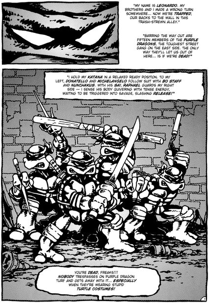
Though the direct market produced many artistic successes and critical darlings since its inception in the mid-1970s, it did not birth a bona fide phenomenon until Kevin Eastman and Peter Laird’s parody of Frank Miller’s manga-influenced Daredevil arrived. This page shows the full quartet of Renaissance-painter-named turtles for the first time. Eastman and Laird’s megasuccess spawned many positive developments, including Eastman’s short-lived but highly innovative publisher Tundra and Laird’s Xeric Foundation, a nonprofit that, among other good works, gave out self-publishing grants to new comics creators until 2012.
Unfortunately, there was a dark side to all of this, too: As back issues of TMNT climbed ridiculously high in value, publishers and retailers smelled easy money. In the hopes of discovering the next Turtles, speculators started buying up all the sudden surge of black-and-white indie titles. An economic bubble was created, and it quickly burst, wiping out innumerable publishers and many retailers in what became known as the Great Black-and-White Boom and Bust. It was the worst thing to happen to the comics direct market, but far from its last catastrophe. To this day, people predict the direct market’s impending demise, but nothing has been able to fully kill the business model that the Turtles helped popularize.
Crisis on Infinite Earths No. 8 (1985)
Writer: Marv Wolfman; Penciler: George Pérez; Inker: Jerry Ordway; Colorist: Tony Tollin; Letterer: John Costanza
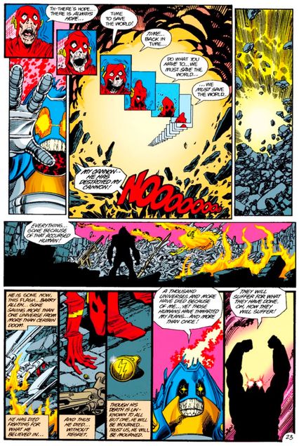
By 1985, DC Comics’ cosmology was, to many readers and more than a few creators, a baffling mess. A so-called “multiverse” had gradually grown, in which conflicting versions of characters were explained away as existing on parallel universes. While initially a novel solution to the “problem” created when they introduced new versions of a number of their then-defunct Golden Age superheroes, the multiverse was seen by many creators at DC Comics in the 1980s as a major drawback for the company in its competition with their chief rival, Marvel, which focused on one main universe. Thus, working with his New Teen Titans collaborator, George Pérez (their New Teen Titans was DC’s best-selling series and Pérez was one of the most popular artists in comics), writer Marv Wolfman launched the very-first company-wide crossover event, Crisis on Infinite Earths, to solve this problem.
The idea was to set DC’s superheroes against a villain, the Anti-Monitor, who wanted to destroy the entire Multiverse. In the end, the heroes were able to defeat him, but not before the Multiverse was condensed to simply one Earth. This allowed DC to then reboot a few of their titles with new continuity. As a way of making the crossover feel like it was important beyond the reboot, DC decided to kill off a few major characters. One was Supergirl; the other was Barry Allen, the Flash. (As superheroes are wont to do, they came back years later, but that’s beside the point.) Barry’s death, brilliantly depicted by Pérez, saw the Flash outrunning an energy beam to save the multiverse from the Anti-Monitor in Crisis on Infinite Earths No. 8. It was highly symbolic of the superhero who launched the Silver Age of comics dying in a comic that eliminated the multiverse entirely. Subsequently, a new, darker age was born.
Neat Stuff No. 3 (1985)
Writer, penciler, inker, and letterer: Peter Bagge
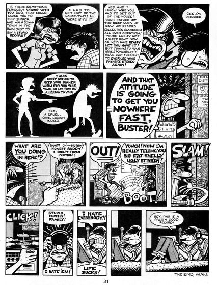
A decade after the brief commercial boom in underground comix in the early 1970s, there was a boom in so-called “mini-comics” from young artists who did not seem to care that they were barely making any money. They just had a need to get their stories out there. One of these creators was Peter Bagge, who spent the 1980s honing his artistic style. Visually, Bagge is best known for his exaggerated characters with big faces and rubbery arms (typically depicted like this when they are angry … and they’re often angry). His first series for publisher Fantagraphics was Neat Stuff. Bagge had a number of features in the series, but the one that ended up defining his career was a semi-autobiographical look at a teen named Buddy living with his dysfunctional family in the suburbs, called “The Bradleys.”
In 1990, after ending Neat Stuff, Bagge aged his Buddy Bradley character and moved him to Seattle as a 20-something for the follow-up series Hate, which became a major hit and defined the boom in alternative comics in the 1990s (and perfected the image of the slacker in popular culture). However, it was in Neat Stuff that Bagge’s view of Buddy first coalesced. The ending of Neat Stuff No. 3 perfectly captured Buddy’s outlook on life. His family sucks. Life sucks. Everything sucks. This record is pretty good, though, so it’s all sort of bearable … until the next day. A legion of ’90s alternative comics followed in Bagge’s footsteps with their own particular versions of Buddy Bradleys.
Shatter No. 1 (1985)
Writers, pencilers, and inkers: Mark Pierce and Mike Saenz; Colorist and letterer: Saenz
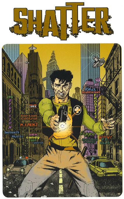
In 1985, the Macintosh computer was an ugly beige slab that was slightly bigger than a bread box and weighed 16-and-a-half pounds. However, it was the most advanced computer for graphics yet available for the home user, and computer art was becoming more common. The comics industry didn’t want to get left behind, and Shatter, published by First Comics in 1985, was the very first comic whose art was created directly on a computer. Written by Peter Gillis with art by Mike Saenz, it was a fairly rote “cyperpunk” story about a cop named Sadr al-Din Morales on the trail of a mass killer and RNA thefts, accompanied by self-conscious narrative.
None of that mattered much. Shatter’s selling point was the fact that the line art was created on the Mac: Saenz would do layouts for approval, then recreate them directly on the computer, using the ungainly mouse of the time, and a pitiful one megabyte of memory. The only thing that wasn’t done on the computer for Shatter No. 1 was the color — an ironic fact, given that color was the first part of regular comics production that shifted to the computer in the 1990s and is still almost always digitally produced to this day. Saenz left the book after a few issues (and subsequent artists figured out how to scan in art for a more fluid look), but he continued to experiment with digital comics for years. Shatter may not hold up artistically, but the feat of drawing with an 1985 Apple Mouse — like Stonehenge and the pyramids — proves that humans will suffer anything to express themselves.
The Dark Knight Returns No. 1 (1986)
Writer and penciler: Frank Miller; Inker: Klaus Janson; Colorist: Lynn Varley; Letterer: John Costanza
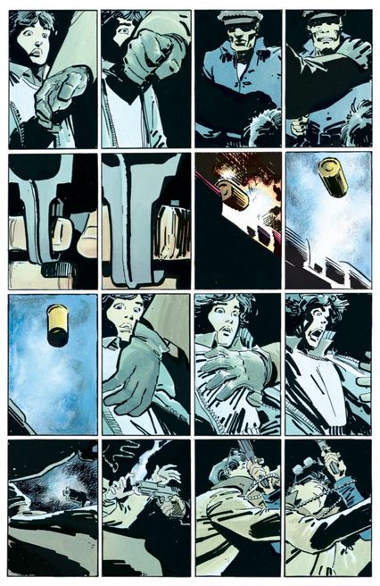
Haunted and helpless, a middle-aged Bruce Wayne channel-surfs through news of one atrocity after another even as bursts of memory — of that memory, the murder of his parents by a mugger in an alley — flash through his tormented mind. This version of Bruce, from Frank Miller’s revisionist Batman smash The Dark Knight Returns, wants desperately not to be the Batman, to retire that persona forever — and yet in Miller’s characterization the Bat is a force that possesses him, irresistibly propelling him back into action. Here Miller takes an idea that had been part of Batman lore almost from the start (as we saw earlier in this list) and fiercely reinterprets it, insists upon it, and makes it matter. Miller’s Wayne is, always and ever, an orphan, and the murder of his parents, as redepicted here, is no mere plot stipulation but a founding trauma, a lived nightmare forever flashing back: a trigger. Miller, at once building on the work of seminal 1970s Batman scribe Dennis O’Neil and yet going his own way, definitively establishes Batman as a trauma victim — the strongest, most influential interpretation in the character’s long and checkered history.
Miller seems to have intuited the often imagistic and disconnected nature of traumatic memory, and the result is a harrowing union of psychological violence and clinical form. He had already shown, in Marvel’s Daredevil, that he was willing to put heroes through hell. But Batman is his most perfect example of that trope: a character born and reborn through suffering. Channeling the layout lessons of Bernard Krigstein (see our aforementioned “Master Race” page, a direct influence on this one), Miller cuts Bruce’s primal scene into thin shards and shuffles them with other images — the banal but horrific stuff of TV news — to create a terrifying origin sequence whose emphasis on traumatic visuality evokes A Clockwork Orange. The killing of Thomas and Martha Wayne unfolds with a dreadful intimacy: the detail of Martha’s necklace breaking and scattering into single pearls (mirroring what Miller is doing with the panels), has become canonical. Artists and filmmakers have been referencing this sequence ever since.
Elektra: Assassin No. 1 (1986)
Writer: Frank Miller; Penciler, inker, and colorist: Bill Sienkiewicz; Letterer: James Novak
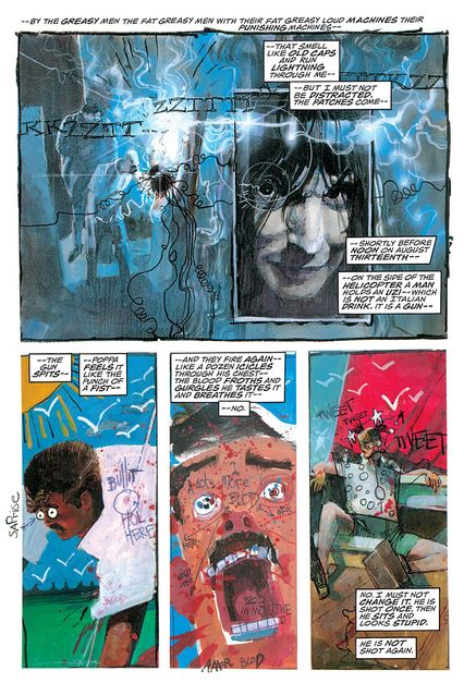
The FX television series Legion does a surprisingly good job, intentionally or no, of channeling the crazy-quilt visual style of the great comics artist Bill Sienkiewicz. Not really “collage,” per se, Sienkiewicz does his best stuff when he works in a variety of styles simultaneously. He experimented with this technique on Moon Knight with Doug Moench and New Mutants with Chris Claremont, the latter of which featured the debut of Legion’s David Haller. But it was on the subsequent Elektra: Assassin that Sienkiewicz really blew people’s minds. Frank Miller accommodatingly wrote a script to match his artist’s skills; calling it “over the top” would be decidedly under the top. In brief: in a prequel to Miller’s Daredevil run (i.e. before she got murdered in a page we featured earlier on this list), Elektra, a half-mad ninja assassin, mentally enslaves a pompadour-sporting black-ops cyborg to help her assassinate a Kennedy-esque progressive presidential candidate who’s been possessed by an ancient Japanese demon. You know, as one does.
Few pages better encompass the totality of Sienkiewicz’s approach than this one, in which the hyperrealism of Elektra’s electroshock therapy in a sleazy loony bin is contrasted with the storybook-like depiction of her father’s assassination in her memories, complete with child’s-drawing notations. Rarely has a comics artist been able to so effectively depict the shifting states of mind that make up all our own internal monologues; in doing so, Sienkiewicz inspired many future superhero experimenters to come.
Watchmen No. 1 (1986)
Writer: Alan Moore; Penciler, inker, and letterer: Dave Gibbons; Colorist: John Higgins
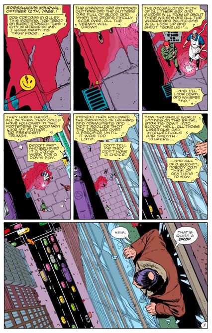
The dirty secret behind the first page of Watchmen is that it isn’t, in fact, the first page in the story — the cover is. Each of Watchmen’s 12 issues had a cover that was treated as one large panel, a bit of abstract, ominous imagery. Because of this, you enter each chapter of Watchmen — arguably the most celebrated and literary deconstruction of superhero comics ever published — unconsciously primed for the quiet, understated revolution it’s about to show you. It’s a matter of form and function. Writer Alan Moore and artist Dave Gibbons immediately establish a strict grid structure that usually fits nine panels to a page, but as rigid as it seems, it’s also fluid — panels melt together whenever a wider canvas is needed, which compels the reader to not just pay attention to what’s within a panel, but also how much space it is being given.
What could be presumed to be a holdover from Moore and Gibbons’s history-making comics in the U.K., where serial strips in comics magazines were the norm and economy was everything, turned out to be one of the most dissected and discussed formalist structures in comics. While Moore and Gibbons are far from the first to adopt this construction, their approach allowed the structure of their story to become its text in a way no one had seen before. Post-Watchmen, the nine-panel grid is often the mark of comics creators at their most ambitious. Contemporaries like Neil Gaiman were directly influenced by Moore, and echoes of Watchmen’s structure appear in his The Sandman. Keith Giffen, J.M. DeMatteis, Kevin Maguire, and others would use it to more comedic and heroic effect in Justice League International, while contemporary teams — perhaps most notably, Tom King and Mitch Gerads of The Sheriff of Babylon and Mister Miracle — embrace the grid for the ways it puts the strength of the medium front and center: With careful plotting and pitch-perfect cartooning.
Raw No. 8 (1986)
Writer, penciler, inker, and letterer: Gary Panter
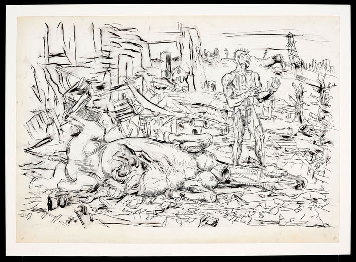
Man flayed, horse slayed, landscape laid to waste — this slashing black-and-white page is the pitch of the punk apocalypse envisioned by Gary Panter. King of the ratty line, Panter is one of the great modern cartoonists. For sheer crazy inventiveness, he’s been compared to Jackson Pollock and James Joyce. He’s tackled not only Nancy and Sluggo, but also Dante’s Purgatory and Pee-wee’s Playhouse (he was their head designer — no, really). And Panter, along with Lynd Ward and Will Eisner, is one of the few in his field to deal directly with God, and godlessness. His drawings of the blasted-out post-nuclear zone called Dal Tokyo, first scrawled in the 1970s, marked the end of the hippie phase of underground comix. Panter’s earliest comics were published as xeroxed and stapled zines, then appeared in the punk magazine Slash, and in Art Spiegelman and Françoise Mouly’s Raw, and from there found their way to hardcover books and gallery walls. Panter’s primal character is Jimbo, a spiky-haired, muscle-bound guy who, with various animals and semi-humans at his side, stumbles through a bombed-out, post-apocalyptic landscape, where the chaos and pain has a lot more to do with Picasso’s Guernica than with traditional superheroics.
Take this page from the section “Jimbo is Stepping Off the Edge of a Cliff!” in which Jimbo and a horse go over a cliff in flames and Jimbo, himself rather charred, puts the damaged horse out of its misery by jamming a metal shard “into the horse’s neck … as if he was trying to cut its head off … He sat down … He decided he’d helped enough for once. It kept on raining ashes and the sun went … ” The next frame, wordless and godless and colorless, decorated with entrails and burnt shards, shows Jimbo with his head cocked, maybe listening for something. It’s an indelible sequence that reminds you why Panter is adored and imitated. But even though there are copiers aplenty, his work “remains in a stubbornly untamed school of its own,” as his friend and fan Matt Groening has said. In fact, Groening himself has “copped a thing or two from Gary,” as he admits: “Check out Jimbo’s spiky hairline and then take at look at Bart Simpson’s picket-fence-topped noggin. Eerie, isn’t it?”
Love and Rockets No. 23 (1987)
Writer, penciler, inker, letterer: Jaime Hernandez
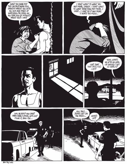
In 1982, the comics world was stunned by the utterly unheralded arrival of the Hernández brothers, two young Latinx cartoonists from Oxnard, California. Gilbert, the elder brother, created long, magical-realism stories that featured buxom women battered by life and dashed hopes; Jaime, the younger brother, spoke fluent punk-rock, tempered by a master inker’s line. “Locas,” Jaime’s long running serial, followed two SoCal punk maybe-lovers, Maggie and Hopey, traversing a world of gang violence and thwarted romance. Maggie was a little overweight, a hopeless romantic, and someone you couldn’t help but root for. Hopey Glass was more anarchic, a troublemaker who pretended to never look back.
In 1987, Jaime created his earliest masterpiece, “The Death of Speedy Ortiz,” which featured the culmination of the story of Maggie’s crush on the thirst trap Speedy, whose dallying with Maggie’s sister Esther was causing a gang war in their home turf of Hoppers. On this — the third page from the end and a symphony of contrast in black and white — Hernández created a shattering moment of passion, regret, squandered potential, and ambiguity as Maggie finally rejects Speedy, and in one devastating panel he realizes the impact his carelessness has had on others. Did Speedy take his own life, or was he killed by the rival gang? We never find out, which raises the question: Does the cause of a death matter as much as the raw impact? The final pages of the story — including a flashback to a much younger, innocent Speedy and Maggie — capture both the haunting past and the unknowable future that define every human moment. Work like this has made both Hernándezes among the most revered cartoonists of the last 40 years, often referenced but never surpassed.
Batman: The Killing Joke (1988)
Writer: Alan Moore; Penciler and inker: Brian Bolland; Colorist: John Higgins; Letterer: Richard Alan Starkings
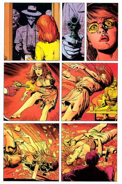
“Yeah, okay, cripple the bitch,” was, according to Alan Moore, what Len Wein, his editor at DC Comics at the time, said to him when he called to tell them what he planned to do to Barbara Gordon — better known as Batgirl — in his graphic novella The Killing Joke. In 1988, the comic was one of the most exciting things to happen in DC, a union between acclaimed artist Brian Bolland and Moore, who had just finished his epic Watchmen, the capstone on his landmark tenure writing for DC. The story they told, detailing the lengths to which the Joker would go to prove to Batman that “one bad day” is all that separates good men from monsters like him, would become one of the most controversial, seminal, and shockingly misogynistic moments in superhero comics.
It all comes down to this page, wherein the Joker visits Barbara Gordon in her home and shoots her, shattering her spine and leaving her helpless on the floor. John Higgins’s colors are stark and the composition is leering; from the moment the bullet makes its impact, we see Barbara’s full figure at all times, her bare legs always in frame, her cleavage visible as she lies in agony atop a shattered coffee table. In the next few pages, it’s implied the Joker undresses her to photograph her, all for the purpose of pushing Batman and Barbara’s father, Police Commissioner Gordon, into madness. The Killing Joke arrived at the end of a decade that superhero comics had spent in the pursuit of a form of psychological verisimilitude in its stories. Heroes were recast as possibly mentally ill vigilantes, villains became truly depraved, and The Killing Joke, at the time, satisfied this call for a fight between good men and a monster to be a struggle truly monstrous. It would be some time before the industry would contemplate the cost of this mission.
Raw Vol. 2, No. 1 (1989)
Writer, penciler, inker, and letterer: Richard McGuire
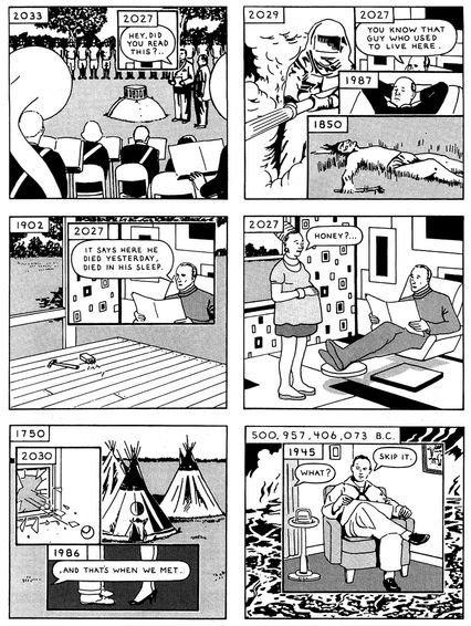
Both exercise and meditation, Richard McGuire’s “Here” is about time: years, centuries, eons. McGuire depicts time’s passage within a single, distinct space bounded by the unchanging square of a comics panel: a shape repeated again and again, but always with some new combination of things inside it. Within this constant shape are smaller inset panels: embedded boxes denoting overlapping time periods and creating a kind of historical palimpsest. A single panel can contain myriad smaller panels and time frames: say, 1750 layered with 1986 and 2030. Flitting back and forth, from an impossible hundreds of billions of years ago, through the life of one man (“Bill,” 1957–2027), and on to the sinking of a time capsule in the ground in year 2033, “Here” does not distinguish between past and present tense, but instead makes everything present and everything past. It’s a disorienting demonstration of the truism that, in comics, time is a function of space.
Fittingly, there are two different printed versions of “Here,” themselves separated by about a quarter century: the original comic, published as six pages in the influential anthology series Raw, and the book-length version, entirely redrawn and reformatted as a graphic novel of about 300 pages in 2014. The original, drawn in black ink on white paper, maintains a steady six-panel grid, while the graphic novel, rendered in part digitally, uses full-bleed spreads and a lush color palette. In the interim between these versions, McGuire’s cascading influence could be seen in the work of such formalists as Chris Ware and Jason Shiga, who can also transform comics into time machines.
Arkham Asylum: A Serious House on Serious Earth (1989)
Writer: Grant Morrison; Penciler, inker, and colorist: Dave McKean; Letterer: Gaspar Saladino
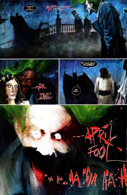
You can draw a direct line from Bill Sienkiewicz’s styles-within-a-style to the more explicitly mixed-media, collage-inspired work of illustrator Dave McKean, who provided frequent collaborator Neil Gaiman’s The Sandman with its distinctive, franchise-making covers. After Gaiman and McKean’s first graphic-novel-length collaboration, Violent Cases, appeared in Britain, DC recruited McKean to illustrate Grant Morrison’s violent, disturbing Batman tale Arkham Asylum: A Serious House on Serious Earth. In it, the inmates have literally taken over the asylum and the Caped Crusader has to fight his way through the entirety of his rogues gallery to free the captive staff; as he descends deeper and deeper into the house and learns its horrific history, he creeps closer and closer to madness himself. (It also made for a terrific video game, 2009’s Batman: Arkham Asylum.)
Morrison has said he wanted The Killing Joke’s more naturalistic Brian Bolland on the book, and worried that McKean’s expressionistic style clashed with his script, but few readers exposed to the artist’s demonic depiction of the Joker would agree. McKean’s expressionistic, mixed-media work would partly define the visual style of the Vertigo era.
The Sandman No. 8 (1989)
Writer: Neil Gaiman; Penciler: Mike Dringenberg; Inker: Malcolm Jones III; Colorist: Robbie Busch; Letterer: Todd Klein
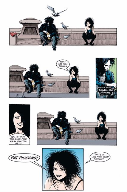
When Neil Gaiman, Mike Dringenberg, and Sam Kieth created The Sandman, it was heralded as an uncommonly good horror comic, one where the endless potential of a story about the lord of dreams and his kingdom of vapor was realized. In its eighth issue, however — written by Gaiman with art from Dringenberg and Malcolm Jones III — The Sandman suddenly became something more. Titled “The Sound of Her Wings,” the comic finds the title character sitting, morose, in Washington Square Park, feeding birds following the harrowing events of the first seven issues. He’s approached by a young woman in full-on goth attire, who sits down beside him. And then, something we haven’t seen before in The Sandman: comedy, via a Mary Poppins reference.
This is how the massively popular character of Death was introduced in 1989. A deliberate inversion of the traditional take on the ghoul, this Death was friendly and funny, a psychopomp less cryptic and more humane. She also signaled a shift in purpose for The Sandman, from occult-tinged horror — which the book would still still do plenty of — to something akin to a box of fables, one where someone like Death could just show up, win you over with a joke, and smile sweetly (as you remember that Death always shows up for a reason). Afterward, comics were never the same.
Weirdo No. 26 (1989)
Writer, penciler, inker, and letterer: Julie Doucet
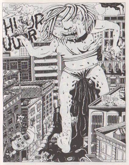
Montreal’s Julie Doucet wasn’t the first female cartoonist to deal with sex, menstruation, and copious nudity, but she did it in a style whose blunt force no one could deny. In a series of stories in Weirdo and then her own book, Dirty Plotte (French-Canadian for “dirty pussy”), Doucet explored her dreams, fantasies, and everyday adventures with a dense, woodcut-like style that filled every inch of the page with vivid details, all the while crackling with energy. Doucet’s dreams were often violent (a knife-wielding Julie cutting things up) or sexual (Julie turns into a man and makes out with herself), but sometimes just made up of whimsical street scenes. Her caricature of herself as a fearless grunge sprite gave even the most outlandish tales an inviting charm. Often, though she was a force of nature.
In “Heavy Flow,” Julie freaks out when she runs out of tampons, and fantasizes the unforgettable image of a giant bleeding woman going full-on Godzilla on an unfortunate town. Doucet’s work inspired several of her male peers to turn to autobiography, but also became a role model for other women who were used to having their work put down as “ugly.” Unfortunately, the strain of being yet another “pioneering female cartoonist” and the lingering sexism in the comics boys’ club that had “allowed” her in — as well as the small financial return in indie comics publishing — led Doucet to leave cartooning. She turned to other fields, including poetry and commercial work, and even made a short film with Michel Gondry. But her comics made a lasting impact, and a collected edition of Dirty Plotte is coming out this fall.
New Mutants No. 98 (1990)
Writers: Rob Liefeld and Fabian Nicieza; Penciler and inker: Liefeld; Colorist: Steve Buccellato; Letterer: Joe Rosen
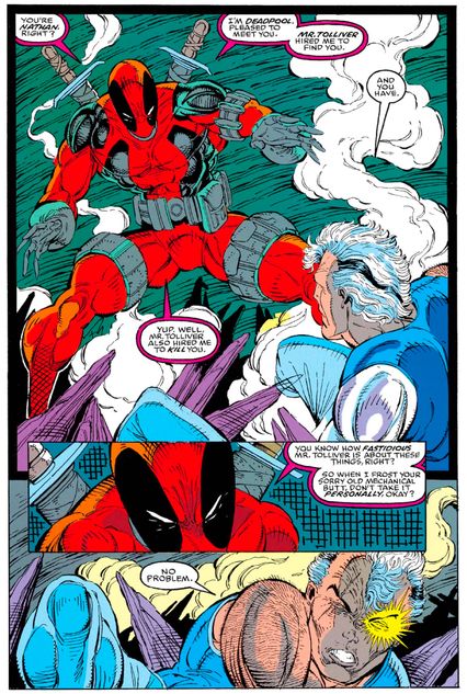
In the late 1980s, Marvel’s sales were starting to rise significantly, driven by a speculator’s market — people thought comics were less important for their content than for their collectibility. That collectibility was specifically being driven by a group of young artists at Marvel whose books sold much better than others. One of them was Rob Liefeld, who became the artist on X-Men spinoff The New Mutants in 1989. During his stint on the book, a number of characters were introduced, including Cable, a grizzled cyborg from the future who became the new leader of the team of youthful mutants. When the longtime writer of the series, Louise Simonson, left Marvel to go write a new Superman series, Liefeld became its main plotter, as well.
Liefeld’s first issue without Simonson, New Mutants No. 98, also began to set up the end of the book, where most of the cast was removed in favor of new Liefeld creations, a mutant strike force called X-Force. In New Mutants No. 98 (with Liefeld now working with scripter Fabian Nicieza), Liefeld introduced a villain named Deadpool who he saw as, in effect, an evil Spider-Man. The wisecracking mercenary proved so popular that when X-Force launched a few months later (becoming, at the time, the highest-selling single comic book ever — it was bagged with five different trading cards, leading many speculators to buy five copies of the issue, hence the record sales), Liefeld’s editor forced him to work Deadpool into X-Force as soon as possible. After Liefeld left Marvel, Deadpool continued to be developed into a more metafictional comedic (and heroic) character. Deadpool recently starred in his own blockbuster film, having become one of Marvel’s most popular characters. But beyond the specific success of Deadpool, this page also encapsulates the violent, scratchy, weapon-filled style that Liefeld and his peers pioneered to such great success in the 1990s.
Bone No. 2 (1991)
Writer, penciler, inker, and letterer: Jeff Smith
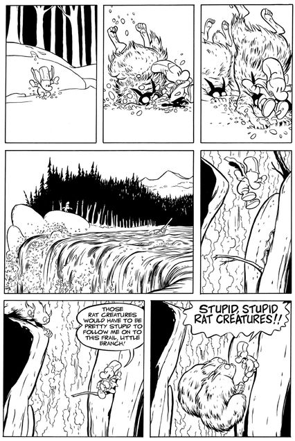
In this page, from an early episode of Jeff Smith’s Bone, our hero, Fone Bone, is running from the giant, evil Rat Creatures. He clambers up a cliff onto a skinny branch, exclaiming, “Those Rat Creatures would have to be pretty stupid to follow me on to this frail, little branch!” Of course, the rats do follow him, and before the branch cracks, bringing both hero and evildoers down, Fone Bone yells the line that’s now not only part of comics history, but also geek slang, indicating the sort of stupid people who cause major inconvenience to others: “Stupid, stupid Rat Creatures!!” Initially self-published by Jeff Smith in 1991, Bone went on to become the progenitor of our current renaissance in all-ages comics when it was reprinted by Scholastic in the aughts. The stars of Bone are cute, almost naked, white, four-fingered, pudgy, bald creatures who come from Boneville. There’s Fone Bone, a plucky fellow who is always getting into trouble through no fault of his own; Phoney Bone, a cheating, self-aggrandizing guy who generally causes the trouble (and wears a sheriff’s star); and Smiley Bone, the pliant one.
For all its cuteness, though, Bone crossed many boundaries. It is, in fact, a masterpiece of comics mix-and-match, combining the look of fantasy fiction comics with the plots of other-world epics and funny-animal comics. The characters are a mishmash too. The Bones could have walked out of Pogo, or Casper the Friendly Ghost, or off a Stay-Puft marshmallow bag. Their relationships feel like those in Carl Barks’s Uncle Scrooge. The humans, particularly the beautiful, buxom Thorn, could have been lifted from Disney’s Cinderella or off the pages of Li’l Abner. And the Rat Creatures, fanged, red-eyed, slow-witted, bloodthirsty monsters obsessed with cooking technique, would fit nicely into the The Lord of the Rings, the epic to which Bone is often compared.
Spider-Man No. 16 (1991)
Writer, penciler, and inker: Todd McFarlane; Colorist: Gregory Wright; Letterer: Chris Eliopoulos
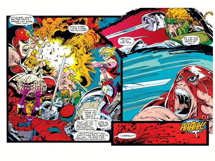
One of the artists at Marvel Comics in the late 1980s helping to drive record sales for the company was Todd McFarlane, who took over The Amazing Spider-Man in 1988 after a popular run as the artist on The Incredible Hulk. McFarlane had an entirely different approach to Spider-Man as a character than the famed John Romita and Steve Ditko versions. McFarlane drew a contorted rendition of Spidey, along with exaggerated features (varying the size of the lenses in Spider-Man’s mask to make his face more expressive) and a thicker webbing (inspired by how Michael Golden would draw Spider-Man’s webbing in a series of Marvel Comics prints that Golden did in the early 1980s). McFarlane’s Spider-Man was so popular that in an era where X-Men-related comics dramatically outsold everyone, The Amazing Spider-Man was only outsold by Uncanny X-Men.
McFarlane decided to leverage his popularity by leaving The Amazing Spider-Man and having Marvel let him write a comic-book series that he would draw. He was shocked when they not only agreed, but gave him his own Spider-Man series. McFarlane’s adjectiveless Spider-Man No. 1 launched in 1990, becoming (at the time) the highest-selling single comic book of all time. Over time, though, McFarlane began to chafe from what he felt was too much editorial influence. The book was being touted as “Todd McFarlane’s Spider-Man” and selling millions that way, and yet they kept making him change things in the book. The final straw was in an X-Force/Spider-Man crossover where McFarlane drew X-Force member Shatterstar stab the villainous Juggernaut in the eye with a sword. Marvel refused to show the actual stabbing, feeling it was too graphic. It was one change too many for McFarlane, and he left the book. Soon, he would take his very valuable brand to a new company, Image Comics, where he would debut the ultraviolent hit character Spawn. More important than that, however, was the business revolution that Image kicked off: it allowed creators to own their characters, rather than handing them off to corporate overlords, and its model continues to great success to this day. Without poor Juggernaut, it might never have happened.
Maus: A Survivor’s Tale II: And Here My Troubles Began (1991)
Writer, penciler, inker, and letterer: Art Spiegelman
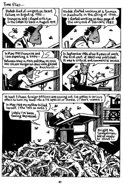
What can you do when the very ground of your reputation and your art is the Holocaust; when genocide is the precondition of your success? Art Spiegelman’s Maus (1978–1991), a true family memoir of Holocaust survival ironically cast in the idiom of “funny animal” comics, was always a risky, impious project, but after the first book-length volume (collecting the early serialized chapters from Raw magazine) became a critical and commercial sensation, Spiegelman’s ambivalence and uncertainty, foregrounded from the get-go, became nearly paralyzing. His own success, predicated on the Shoah and on the imprisonment, suffering, and losses of his parents, came to plague him, and what had already been arch and self-reflexive had to become even more so — to, as Spiegelman has said, “make the obstacles manifest.”
If anyone had doubted why Maus Volume One devoted so much energy to capturing the circumstances of its own making, then Volume Two gave an answer: a Holocaust comic, indeed any artistic representation of the Holocaust, ought to be forthright and knowing when it comes to admitting its own role in making art (and profit) out of catastrophe and trauma. Spiegelman well understood the ethical and psychological implications of turning the Holocaust into product (the back cover of Volume Two recasts the scannable bars of the ISBN label into the stripes of his father’s camp uniform). On this much-studied page, Spiegelman confronts the awfulness of the story he has set out to tell, and the awful consciousness of his own temerity, by adjusting his persona — now not that of a mouse, but of a man with a mouse mask tied on with string. Further, he shows mouse-like corpses that pile at his feet like so many crumpled, discarded drafts, and discloses, for the first time in the text, the death of his father and informer, Vladek. This unnerving moment of self-accusing self-reflexivity may be the key page for understanding the ethical complications inherent in graphic memoir (one can hardly imagine Bechdel’s equally haunted Fun Home, featured elsewhere on this list, without it). It’s a bold and disconcerting masterstroke at the heart of a masterpiece.
Superman No. 75 (1992)
Writer: Dan Jurgens; Pencilers: Dan Jurgens and Brett Breeding; Inker: Breeding; Colorist: Glenn Whitmore; Letterer: John Costanza
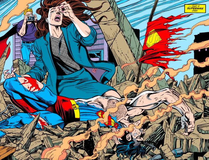
In the late 1980s, the various Superman series tried a new approach, where the creative teams on the three Supes-starring titles would coordinate their stories so that they would flow from one book to the next. After adding a fourth series in 1991, DC Comics now had, in effect, a weekly Superman series that was just split through four different periodicals. The creative teams would then get together at “summits” where they would plan out the next year’s stories. In 1990, they drew massive headlines when Clark Kent and Lois Lane got engaged in Superman No. 50, so during their summit for 1992, the plan was for the two to get married in Superman No. 75. Then a funny thing happened: Warner Bros. (who owns DC) was launching a new Superman TV series based around the will-they-or-won’t-they romance between Lois and Clark. So the comic book series had to hold off on marrying them. If they couldn’t have Superman get married, what could they do?
Sure enough, they decided that they would simply kill him off! They planned a story line called “The Death of Superman,” where an alien monster named Doomsday would go on a rampage, with Superman being the only person who could stop him. Which he did, but at the cost of his own life. Never had a mainstream audience connected so much with a comic-book event (slow news days helped) and the death of Superman became a cultural sensation. Black-bagged copies of his death (complete with a black armband) sold millions. It completely altered the way that DC wrote comics, and now every title had to do regular “events” — often death-based — like this. Some would say the returns are diminishing (and the swift resurrection of Supes just a few months later certainly undermined some of the impact), but a staple aspect of superhero comics was born.
Palestine No. 1 (1992)
Writer, penciler, inker, and letterer: Joe Sacco
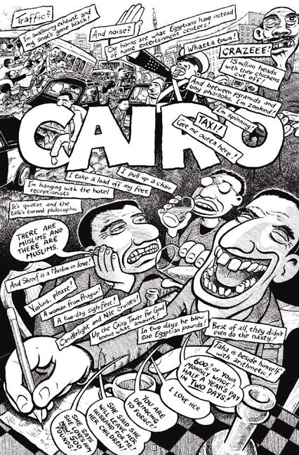
Nonfiction comics have their own, long history in the American medium, beginning in fits and starts with Golden Age efforts like DC’s Real Fact Comics. They made their first significant achievement during the underground era with Larry Gonick’s Cartoon History of the Universe series.
But the first to use nonfiction comics to comment on current events was writer/artist Joe Sacco. He became fascinated with Middle Eastern politics in the wake of the first Gulf War and grew frustrated by the biased coverage he felt American journalists were giving the situation in Israel’s occupied territories. So Sacco went there himself, armed with a sketchbook, to report on local conditions in comics form. At first, Sacco planned to do more of a straightforward travelogue, but as he made his way through Gaza and the West Bank, learning the daily struggles of ordinary people, he was inspired to create a much more ambitious work, as dramatic as any fiction. Here is the first page of that work, Palestine, which would win an American Book Award for its collected edition. Sacco has said he wanted to create an “everyman” feel for day-to-day life where he was travelling; there’s no better example of that approach than this page, in which he uses layout and lettering to evoke the metropolitan chaos of the Egyptian capital, which he visited en route to Palestine. Comics journalism as we know it probably wouldn’t exist without Sacco pages like this one.
Icon No. 1 (1993)
Writer: Dwayne McDuffie; Penciler: Mark D. Bright; Inker: Michael ‘Mike’ Gustovich; Colorists: Noelle C. Giddings, Rachelle Menasche, and James T Sherman; Letterer: Steve Dutro
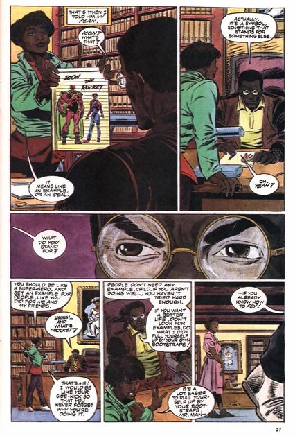
During the early 1990s comic-book-sales boom, when it seemed like any given comic-book company could launch and sell 100,000 copies of their first issue, there was a noticeable lack of ethnically diverse superheroes. It was so noticeable that a group of comic creators decided to do something about it. Dwayne McDuffie, Denys Cowan, Michael Davis, Derek T. Dingle, and Christopher Priest (who bowed out before the company became official), formed Milestone Media in 1993, a comic-book company dedicated to delivering diverse superheroes.
Among the four initial titles was Icon, written by Dwayne McDuffie and drawn by M.D. Bright. A clever inversion of the Superman origin story, Icon was an alien who landed on Earth in the 19th century and took on the form of the first human he saw, who happened to be an African-American slave. The alien did not age, and over time, he amassed a small fortune and became a political conservative. He kept himself cut off from the world, until a young, liberal teen challenges him on his isolationist views, ultimately compelling him to become a superhero. This encapsulated the importance of Milestone’s mission statement: It mattered to give people of all backgrounds inspirational heroes. Though Milestone would fall on hard times and disappear, it left a legacy of increased representation, and this page was essentially their mission statement.
Understanding Comics (1993)
Writer, penciler, and inker: Scott McCloud; Letterer: Bob Lappan
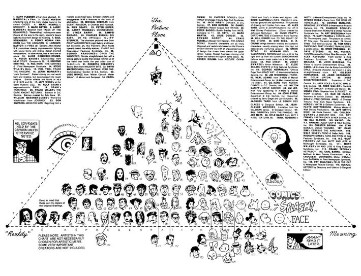
It’s hard to overstate what a statement McCloud’s book-length comics essay on how the graphic medium works made when it landed among comics-creating communities in 1993. For those hanging around illustrators studying comics in college at the time, it was all anyone could talk about.
McCloud is a gifted, almost compulsive explainer, and the simplicity of his arguments means they’ve held up remarkably well over time. He points out the way the mind conjures a human face from the abstraction of a circle, two dots, and a line (a smiley face), and how the true verisimilitude in comics storytelling comes from what the reader’s mind fills in between panels — both seen as commonsense truisms today. The book introduced nonlinear storytelling on paper years before these concepts would be fully developed (often by McCloud himself) by webcomics pioneers. That this pyramid, in which McCloud tries to map the styles of various comics creators along the axes of “Reality,” “Meaning,” and “The Picture Plane,” is only one of the most ambitious things in the book is saying something.
The Batman Adventures: Mad Love (1993)
Writers: Paul Dini and Bruce Walter Timm; Penciler and inker: Timm; Colorists: Rick Taylor and Bruce Walter Timm; Letterer: Tim Harkins
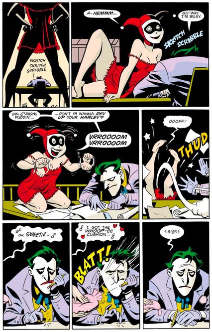
At the start of the 1990s, there was a strange, dichotomous relationship between comic books and animation. The world of animation looked down on superhero comics. Sure, there had been plenty of superhero cartoons over the years, but they rarely actually adapted the comic-book stories themselves, instead using the characters in simplistic new setups, like the Justice League becoming the Super Friends. Meanwhile, the world of comics looked down on the art style used in most cartoons, viewing it as “kids’ stuff.” Writer Paul Dini and writer/artist Bruce Timm changed both sides of that equation in 1992 with the introduction of Batman: The Animated Series.
A lush, beautifully drawn collection of tales, the Batman animated program was a smash critical and commercial success. Meanwhile, Dini and Timm brought their art style to the comic-book world directly with 1994’s Batman Adventures: Mad Love, which told the origin story of Harley Quinn, a massively popular character both then and now, who they had introduced in the show. This page showed Timm’s brilliant gift for expressive facial features, as well as their push-the-envelope approach to sexual content in a story for kids. The comic was a major success, winning the Eisner Award for best single issue. It also made Timm’s cartoon-like style more acceptable for “serious” comic book stories, which allowed a whole generation of animation-inspired artists, like Darwyn Cooke and J. Bone, to break into the mainstream comic-book world.
Hellboy: Seed of Destruction No. 4 (1994)
Writers: Mike Mignola and John Byrne; Penciler and inker: Mignola; Colorist: Mark Chiarello; Letterers: Mignola and Byrne
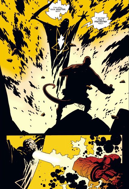
Looking at the great experimental artists in comic-book history, they rarely start off in their most experimental form. Take Mike Mignola: While he was always a stylish artist, when he was drawing The Incredible Hulk and Alpha Flight for Marvel, his art looked relatively normal for the era. As he grew more popular, though, he started to experiment more with things like form and design. One of the areas where he really started to shine was with the use of shadows in his work. Few comic-book artists ever had as much black ink on a page as Mignola. After a while, he realized it made more sense to come up with his own character that would fit his style rather than try to place established Marvel and DC characters into that style.
Superstar artist Arthur Adams recruited Mignola to join a creator-owned line of books at indie publisher Dark Horse, where Mignola invented Hellboy, a heroic half-demon who investigated the paranormal, giving Mignola consistent avenues to tell dark, shadowy stories. In Hellboy’s first adventure, he faced off against Grigori Rasputin, who had drawn Hellboy to Earth in the first place at the end of World War II. In this excellent example of Mignola’s use of shadow and light, we see Hellboy face off against the villainous Russian. Hellboy eventually became its own comic-book franchise and has inspired two movies (with a new one forthcoming), making it one of the most successful creator-owned comic books ever. Mignola’s flair for high-contrast action has been a clarion call for artists ever since.
Black Hole No. 1 (1995)
Writer, penciler, inker, and letterer: Charles Burns
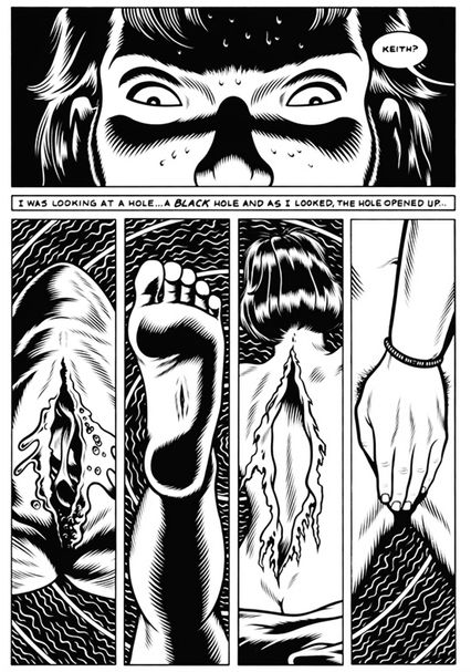
Talk about an opening. To set the scene for his magnum opus of suburban horror, Black Hole, Charles Burns starts with an all-American intro to evisceration: he titles his first section “Biology 101,” and it’s frog-dissection day. At first, high-schooler Keith is thrilled to be lab partners with Chris, “a total fox.” Suddenly, inexplicably, Keith is transfixed by the incision he’s just made, drippy with guts and formaldehyde: “I was looking at a hole,” he remembers, “a black hole and as I looked, the hole opened up…” In hallucinatory jump-cuts, that “black hole” flashes forward to other openings throughout Black Hole, seen by Keith and his classmates, waking and dreaming: a bloodless piercing inside a foot’s instep; a woman’s skin fraying down her spine, peeling away like old wallpaper; another woman’s genitals shielded by her hand, pubic hair peeking out from behind.
The moment, like Black Hole itself, bridges genres; part trippy horror and part sardonic comedy. Keith may be peering into a “black hole” of nothingness, beyond bodies and mortality and existence itself, but he’s also one more straight adolescent boy making everything about vaginas. Burns’s unmistakable aesthetic — full of uncomfortable curves, deliberate in every gesture, black-and-white-but-overwhelmingly-black — can trick you into seeing everything in polarities, just as its anxious high-schoolers sort everyone into girls and guys, preps and stoners, teenagers with and without “the Bug” (the book’s mysterious, body-morphing STD, a “teen plague” that can seem as dire as HIV or innocuous as hickies). By the end of Black Hole, Burns has you convinced that nothing is ever that neatly divided — not the slick suburbia so popped with one satirical scalpel-swipe, not this startling early page that finds seduction amid abjection, an existential crisis in Biology 101. In its decade of serialization, and even more so in its eventual collected edition, Black Hole inspired comics creators to explore the horrors of our bodies and our teenage selves.
The Acme Novelty Library No. 6 (1995)
Writer, penciler, inker, colorist, and letterer: Chris Ware
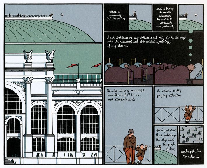
“GOETHE: ‘ARCHITECTURE IS FROZEN MUSIC’”: in 1995, Chris Ware wrote those words, in uncharacteristically scratchy capital letters, at the top-left corner of a fresh sketchbook page. Below Goethe’s assertion, Ware scribbled his own elaboration: “This is, I think, the aesthetic key to the development of cartoons as an art form.” Glance at Ware’s beloved graphic novel Jimmy Corrigan: The Smartest Kid on Earth (originally presented in the series The Acme Novelty Library) and you’ll see why Goethe’s definition appeals. Ware designs every page with an architect’s rigor and care, worthy of the Chicago cityscapes he reverently reproduces. “Frozen” is an apt description both for these stilled, vacant scenes and for the stunted characters inhabiting them, their lives trapped in repetitive behaviors, depressive cycles, and family tragedies recurring across generations. The modern-day Jimmy Corrigan (not “the smartest kid on earth” but an oblivious 36-year-old sad sack) stumbles through one defeat after another, but perhaps the book’s most heartbreaking defeat befalls his grandfather James, in an extended, century-crossing flashback.
Eight-year-old James barely believes his luck as he explores 1893 World’s Columbian Exposition on opening day; with dawning horror, both we and James realize that his embittered father led him into the swarming exposition and “right up to the edge of the largest building in the world” only to abandon him there. In trauma-rattled nightmares, James sees himself hurled from the building’s observation deck, but his world ended not in that “truly dramatic manner” but with his father’s “dull” mumble, a furtive glance, an unnoticed step aside. “I wasn’t really paying attention,” James recalls: the page’s pathos comes, in part, from the breathtaking but all-too-late attention Ware can bestow — we see the building’s neoclassical edifice, its ornate columns, angled light and shadow, the specklike people below, the exact moment James becomes fatherless. And there’s a severe pathos in Ware’s mathematically shrinking panels: half-page panorama gives way to quarter-page analysis; James’s world keeps constricting in halves, until the last, tiny, imageless panel records only a vain wish — “waiting for him to return.” Since Jimmy Corrigan, Ware’s distinctive style of “frozen music,” precise and elegiac, has resounded throughout contemporary comics, from Nick Drnaso’s Beverly to Hawkeye’s fabled “Pizza Dog” issue (seen later in this list), and can boast fans from far outside comics — Zadie Smith, J. J. Abrams, and Ira Glass, just to name a few.
Kingdom Come No. 1 (1996)
Writer: Mark Waid; Penciler, inker, and colorist: Alex Ross; Letterer: Todd Klein
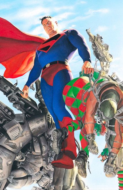
Superhero comics had gone too far. That’s the main thrust of Kingdom Come, Alex Ross and Mark Waid’s four-issue mini-series about what happens when a new generation of superheroes arises without the scruples of their mentors, abandoning the ideals that caused their forebears to keep their power in check and not kill the criminals they fought against. Disaster strikes when these younger, edgier heroes, in their recklessness, inadvertently cause a nuclear disaster in the American heartland, causing Superman to come out of retirement to lead a crusade for the ideals he once stood for. Primarily a showcase for Ross’s unique painted photorealism and affection for Greatest Generation iconography, Kingdom Come framed Superman’s return to this wayward world as a harrowing chronicle of the signs of the times. In 1996, edgy, amoral superheroes were overwhelmingly popular as creators attempted to recreate the aesthetics of the the previous decade’s grim deconstructionist hits, but without the thoughtful criticism those revered stories evoked.
It builds to one remarkable full-page splash of Superman, making his presence known with a striking, darker shield on his otherwise classic costume, lawless vigilantes helpless in his grasp. Between the timelessness of Superman as an icon and Ross’s reverent brand of superhero classicism, this page is where Kingdom Come throws the gauntlet: The old heroes still matter. Being good for its own sake is still enough. The rest of Kingdom Come would test that assertion, and despite coming to a conclusive answer, it’s a debate that superhero comics continue to have to this day.
Eightball No. 18 (1997)
Writer, penciler, inker, colorist, and letterer: Daniel Clowes
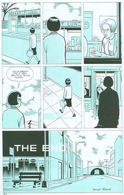
From 1989 to 1997, when Daniel Clowes wasn’t even sure he wanted to be a cartoonist, he drew 18 issues of an anthology series he created called Eightball, trying out various comic styles. When he came to issue No. 11, Clowes began the comic story that would become his classic, “Ghost World,” and he continued it through issue No. 18. “Ghost World” has been described as the comic you give your friends to show the full potential of the medium, and it has won awards and inspired many imitators. Drawn in a fine-line style with single-color washes, lurid lighting, and cinematic jump-cuts (appropriately enough, it was adapted into a film in 2001), “Ghost World” is a portrait of the nether-space between childhood and adulthood. It centers on two outsiderish high-school girls, Enid (dark hair, glasses, lots of self-loathing) and Rebecca (blonde bob, conventional good looks, slightly less self-loathing). The two go around town looking for perverts to befriend and people, music, and cornball retro diners to make fun of. Enid and Rebecca are post-punk flaneurs, with a fuck-you attitude toward just about everything.
On the very last page of the story, Enid, who has at this point adopted a more traditional look, is about to leave town for good when she happens to see Rebecca sitting in a café with Josh, her one non-creepy male friend. Rebecca has now assumed some of the qualities that Enid once had — spectacles, short hair, an anxious look, a chewed straw. From outside the window, we see Enid looking in and saying a line that has been parsed and re-parsed, but nonetheless remains opaque: “You’ve grown into a very beautiful woman.” Clowes has a great eye for the telling detail (books, magazines, records, signs, toys, menus, hair styles, glasses) and an even greater ear for realistic dialogue (one wonders how he could have eavesdropped so extensively on the teenage females of America). His rarest gift, though, especially in the comics world, is his evocation of the inner lives of critical, curious girls wondering about the world and their place in it.
Preacher No. 24 (1997)
Writer: Garth Ennis; Penciler and inker: Steve Dillon; Colorist: Matt Hollingsworth; Letterer: Clem Robins
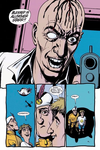
In 1995, DC’s Vertigo line of mature-themed comics was at a crossroads. Their flagship title, Neil Gaiman’s The Sandman, was set to end at the start of 1996 and no one was really sure whether the line could survive without it. Luckily, they were saved by the launch of an unusual series by writer Garth Ennis and artist Steve Dillon called Preacher, which gave Vertigo their first big hit in years. Preacher told the story of a small-town Texas reverend named Jesse Custer who suddenly received the Word of God: he can make people do whatever he says. Along with his former girlfriend (now working as an assassin) and his new best friend (an Irish vampire), Jesse traveled across the United States trying to find God (who had abandoned Heaven as soon as Jesse received the Word). They ran afoul of the Grail, a secret religious organization that manipulated the world from behind the scenes through their control of the Messiah, the inbred descendant of Jesus Christ.
Preacher became famous for its violence and pitch-black humor, both of which are on display in this riotous page. The villainous Herr Starr seizes control of the Grail soon after having his bald pate carved up to look like a penis; the idiot Messiah and a Grail footsoldier find themselves beneath the massively obese Grail leader Allfather D’Aronique as the latter falls from an airborne vehicle, exchanging deliciously terse final words. It was quintessential Preacher: Ennis would come up with twisted ideas and Dillon would deliver them in such a way to make them almost seem matter-of-fact. Preacher didn’t just push the envelope, it tore the envelope to shreds and defaced the remaining paper, inspiring an AMC TV adaptation and legions of books at Vertigo and elsewhere that tried to capture the obscene magic.
The Authority No. 4 (1999)
Writer: Warren Ellis; Penciler: Bryan Hitch; Inker: Paul Neary; Colorists: Wildstorm FX and Laura DePuy; Letterer: Ali Fuchs
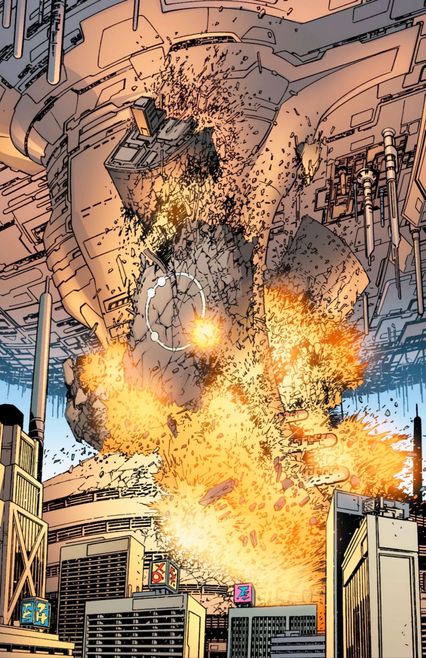
In 1996, Warren Ellis took over the series Stormwatch — published by Image imprint WildStorm — about an international superhero team. Ellis put a darker spin on the title and introduced the concept of Stormwatch having a black-ops team to do their dirty work. Production delays led to a fill-in arc by the relatively unknown artist Bryan Hitch. Paired with Hitch, Ellis was newly inspired. After just a year, he ended Stormwatch in the most shocking way possible: he had the aliens from the Aliens films kill most of the cast, leaving only the black-ops team standing. They were now renamed the Authority and they would appear in comics that told stories on a scale never before seen in superhero comics.
In their first arc on The Authority in 1999, Ellis and Hitch decided to have the Authority take care of the biggest villain in the WildStorm Universe, Kaizen Gamorra, who had built a superpowered army and took advantage of the absence of Storrmwatch to have his army destroy Moscow. When they tried to do the same to London, the Authority showed up and stopped them. After preventing a similar attack on Los Angeles, team member Midnighter used the team’s giant inter-dimensional ship, the Carrier, to crash through Gamorra’s powerful force field and destroy his island home. Hitch defined the concept of what came to be called “widescreen” comic book adventures: over-the-top action sequences that took up much of the page and echoed the cinematic approach of action blockbusters. Hitch and writer Mark Millar would go on to develop this approach even further in Marvel’s Ultimates, and the widescreen comic-book style became the comic-book inspiration for the Marvel Cinematic Universe — making The Authority retroactively one of the most influential comic books of the past two decades.
Powers No. 1 (2000)
Writer: Brian Michael Bendis; Penciler and inker: Michael Avon Oeming; Colorist: Pat Garrahy; Letterer: Bendis
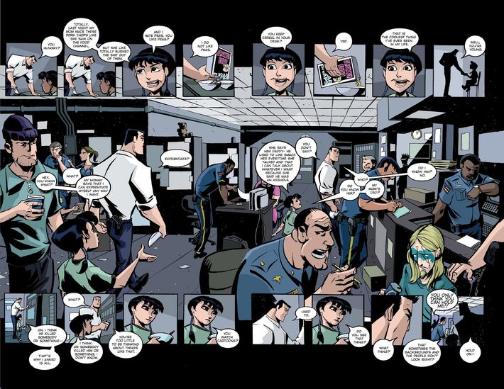
After Brian Michael Bendis, dialogue in comics would never be the same again. In the 1990s, he first drew attention for his work on crime comics, like A.K.A. Goldfish, Jinx, and Torso. After winning the 1999 Eisner Award for Talent Deserving of Wider Recognition, the next big step for Bendis was Powers in 2000. Produced with artist Michael Avon Oeming, Powers starred Christian Walker and Deena Pilgrim, two police detectives in a world filled with superhumans. The highlight of early Bendis work was his dialogue: Akin to that of David Mamet, it was a rapid back-and-forth that often saw characters overlap with each other — something unusually naturalistic for comics of the time.
In this page from Powers No. 1, the banter between Walker and a little girl whose mother was murdered by a superpowered killer is realistic, entertaining, and humanizes both characters. Bendis’s ability in Powers to give a relatable spin on superhero tropes made him the perfect choice for Marvel’s then-new Ultimate Universe, where, in 2000, he was given the opportunity to reboot Spider-Man as a teenager with fresh continuity. Bendis went on to become Marvel’s most popular writer for the next 17 years, adapting his unique dialogue to fit established heroes like Daredevil, Spider-Man, and Luke Cage. Generations of writers who didn’t feel like their style fit the superhero genre realized otherwise when Bendis blew up.
Blankets (2003)
Writer, penciler, inker, and letterer: Craig Thompson
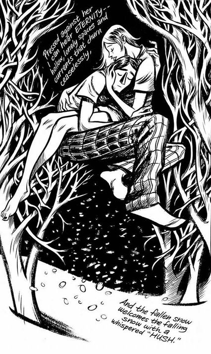
Until the aughts, the most influential autobiographical comics creators — R. Crumb, Aline Kominsky-Crumb, Justin Green, Chester Brown, and others — had been swimming in masturbation, bodily secretions, and clinical self-loathing. All that changed with Craig Thompson’s Blankets, a true coming-of-age tale that wallowed only in lyrical snowy landscapes, tremulous internal monologues, and heartfelt passion. In swirling, inky pages that radiated emotion, Thompson told of his upbringing in a strict evangelical Christian household and his fateful meeting with a girl named Raina at Bible Camp. Raina is a Christian as well, but her faith is rooted more in the real world, and as they fall for each other, Craig begins to question a rigid faith that denies that human love can also be sacred.
That spirituality and romance are beautifully captured on this page as Craig and Raina experience nature and physical longing together. As Thompson would later say, his goal in Blankets wasn’t to talk about physical love so much as what it’s like the first time you literally sleep (as in, fall asleep) with another person. Although Blankets’ heart-on-its-sleeve emotion is somewhat out of fashion now, when it came out, it spoke with urgency to young-adult comics readers who were looking for stories that reflected their own lives and the questioning of orthodoxy. Named the graphic novel of the year by Time, Blankets propelled its original publisher, Top Shelf, to prominence, and Thompson to a huge deal with Random House for his next graphic novel. Blankets’ success helped the traditional book world take graphic novels more seriously and showed young cartoonists that it was okay to be sentimental.
The Walking Dead No. 1 (2003)
Writer and letterer: Robert Kirkman; Penciler, inker, and colorist: Tony Moore
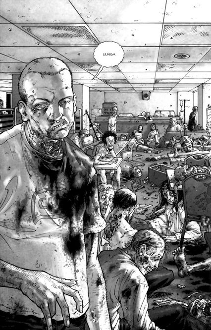
In the wake of its television megasuccess, it’s hard to remember that The Walking Dead was a huge deal in comics long before somebody thought Andrew Lincoln would look good in a sheriff hat. This self-proclaimed “George Romero movie that never ends” has been a strong sales and critical leader since it started: In the past decade, the first trade paperback collection in which this page appears has sold over a half-million copies. Though TWD has been ably stewarded by British artist Charlie Adlard for approximately a billion issues, the first six were drawn by Tony Moore, whose energetically pulpy style was perfect for introducing the series’s hyperviolent, show-no-mercy setting. Little wonder this page was appraised for $20,000 on the VH1 reality show For What It’s Worth.
The zombie virus provided a much-needed shock to the system of Image Comics, which was in danger of losing its relevance in the new millennium. It was entirely fitting when Image made TWD co-creator Robert Kirkman a partner in 2008, the first non-founding partner in the company’s history. In addition to its impact on the comics themselves, TWD’s small-screen dominance has inspired a nice secondary source of income for creators as comic after comic gets optioned for adaptation. Nothing succeeds like success, particularly in Hollywood.
DC: The New Frontier No. 6 (2004)
Writer, penciler, and inker: Darwyn Cooke; Colorist: Dave Stewart; Letterer: Jared K. Fletcher
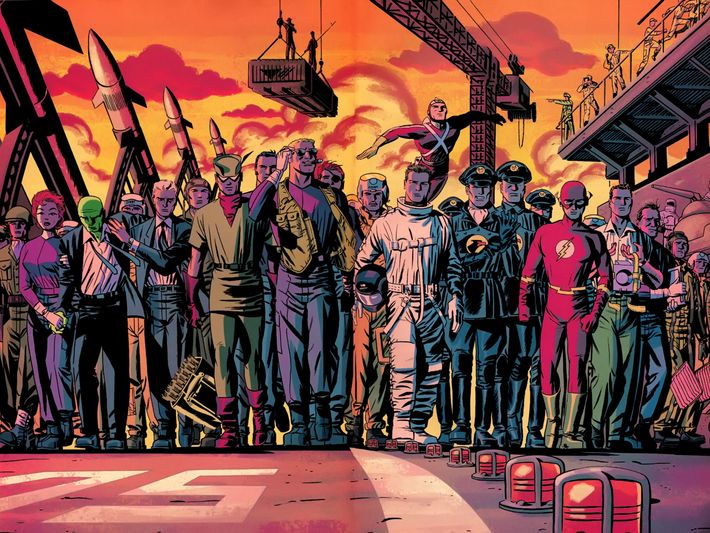
Darwyn Cooke was taken from us too soon when he died in 2016, but boy, he left a mark in the time he had. The writer/artist made his comic-book debut when he was just 23 years old with a 1985 issue of DC’s Talent Showcase. When comic-book work did not pay enough, he went home to Toronto and worked as a graphic designer for the next 15 years. In the early ‘90s, he tried to break into comics again but couldn’t get a gig, so he instead went to work for Warner Bros. Animation, where he was hired by Bruce Timm to work on the Batman animated series. Cooke worked in animation for the rest of the decade, but in the late ‘90s, DC editor Mark Chiarello found an old proposal that Cooke had sent in and was so impressed that he hired him for the graphic novella, Batman: Ego. When Chiarello then told Cooke that he should do a Justice League story, Cooke delivered one of the great superhero works of the 21st century, DC: The New Frontier.
The mini-series was set in the ‘50s and early ‘60s, and showed the new superheroes of the Silver Age slowly becoming the major superheroes that we now know. Chiarello later described the series as “pure a comic-reading experience as any comic that’s ever been published,” and countless creators and readers would agree. The tale led up to this iconic scene at the end of New Frontier No. 6, when Superman has been knocked out of the count by an alien threat and so the remaining motley crew of humans and brand-new superheroes must save the day. (They walk out for their possibly fatal mission in the same slow-motion walk used for the astronauts in The Right Stuff.) It was visually rich, but also paved the way for a deepened appreciation of Silver Age earnestness in superhero comics. New Frontier established Cooke as one of the greats in the industry, and he continued to prove his mettle for the rest of his life.
All-Star Superman No. 1 (2005)
Writer: Grant Morrison; Penciler: Frank Quitely; Inker and colorist: Jamie Grant; Letterer: Phil Balsman
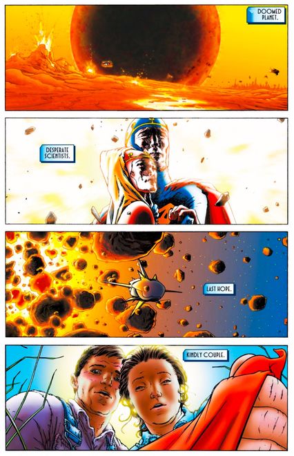
In the late 1990s, Grant Morrison tried unsuccessfully to become the regular writer on Superman, as part of a collective pitch where he and writers Mark Waid, Mark Millar, and Tom Peyer would take over the four monthly Superman titles. They dubbed their pitch “Superman Now,” as they did not plan on rebooting the character, just revamping him to make him more current while still keeping aspects of every previous incarnation of the character. It was a bold plan and DC seemed to be on board initially, but ultimately they went with another pitch. Morrison thought that his chance of writing Superman had passed, but after Morrison left a gig at Marvel Comics in 2004, DC’s vice-president, Dan DiDio, offered him a place in a new line of comics called All-Star, where top creators could tell stories featuring DC’s biggest heroes using whatever continuity that they felt like using.
Morrison teamed up with longtime collaborator Frank Quitely to create All-Star Superman, which spent 12 issues telling timeless stories starring the legendary hero. Morrison was intent on making the reading experience easy for both longtime fans and total newbies. That goal tied in with the brilliant opening page of the series, where Morrison and Quitely (and digital inker Jamie Grant) condensed Superman’s entire origin story into just four panels, each containing simply two words. It’s impressive that the idea even occurred to them, but it’s remarkable that Morrison and Quitely were actually able to pull it off. The series was an instant classic and its hearty optimism has informed the treatment of Superman by writers ever since.
Fun Home (2006)
Writer, penciler, colorist, and inker: Alison Bechdel
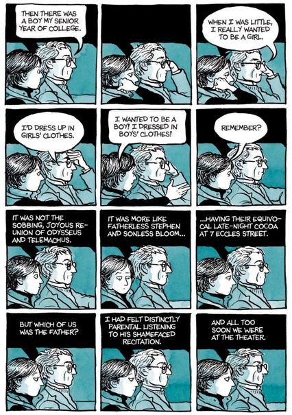
Two chapters into Alison Bechdel’s 2006 graphic memoir Fun Home: A Family Tragicomic, you learn “fun home” is short for “funeral home,” where Alison’s father Bruce, a high-school English teacher, made his part-time living as the town mortician — and it takes two seconds of reading, tops, to realize that the Bechdel household can be short on fun. Among the stories entangled in Bechdel’s labyrinthine, compulsively backtracking memoir are Bruce’s advances on teenage boys (including students and Alison’s babysitter), Alison’s coming out as a lesbian (the inverse of her father’s closeted homosexuality, an increasingly open secret), and Bruce’s apparent suicide, two weeks after his wife requested a divorce. So Fun Home has no shortage of dramatic pages, but few are as sadly deflating, or as quietly innovative, as this page of father and daughter, finally alone, driving to see Coal Miner’s Daughter. Back home on break from college, a recently out Alison has been hoping for some acknowledgment from her father, some openness about their “shared predilection,” maybe even a reenactment of Odysseus’ reunion with his son Telemachus — a high-literary level where the two bookish Bechdels might actually meet.
American Born Chinese (2006)
Writer, penciler, inker, and letterer: Gene Luen Yang; Colorist: Lark Pien
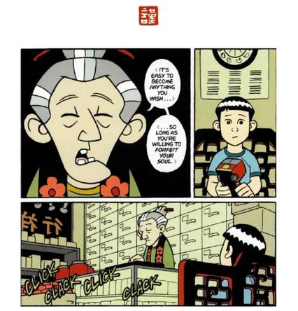
As he sits waiting in an apothecary’s shop, Jin Wang, a Chinese-American schoolboy, tries to explain to the aged shopkeeper his personal obsession: Transformers. He loves the idea of being able to change oneself into other things, like a truck that can become a battling robot. That’s no trick, the shopkeeper replies, “so long as you’re willing to forfeit your soul.” This line is the linchpin of Gene Luen Yang’s fable of identity, American Born Chinese, in which Jin, a child of immigrants, struggles to distance himself from his Chinese heritage, out of a desperate desire to assimilate into white American culture.
In its trio of interconnected stories, American Born Chinese plays with fire as it invokes racist types and tackles internalized racism, so much so that some booksellers initially refused to sell it. Its splicing of Buddhist culture with Yang’s devout Catholicism continues to inspire further criticism. Yet it has become an oft-taught classic of contemporary comics and Asian-American literature. Yang’s accessible clear-line style and gift for humor belie the terrible seriousness of the story, which explores themes of self-hatred and betrayal. The first graphic novel to be nominated for the National Book Award for Young People’s Literature, and the first to win the Printz Award for YA Literature, American Born Chinese became the breakout book for Yang and his publisher, First Second, and one of the signature books of the young-readers graphic-novel movement, which is the most popular and lucrative segment in U.S. comics publishing today. It also led to Yang becoming the National Ambassador for Young People’s Literature in 2016-2017 — another key first for a comics creator.
Scott Pilgrim Gets It Together (2007)
Writer, penciler, inker, and letterer: Bryan Lee O’Malley

When the video-game references start casually dropping in Bryan Lee O’Malley’s Scott Pilgrim, they might look like just another ’80s-baby cultural touchstone, another case of O’Malley’s stylistic omnivorousness, gobbling up geek culture alongside manga and anime and choose-your-own-adventure books, rom-com blushes and sitcom-quick wisecracks, vegan recipes and Canadian indie rock (complete with strum-along chord charts). By the six-volume series’s end, video games have become O’Malley’s elaborately wishful metaphor for your 20s — that impossible RPG we all slog through, forging our identities as we go. Those years can seem shapeless and undirected, so it’s almost out of kindness that O’Malley gives his slacker protagonist Scott Pilgrim plenty of weapons to unlock, experience points for every adulting win, and ever more imposing enemies to defeat, not least the seven Evil Exes of his new girlfriend Ramona Flowers. O’Malley’s video-game jokes become more absurd and more relatable in equal measure: When Scott defeats an ex, they vanish and turn into loose change. What cash-strapped 20-something wouldn’t take that deal?
Falling for something like Scott Pilgrim means graduating from an infatuation for eye-grabbing surfaces to a deep, unembarrassed love: Scott himself learns as much at the close of the series’s fourth volume, Scott Pilgrim Gets It Together. Finally using the L-word with Ramona, he emotionally levels up (Guts +2, Heart +3, Smarts +1, Will +1), and bares his heart in the form of a flaming longsword. O’Malley’s pen pivots resourcefully between styles: Here, he commits to both eight-bit fonts and the manga that inspired Pilgrim, which he helped other artists realize they could infuse into their own work. In just a few pages, he’s back to dotingly sketching Toronto, documenting it one neighborhood at a time. Raising the reality of young adulthood to fantasy’s exuberant heights, O’Malley looked forward to adventurous YA works like Marvel’s Runaways and the ongoing Lumberjanes, and portraits of young obsessives like Dash Shaw’s Cosplayers.
Smile (2010)
Writer, penciler, inker, and letterer: Raina Telgemeier; Colorist: Stephanie Yue
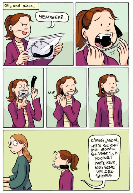
In the 21st century so far, one of the few hopeful spots in the otherwise struggling mainstream publishing industry has been comics. The graphic novel and manga section of your local Barnes & Noble has been one of the few areas of growth in recent years. And as of 2016, roughly 5 percent of overall graphic-novel bookstore sales came from the pen of one woman, Raina Telgemeier. According to available Bookscan data, that’s 1.3 million copies sold for $14.4 million. That’s, uh … that’s a lot of comics.
Starting out at Scholastic adapting the popular Baby-Sitters Club series into graphic form, Telgemeier embarked on her own original work with 2010’s Smile, an autobiographical comic about her childhood misadventures with dentistry. Smile and her subsequent titles (Drama, Ghosts, Sisters) have so dominated the best-seller charts that perhaps the New York Times got rid of its Top Ten graphic-novel lists because they were going to have to rename them “The Raina Telgemeier Weekly Sales Rankings.” Telgemeier’s incredible success, and the voracious appetite of her particular demographic for her work, indicates that in comics, at least, the future is indeed female.
Flashpoint No. 5 (2011)
Writer: Geoff Johns; Penciler: Andy Kubert; Inkers: Sandra Hope and Jesse Delperdang; Colorist: Alex Sinclair; Letterer: Nick J. Napolitano
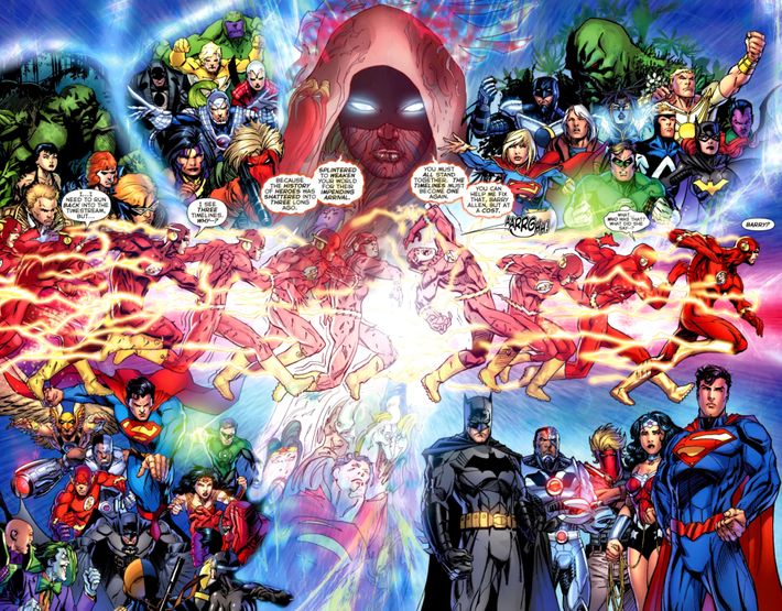
In 2011 DC Comics found themselves in a sales rut, mired in continuity and dwindling returns from line-wide “event” stories. The company needed a jolt, co-publishers Jim Lee and Dan DiDio dreamed up a doozy: a publishing initiative called the New 52, in which every DC character would get a new story line and a new No. 1 issue. It was a spectacularly bold idea, and it needed some kind of bridging event to explain how things changed. And there was only one person to write it: Geoff Johns, a fan-favorite writer who treasured continuity and the optimism that the DC heroes represented.
The resulting limited series, Flashpoint, not only became a definitive Flash story — a movie adaptation is in the works from directors Jonathan M. Goldstein and John Francis Daley — but it fed off of the kind of brutal “lady or the tiger” situation that comics thrive on. Barry Allen, the Flash, wakes up in a dark world where most of the heroes are dead. It turns out he himself created this timeline by going back in time and preventing his mother’s murder. In order to put things right, Allen uses his super speed to blast through time and space: In one page, readers see the old DC continuity give way to the New 52 world before their very eyes, penciled into existence by the legendary Andy Kubert. It was a sales sensation that launched the New 52 to DC’s highest sales in years, and set the template for their subsequent re-reboot, DC Rebirth. This page symbolizes not only a pivotal moment for the DC universe, but how business realities can affect storytelling.
Saga No. 1 (2012)
Writer: Brian K. Vaughan; Penciler, inker, and colorist: Fiona Staples
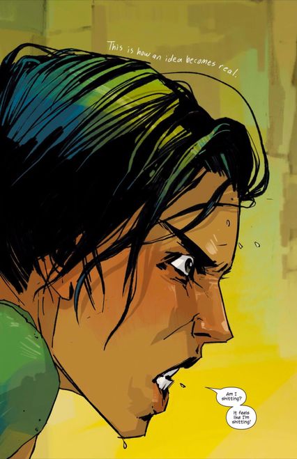
There’s only one image on the first page of Saga No. 1, and it’s of a woman’s face in profile, as she wears an expression somewhere at the nexus of pain, anger, fear, confusion, shock, and horror. “Am I shitting?” she asks someone off-camera. “It feels like I’m shitting!” The only other text is a caption, scrawled in handwriting above her head: “This is how an idea becomes real.” And this is how you win over an entire generation of comics fans that have no attachment to superheroes and the trappings thereof: a single image of a woman in the throes of childbirth, panicking about one of those truths about becoming a parent that no one tells you but everyone finds out. Yes, you’re probably gonna shit yourself.
Opening with a single, provocative image is an old trick, but what artist Fiona Staples and writer Brian K. Vaughan do in this first page is project — with profane honesty and complete earnestness — a beautiful, compassionate humanity placed front and center in their story. There’s no world-building, no names to learn, nothing to grasp onto except this very real, complicated, genuine emotion rendered in Staples’s digitally painted artwork, refined yet rough, fully realized but still in progress, like the imperfect but three-dimensional characters we were about to meet. Saga opened the floodgates for an array of deeply human, beautifully drawn genre stories to flourish: Jeff Lemire and Dustin Nguyen’s Descender, Rick Remender and Greg Tocchini’s Low, and ODY-C by Matt Fraction and Christian Ward all owe debts both small and large to Saga, a triumph of science fiction with a genuine, beating heart.
Hawkeye No. 11 (2013)
Writer: Matt Fraction; Penciler and inker: David Aja; Colorist: Matt Hollingsworth; Letterer: Chris Eliopoulos

Ever since superheroes became a Hollywood mainstay around the turn of the millennium, it’s been interesting to see comic-book companies attempt to tie in with the films. For the most part, such efforts to sync the look and feel of a character’s movie version with their comic-book incarnation have fallen flat. In 2012, following the record-breaking box office of The Avengers, it made sense that Marvel would come out with a Hawkeye comic book. However, instead of being simply a movie tie-in, Matt Fraction and David Aja’s comic book ended up influencing the entire next generation of Marvel Comics.
Fraction and Aja’s Hawkeye eschewed traditional superhero beats for a more down-to-Earth story of Clint “Hawkeye” Barton buying an apartment building and dealing with the criminal elements that want to take over the block. Barton has an apprentice, Kate Bishop, who also uses the Hawkeye moniker, except she’s more competent than him. The highlight of the run came in Hawkeye No. 11, an issue told through the eyes of Lucky, a dog that Hawkeye adopted in the first issue of the series. Lucky (or Pizza Dog, as he thinks of himself, due to his taste for pizza) sees the world through a series of nonverbal signifiers (the book’s letterer, Chris Eliopoulos is credited as “production” for the issue, as he delivers a lot more than just lettering in the issue). It’s Chris Ware–esque diagram artwork, but with a great deal more heart behind the experiences of Lucky. This was one of the most acclaimed single issues of the past decade, winning an Eisner Award for Best Single Issue. You can draw a straight line from Hawkeye to the series of off-beat, character-driven comic series Marvel has released since, like Captain Marvel, Ms. Marvel, and Unbeatable Squirrel Girl.
All-New Marvel Now! Point One No. 1 (2014)
Writer: G. Willow Wilson; Penciler and inker: Adrian Alphona; Colorist: Ian Herring; Letterer: Joe Caramagna
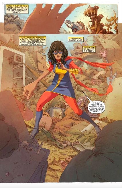
At the end of Kelly Sue DeConnick’s first volume of Captain Marvel, readers saw the influence that the title character — formerly known as Ms. Marvel — had on her fans in the Marvel Universe. The very last page showed a young woman in Jersey City who was inspired by Captain Marvel, and that young woman was Kamala Khan, who would go on to pick up the Ms. Marvel moniker from her hero. Kamala got her start when Captain Marvel editors Sana Amanat and Steve Wacker were talking about Amanat’s life growing up as Muslim-American. They thought that was a fascinating background for a new character, so they brought in writer G. Willow Wilson (also a Muslim) and artist Adrian Alphona to help create the new hero, who had her first full appearance in costume on this page from an anthology comic called All-New Marvel Now! Point One.
The hook for the character was quickly established right from the get-go in this story: Kamala is a teen with a loving but very conservative family, and she sometimes finds herself conflicted about her place in the world. Speaking on the character, Amanat noted, “[T]his book isn’t preaching about religion or the Islamic faith in particular. It’s about what happens when you struggle with the labels imposed on you, and how that forms your sense of self.” Her solo series, Ms. Marvel, was a surprise hit, with the first issue going through a shocking six printings. Not only that, but Ms. Marvel also saw a significant boost from digital sales, making it one of the first Marvel comics to show the buying power of the online-only marketplace, where women make a larger percentage of the purchasers, as opposed to traditional comic-book stores. Ms. Marvel’s success was a direct inspiration for Marvel trying out a more diverse slate of superheroes, like Moon Girl in Moon Girl and Devil Dinosaur and RiRi Williams in Invincible Iron Man.
Lumberjanes No. 1 (2014)
Writers: Grace Ellis and Noelle Stevenson; Penciler and inker: Brooke A. Allen; Colorist: Maarta Laiho; Letterer: Aubrey Aiese
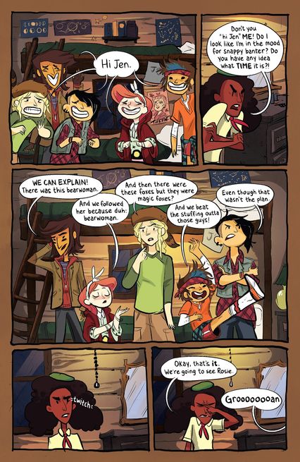
In 2013, publisher BOOM! Studios was having so much success with their KaBOOM! line of kid-oriented comics, edited by Shannon Watters, that they put her in charge of a new imprint called BOOM! Box that would be aimed at a slightly older crowd. The only unifying theme would be, as Watters later recalled, “The kind of comics that you make for the love of comics.” The second comic that BOOM! Box released was Lumberjanes, the result of Watters approaching writer Grace Ellis about designing a new girl-centric series. Brooke Allen was brought in as the artist (and character designer) and Noelle Stevenson joined the book as Ellis’s co-writer.
The series is a delightfully off-the-wall story about a group of girls (Mal, Ripley, Molly, April, and Jo) at a scout camp (their scout troop is the Lumberjanes, of course) who experience lots of spooky phenomena at their camp and go on awesome adventures while their beleaguered counselor, Jen, tries to keep control of them. Originally intended to be an eight-issue mini-series, the immediate response was so overwhelmingly positive that it became an ongoing series by the time the second issue was released. Lumberjanes is the perfect example of why the future of comics is so bright: It’s a lovingly created series starring a group of diverse girls, and their diversity is just a normal part of the story. When two of the girls develop crushes on each other, it’s not treated as anything different than the crushes little boys and girls have on each other in every kids’ adventure story ever. The success of Lumberjanes, which is also being developed as a major motion picture, has facilitated the release of even more comic books like it — such as Gotham Academy, Goldie Vance, and Giant Days — and provided cause for even more optimism about where this medium is going.


